ZTE Nubia Z11 Review : Almost the best
The Nubia Z11 fails where Nubia phones have traditionally excelled: the camera. However, it's still a really fast smartphone with above average battery life, and what is arguable the best design of 2016. It's a viable alternative to the OnePlus 3T and definitely worth considering.
The Nubia Z11 is also one of the few bezel-less smartphones you can buy today. That gives it a huge…umm…edge, in terms of design. But is that enough to earn a place in your pocket?
Build and Design
Personally speaking, the Nubia Z11 is my pick for the best designed smartphone of 2016. There weren’t too many contenders for this any way, but between this, the Mi Mix and the Samsung Galaxy S7 Edge, the Z11 is simply the best.
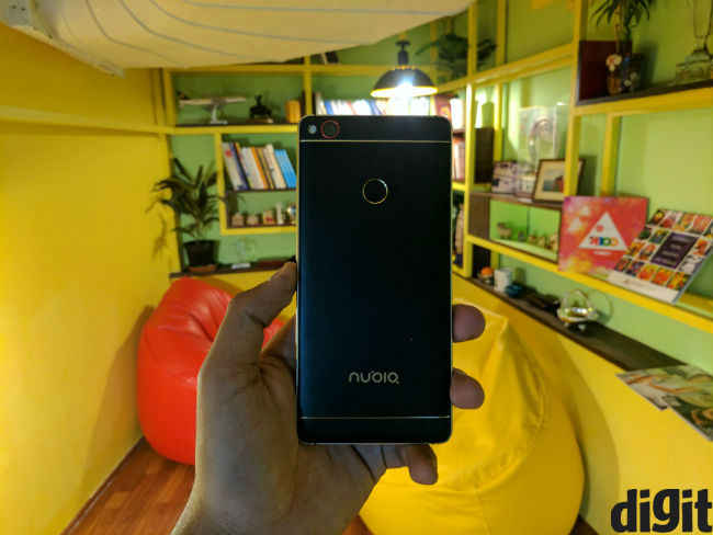
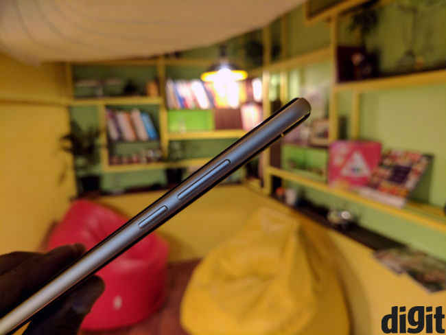
Nubia chose an all-metal approach this time, with a metal frame and back all over. That actually gives this phone a much more premium appeal. The chamfered edges from the Nubia Z9 have been dropped in favour of a more rounded design. This rounded metal frame on the side is quite easy to grip.
Two Gold lines run along the top and bottom of the back, while the fingerprint sensor also has a Gold accent. The camera module rests on the top left of the back, with a signature Red accent that would appeal to many. The back also feels somewhat matte-ish, which is pleasant.
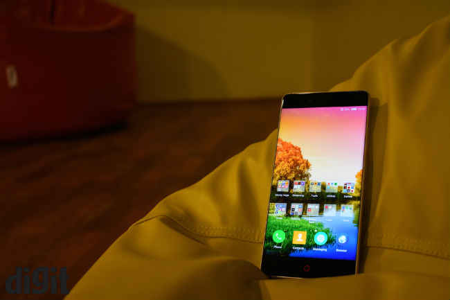
The glass on the front is curved near the edges, and this is perhaps the only phone where 2.5D glass has been put to some real use. Given that a completely bezel-less phone isn’t really possible, Nubia uses curved glass to hide the miniscule bezel that this phone still has. Even if you look very closely, you’ll only find a parallax effect from the curved glass, instead of a black bezel line. Looking straight at the phone, it feels like there are no bezels.
Perhaps the best part of this design, though, is how narrow the Nubia Z11 is. It’s easy to grip. Even smaller hands like mine, are enough to use this phone with one hand. You need to shift your grip only when reaching for the top quarter of the screen, which is most often for the notification drop-down. Even so, Nubia UI allows you to swipe down anywhere on the screen to pull this down, so as to avoid reaching for the top unless absolutely needed.
As good as the design is though, one has to be wary of dropping it. Much like the Mi Mix, the first time you drop this phone will be the last time for this display. Another slight chink is when you look at the phone from different angles. If your friend is watching a video on this phone while standing next to you, he or she may see image distortion near the corners.
Display
The entire appeal of this smartphone revolves around its display. The 5.5 inch FHD panel is gorgeous, with vibrant, warm and pleasant colours. They aren’t absolutely accurate, being more on the oversaturated side, but it’s pleasing to look at still. Icons look sharp, as do images and videos.
My only real qualm with the display is that it’s dim. It produces a maximum luminance of 577 Lux, which can be an issue in sunlight. Outdoor visibility is sub-optimal.
UI
Nubia UI is more about aesthetics and experience, and that makes it far removed from stock Android. There are myriad changes, both aesthetically and features-wise.
The most interesting of these are Nubia’s bezel gestures. You can swipe down from a bezel to switch apps, while sliding up and down along the two bezels will increase or reduce screen brightness. There are other functions too, but in general, the bezel features take some getting used to. They’re not really intuitive and I didn’t particularly like using them. The bezel functions seem nice at first, but they can’t really replace current methods of doing things.
Interestingly, Nubia has also retained a feature from Android’s Ice Cream Sandwich days. Instead of a recents button, you get a settings button, that opens menus within apps or on the home screens. You have to long press the back button for accessing recents.
When first booting the phone, you’ll also need to change the default contacts display option to your Google accounts, or wherever else you store them. By default, the phone shows only contacts that are stored on it.
Overall, Nubia UI is an interesting, but not the most intuitive UI out there. The concept itself is nice. It looks good, feels premium and sophisticated, but is also heavier than something like Oxygen OS on the OnePlus 3T.
Performance
Nubia’s smartphones have been more about the experience than top-end specs. However, the Z11 checks all the right boxes. It has a Snapdragon 820 SoC and 6GB of RAM, right up there with the OnePlus 3T.
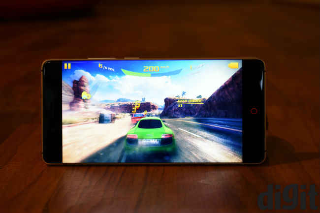
On regular usage, app performance is fast, and the Snapdragon 820 doesn’t disappoint. However, over extended periods of gaming or camera usage, the phone tends to generate more heat than is ideal. Over 15 minutes of gaming, the phone reaches a peak temperature of 15 degrees, while 4K video recording pushes it to 42 degree celsius over 10 minutes. While this is acceptable, it isn’t ideal.
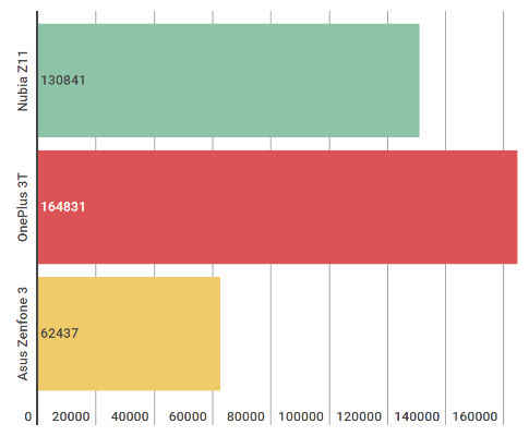
AnTuTu Benchmark
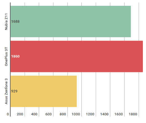
Geekbench 4 Single Core
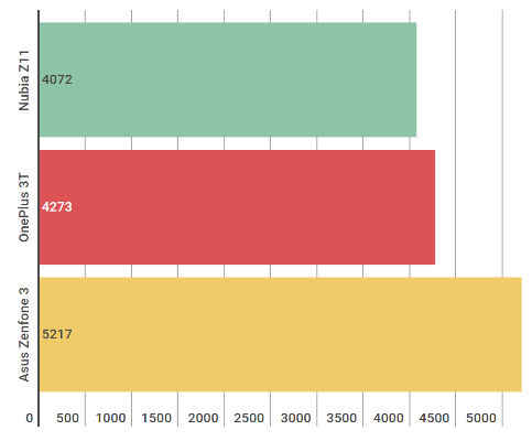
Geekbench 4 Multi-Core
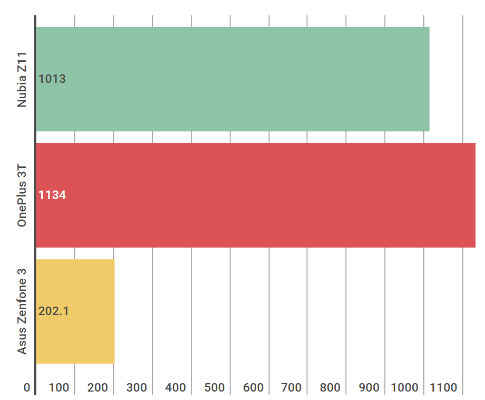
GFXBench Car Chase
In fact, the phone sometimes does feel a tad sluggish compared to a OnePlus 3T. It’s not as snappy as you’d want from a premium device of this caliber. The processor seems to be throttled to avoid heating, which increases app load times by a bit. To be clear, it’s not detrimental or even noticeable unless you’ve used both the OnePlus 3T and the Nubia Z11.
Camera
Nubia has always been known for its cameras. Last year’s Nubia Z9 Mini was almost as good as flagship phones at the time, and this year’s Nubia Z11 Mini is also far ahead of its competitors in camera performance. So, we expected a lot from the Nubia Z11 and that’s perhaps why we were disappointed.
The camera often screws up white balance and colours appear bleak. Images lack details, irrespective of noise, and photos shot in low light are marred by noise. ZTE has made the camera more responsive, but while the app opens faster than before and takes lesser time to process, it still takes long to focus on subjects.
The camera is passable at best, but it loses the Nubia Z11 major points amidst competition.
Battery
On paper, the Z11 has only a 3000 mAh battery, but its battery life can be better than the OnePlus 3T. Charging it to 100% at 11 am, the phone got me through to 11.30 pm with 15% charge remaining. This, though not ideal, is pretty much the best battery life you can expect from the industry right now.
It lasts for 6 hours 55 minutes on the PC Mark battery test, which is nearly two hours more than the OnePlus 3T.
Bottomline
The Nubia Z11 Mini is amongst the best smartphones to buy today. It’s arguably the most beautiful mainstream smartphone available, it’s fast, has good battery life, and a pleasant display. With a better camera, this phone would perhaps be as good as the OnePlus 3T, but even without it, it’s definitely a viable replacement. At Rs. 29,999, the Nubia Z11 is a phone you can definitely consider.

