Vivo V17 Review : Well-rounded offering
After our round of testing, the Vivo V17 came out as a well-rounded smartphone that ticks most of the boxes offering decently powerful hardware and good cameras. This is no flagship but Vivo is offering the latest design with a punch-hole display, good gaming performance and a day-long battery life. Check the full review to know more.
As the year comes to a close, Vivo has squeezed one last offering bolstering its lineup of slightly premium mid-range smartphones. It started with the Vivo V15 Pro early this year and ends with the Vivo V17. And in that time between, Vivo also brought some nifty new innovations to make its smartphones compete better with the likes of Xiaomi, Nokia and the others in this upper mid-range segment. The Vivo V17 embodies the same philosophy. That of offering brand new features to entice buyers. But how consistent are they? Let’s find out —
Performance
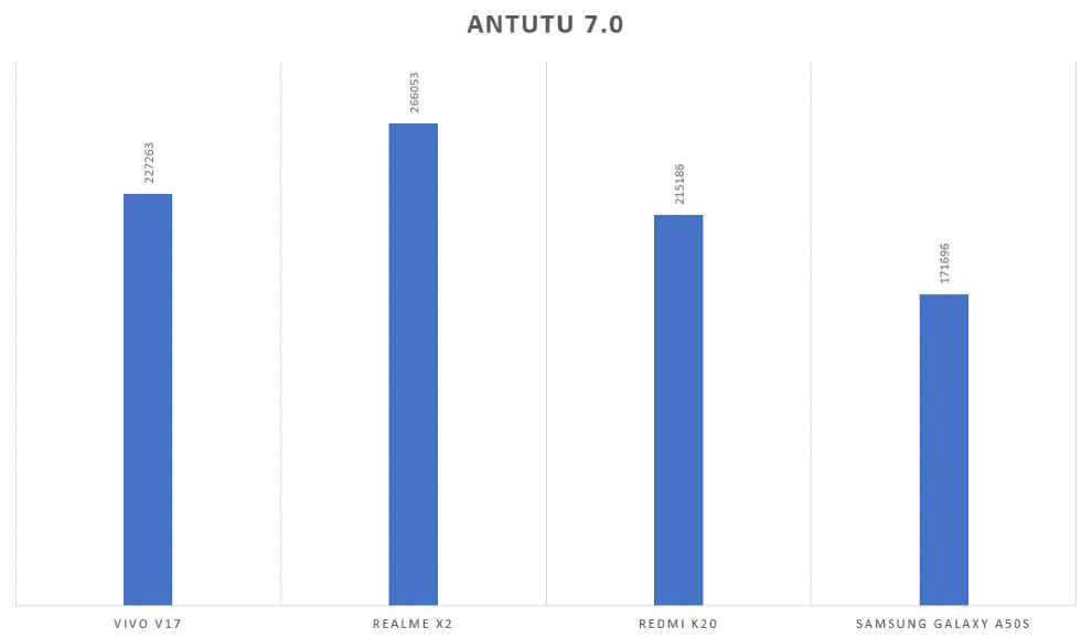
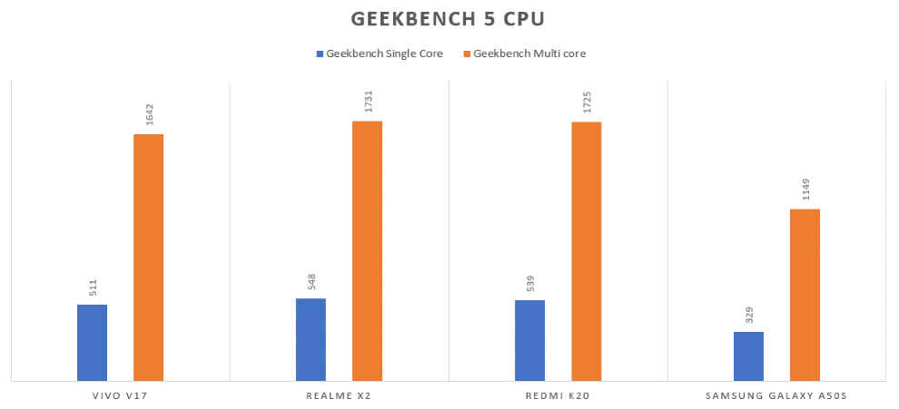
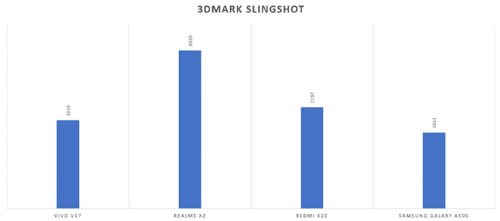
The Vivo V17 takes on smartphones like the Redmi K20, Samsung Galaxy A50s, and the company’s own Vivo V15 Pro, and most phones in that price come with at least a 7-series Snapdragon chipset. The Vivo V17 is powered by the Snapdragon 675, the same chipset thats’s on the Redmi Note 7 Pro. However, the V17 does offer 8 gigs of RAM and 128GB storage in that price. How does it fare in raw performance against its peers? Here are the benchmark graphs —
On AnTuTu, the Vivo V17 scored 227263 points, which did beat the Redmi K20 and the Galaxy A50s but fell slightly short of the Redmi Note 8 Pro’s score. On Geekbench Single Core and multi core CPU benchmark, the phone scored 511 and 1642, higher than the Galaxy A50s but much lower than the Redmi K20’s score. On 3DMark Slingshot, the Vivo V17 scored 1919, much lesser than the Redmi K20 and the Redmi Note 8 Pro.
Clearly, the Vivo V17 needs to up its game in performance to compete with the bestsellers in the segment. However, in the real world, the Vivo V17 works just fine. I managed to do my daily tasks with ease on the Vivo V17 which basically involved shooting photos, reading articles, browsing social media and the likes. Heavier tasks like editing a RAW image, launching apps like Google Earth and the likes do take a little more time, coming from the OnePlus 7T.
Thanks to the Snapdragon 675 however, the Vivo V17 handles high-end games pretty well. We played PUBG Mobile, Asphalt 9 and Call of Duty: Mobile on the phone, and the performance was satisfactory to say the least. We tested gaming performance using GameBench and all graphics settings maxed out, and the numbers were certainly quite impressive.
Asphalt 9 delivered 25 FPS at 71 percent stability while Call of Duty: Mobile clocked in a 36 FPS at 73 percent stability. PUBG Mobile ran the best with 30 FPS at 100 percent stability. Clearly, this phone is well-tuned to handle PUBG Mobile, and that shouldn’t be surprising considering Vivo is one of the partners of PUBG Mobile’s Esports tournaments.
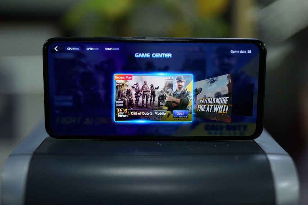
Vivo also offers a game center where you can see the CPU, GPU and temperature data in real time, block calls and messages and see general stats about your game play. There’s also things like a voice-changer for those concerned about privacy while chatting in-game, and the ability to lock the screen without pausing the game. What’s missing are 4D vibrations and Vivo’s training center for games like PUBG Mobile.
Software
While the hardware inside the Vivo V17 just about ensures it stays competitive, it’s the FunTouch OS the phone runs on that sets it back from offering that premium experience. For most people, the UI will work fine after a slightly steep learning curve. For instance, people used to having the quick settings in the notification panel will have to swipe up from the bottom, similar to iOS. Giant icon tiles, missing app drawer, and a complicated keyboard are some of the quips I faced while using the phone, so much so, that I couldn’t wait to get back to using something else. The software is also based on Android 9 and we’re not sure when, if ever, the Vivo V17 will get an update to Android 10.
It’s not that the Vivo V17’s software lacks a lot of features we like to see in phones. In fact, it mostly has them all. The UI has its own theme engine, a minus-1 screen showing personalised information, dark mode, encrypted vault and the likes. But then, the UI design itself now looks dated. Never mind the bunch of bloatware apps you find on the phone right and beginning and the notification overload it leads to after a few days of use.
Frankly speaking, the Vivo V17, and most other Vivo smartphones seem to be geared to the tastes and preferences of Chinese users, and Vivo users in India have no choice other than to live with it. It’s also the same with the likes of Oppo, Realme and Xiaomi, all of whom tailor their operating system based on Chinese preferences, and then tweak some features for the Indian audience. The Vivo V17 doesn’t seem to have any such specific India-centric additions, and while that hasn’t really stopped Vivo from selling phones in India, it could look towards developing something specifically for one of its largest markets in the future.
Battery Life
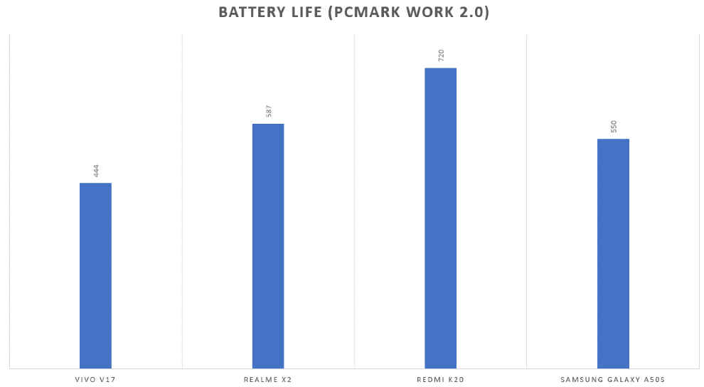
The Vivo V17 packs a 4500mAh battery with the ability to fast charge it with the 18W brick that comes out of the box. For the most part, the phone easily lasts a day, provided you stick to just the usual tasks. Recording videos and shooting photos during a vacation will drain the battery much faster. We played PUBG Mobile and streamed The Big Bang Theory on Netflix for 15 minutes and the battery drop was around 4 percent in both cases. That’s a conservative number as we have seen other smartphones discharge much faster. This conservative drain, I felt, was primarily because of the aggressive resource management Vivo employs. Apps in the background are put to sleep soon after you’re done using it, to the point that it sometimes became detrimental. For instance, the battery logging app that we run in the background kept stopping after just 15 minutes of recording. This aggressive resource management is even more pronounced while gaming. Launching a game via the GameCenter will kill all background apps to free up resources which is disappointing considering the device comes with plenty of RAM to keep at least some apps running. You can of course whitelist apps you don’t want killed, but that’s a long-drawn complicated process involving several steps.
Camera
As for the camera, the Vivo V17 rocks a quad-camera setup that includes a 48MP sensor, most likely by Samsung, an 8MP ultra-wide camera, a 2MP macro lens and another 2MP depth sensor for portraits. Together, they form a versatile setup that offers a lot of options to the shooter. You can shoot in high-res 48MP or stick to the default 12MP. Then there's ultra-wide mode and a macro mode, along with a portrait mode. But how well do they all work? Let's take a look at a few samples –
Day time
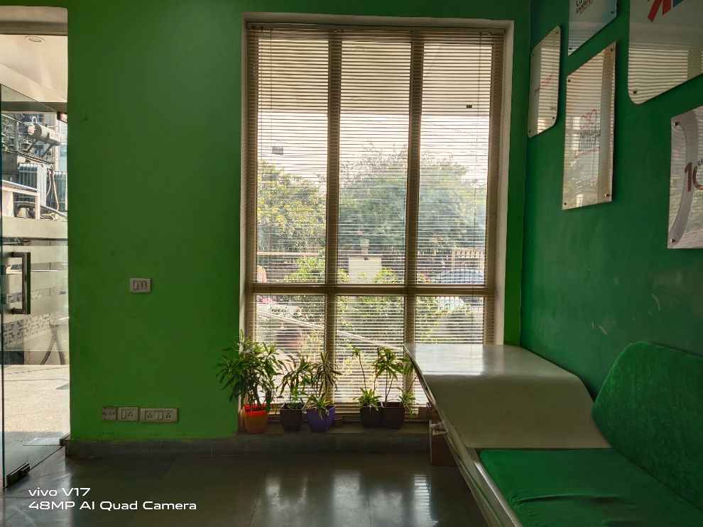
The Vivo V17's cameras seem to be tuned to capture bright blue skies and green foliage. These two things are captured perfectly well by the primary 48MP sensor and the ultra-wide lens. Only, the ultra-wide lens offers very little details if you zoom in. The 12MP binned image too feels a little too oversaturated but looks pleasing to the eye. Rough textures also come out decently well. Indoors with a strong backlight also come out well with good details in the shadows. But then again, if you compare with smartphones like the OnePlus 7T or even the Pixel 3a, the Vivo V17's photos won't look very natural.
48MP vs 12MP
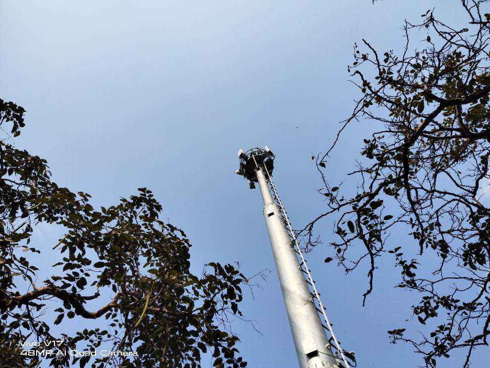
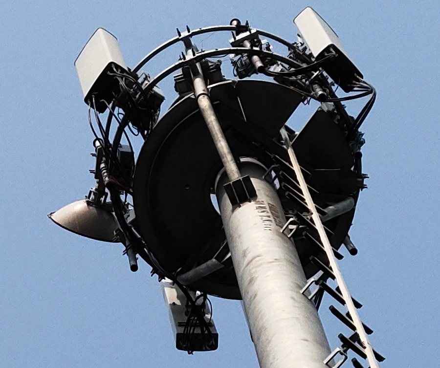
100 percent crop of 48MP image
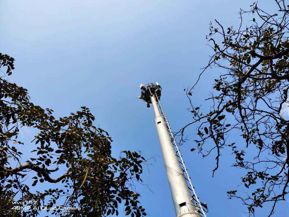
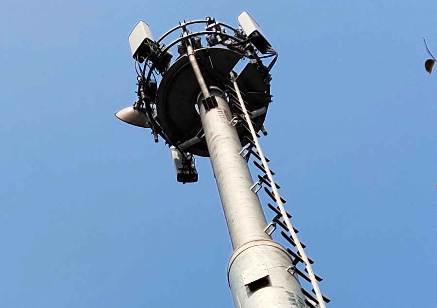
100 percent crop of 12MP binned image
The Vivo V17's 48MP sensor does let you zoom in to see details from far, and under 100 percent crop, the image does look quite sharp around the edges. All the elements of the tower can be identified. However, as the next results suggest, it's better to shoot at 12MP. The 12MP binned image of the same frame proves the colours, details and the overall clarity are much better as compared to the 48MP shot.
Close-up vs Macro
Macro mode
As for the macro lens, it's not as good. You will get better results from the primary lens itself. The minimum focusing distance lets you go a lot closer than usual. And the details, sharpness and the likes come out quite crisp. The macro lens lets you go as close as 2cm but the details are nowhere as good as what you get from the primary lens.
Low light
The Vivo V17 comes with a dedicated night mode to capture low-light shot. The feature works by combining multiple images into one to get a clean, final shot. As a result, the colours, brightness and the rest are on point. However, Vivo still has to work on the details, sharpness and dynamic range.
Portraits and Selfies
Portraits and selfies are good enough with the camera capturing all the details with good clarity. But selfies have that extra AI touch that softens facial details. The portrait mode is actually pretty good with consistent background blurring and accurate subject separation.
Display and design
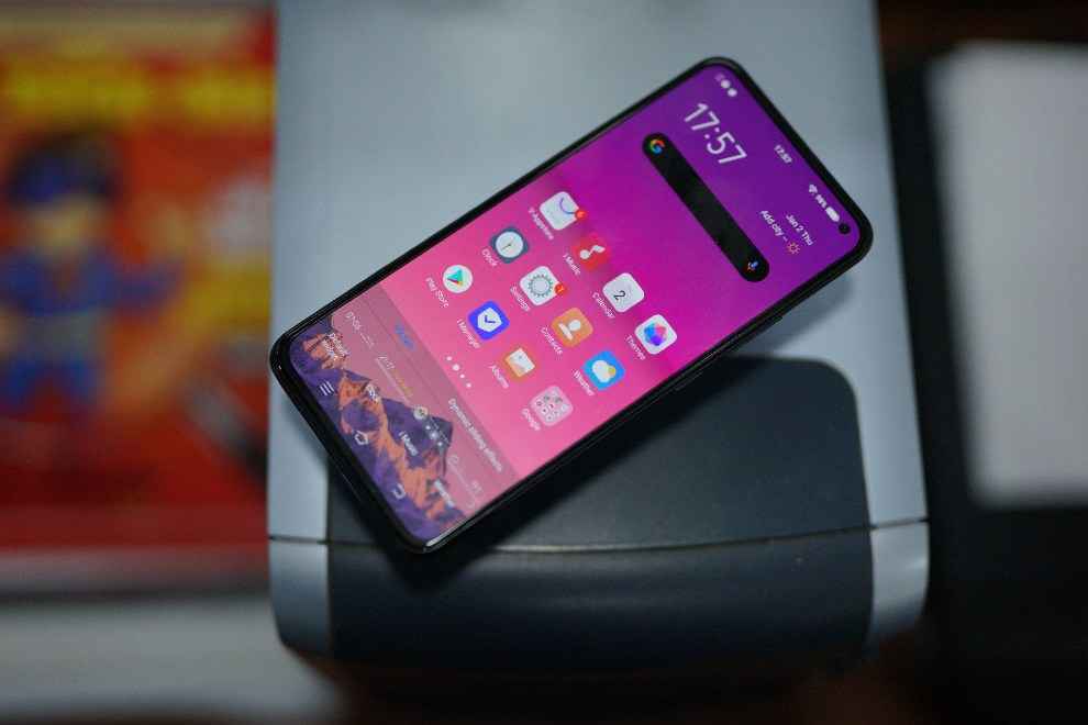
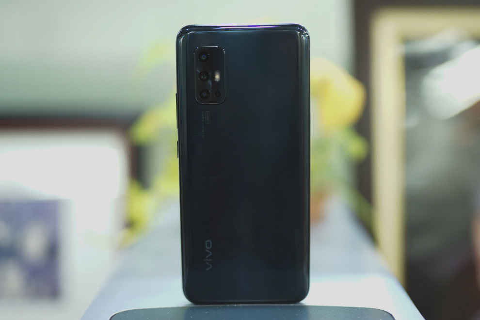
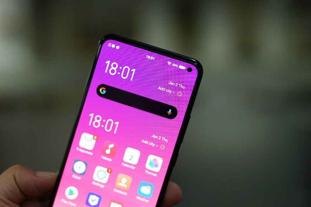
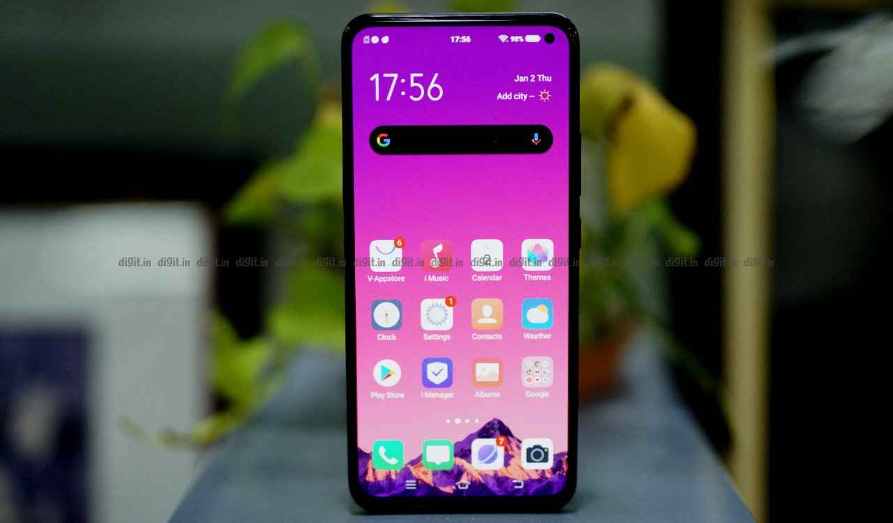
The Vivo V17 bears a lot of resemblance to the Vivo V17 Pro from the back, save for the camera module which is perhaps the only way to differentiate the two. That allows the Vivo V17 manages to retain the premium look of the V17 Pro, but knock your knuckles on the back panel and you’ll quickly realise it’s plastic. The build quality of the Vivo V17, as a result, becomes questionable, especially when most phones priced above Rs 20,000 use protective glass at the back. But where Vivo cut costs in build quality, it made the Vivo V17 an excellent carrier for its design innovations. The punch-hole camera, for one, is one of the smallest we have seen on a smartphone and while using the phone as a daily driver, it felt like just another just element in the status bar. So while the Vivo V17 Pro had to rely on a pop-up module to go all screen, the V17 does it with a tiny punch-hole camera. The bezels around the display are also some of the thinnest we have seen, especially down below using a tech called ‘Chip-on-flex’ which allows the display driver to be installed on a flexible module. Design is one area, where the Vivo V17 is far ahead of the rest of the competition in that price segment.
Moving on to the display itself, it’s a 6.44-inch Super AMOLED display with Full HD resolution and 20:9 aspect ratio. The panel looks bright and vivid, if not a little oversaturated. Vivo also claimed 100% DCI-P3 coverage, but it’s unlikely you’ll be able to make full use of the colour space since there’s no HDR certification. Full support of the DCI-P3 colour space comes handy during HDR playback but that’s surreptitiously missing. During our test, the display clocked 386 lux in maximum brightness out in the sun, with auto-brightness turned on, while in the dark, the minimum brightness went down to 8 lux.
Bottomline
The Vivo V17 comes out as sort of an all-rounder. The performance is good enough to handle all the latest apps and games. In fact, gaming performance was top-notch. The camera setup offers a lot of options, but only the primary 48MP lens is good to use in all situations. The rest are best used under ample light. The low light mode is good enough to get the brightness and the ambience right, but the details are still missing. While the hardware remains quite competitive, it's the software of the Vivo V17 that sets it back. FunTouchOS desperately needs a revamp and the UI is the only thing that acts as a deal-breaker in this phone. Otherwise, the Vivo V17 is easy to recommend.

