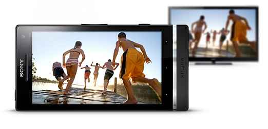
Sony really needs to push the ICS updates out of the door, very quickly. The Xperia S seems to have everything in place – good hardware, excellent build quality and design and a very good display. However, Sony needs to get the UI sorted. When compared straight with the HTC Sense, the UI just looks boxy. But with the ICS update inevitable, this is a pretty decent device to buy.
Look & Feel
The Sony Xperia S has a very premium build quality. It feels worth the price, and no point of time does it look less expensive than what it really is. To start off, the transparent strip running below the display only breaks the darkness of the piano black glass. Labeled on this transparent strip are the three icons – return, home and options. However, the actual keys are the touch sensitive ones just above the strip, indicated by three tiny dots. The video-calling camera sits on the right top corner above the screen. Compare on either side of this glass, and it is like the city of Liverpool divided by the Mersey River – completely different from the other. While it is the darkly shiny bit around the display, the rubberized finish below it adds a contrasting dimension. Also, this rubberized finish flows all the way around to the back also.
Speaking of which, this finish of the rear panel is helpful when gripping the phone and typing with the same hand – the Xperia S doesn’t slip around as some phones do. Towards the top is the 12MP camera, which we feel is a little too far that way. We shall get to that point later. Sony haven’t given the Xperia S the unibody design goodness, which means the rear panel can be opened to access the micro SIM slot. However, the battery is locked away from user access. We would have loved to see this phone with the unibody build, and the micro SIM slot could have been implemented on a spine. There are covers for the HDMI port as well as the micro USB port. While the covers themselves are quite solid, the hinge holding them is surprisingly flimsy plastic. We would be very careful every time we plug in the phone for charging, fearing even the slightest rough use will break it.
Two issues with the design elements though. First, the touch sensitive keys below the display aren’t easy to get used to immediately. The finger will always assume the transparent strip is the actual key, whereas it isn’t! Secondly, the camera could have been placed a bit better. Currently, it is too close to the top edge, and in most scenarios of holding the phone in landscape mode to click a picture, you will have to be extra careful of not blocking it.
The build quality is brilliant overall, with a definite premium feel to it. Fits well in the hand, despite multiple curves and flat areas converging on one front. The transparent strip may be perceived as a gimmick, but it silently brings in a bit of illumination to an otherwise dark “yet another phone” design. And that accentuates the other likeable things with the design as well. While the Xperia S doesn’t stand out in a crowd of smartphones by some shouty design elements, this one definitely does it smartly.
Also, check out our video review of the Sony Xperia S:
Visit next page to read Sony Xperia S’ features and performance, Our Take
Features & Performance
You will be forgiven for thinking we are a bit bonkers to talk about the transparent strip even before we get down to the business end of the powertrain. But there is a reason for that. If you look very carefully, you will notice a diagonal grid running through almost the entire length of the strip. Sony says this is a part of the antenna system on the device. The call quality was as good as any top of the line smartphone out there. However, inside an elevator for example, is where the call quality was definitely better than most phones.
Sony has clearly decided not to be a part of the quad core processor wave, perhaps focusing more on functionality than anything else. This one comes with a dual core processor, and on paper, that is a bit weak for a flagship device. We have a set of tables here comparing the benchmark scores with the best dual core smartphones around, and to put the performance in perspective with the additional dimension of a quad core HTC One X in the mix.
.jpg) |
.jpg) |
.jpg) |
.jpg) |
From these scores, you can see that Xperia S is only slightly behind the Galaxy SII, but is considerably quicker in the Antutu score sheet. It is the same story in the Linpack test, but only just. However, the Xperia S browser is the best of the lot, with clearly the highest score in the Peacekeeper test.
The Xperia’s 4.3-inch display has a 720p resolution. Immediately, compare it to any AMOLED display and you will notice that while the colours don’t jump out at you, they are a lot more natural. Black levels are quite deep, but AMOLED again has a slight advantage. However, gradation is a bit of an issue that you will see with most images where colours are in bands. Apart from that, the sharpness of the display is impressive. Text looks very crisp and readable, and no edge noise problem that is prevalent with most displays when you zoom in to text. While the display is natively quite bright, we were a bit perplexed to find that there is no automatic brightness setting. While the display isn’t technically matte, this one is less reflective than the predecessor the Arc S and even the HTC One X that we tested recently. Wider viewing angles are a direct happy result of that, and so is the ability to use it in most environments with the brightness set at around 50%.
We can’t understand why Sony would send out a phone in this day and age without Android ICS. And that too for what is essentially a flagship device. At the time of writing this, we are hearing that Sony has started rolling out the ICS updates for the Xperia S in some regions. Expect a global coverage by the end of May 2012.
Timescape UI will get a major overhaul with ICS, but the current one is workable to the extent that it gets the job done without inspiring any visual goodness. Compared to the best UI out there, the HTC Sense, Timescape feels very boxy, limited widget range and just a bit drab. Hopefully, the new one will be a completely new experience.
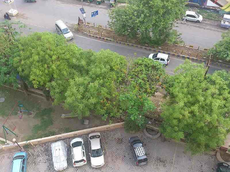
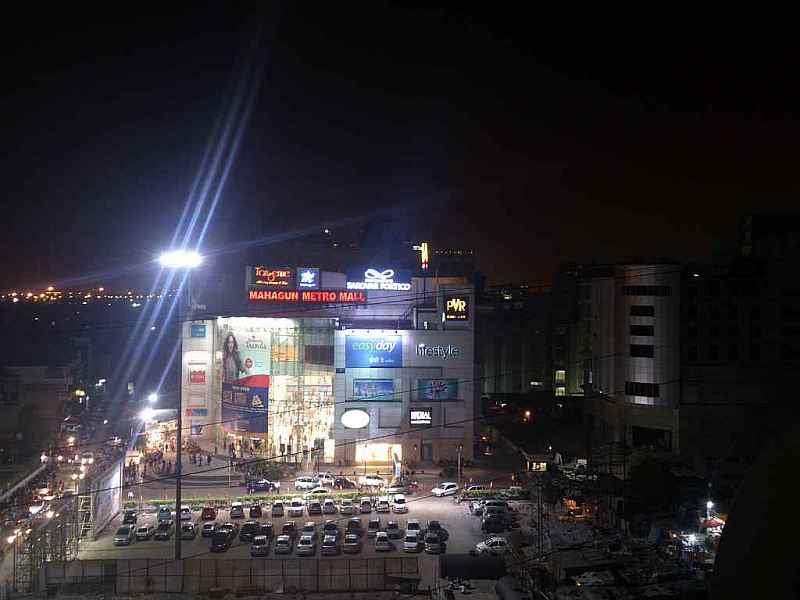
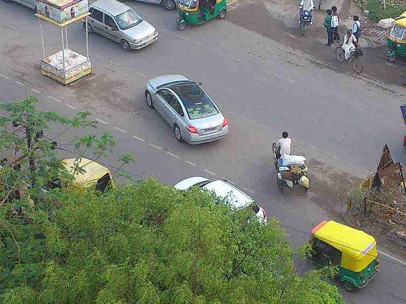
Despite a solid background credential check (success of Sony’s Alpha NEX range being one), the 12MP camera on the Xperia S is a bit of a mixed bag. First off, the hardware key will take you straight to the camera, even if the phone is locked. We do not think that the camera is very well placed. It is too far towards the top, and when you are holding the phone in landscape mode, chances are you will have to reposition your fingers against what they would naturally do. A slightly more central location would have helped ease this issue. Image quality is a case of two very distinct halves. If you are using this to take shots in daylight or good lighting conditions, the 12MP clicker will be a delight to use – detailed shots, with a dollop of crispness and good colour depth. However, zoom in on an object and you have a problem – the clarity is severely compromised with a lot of noise. For night shots, you will have to factor in severe shutter lag. Also, the more you zoom in, the less effective image stabilization is. Can take 3D panorama shots as well, just like most Alpha NEX cameras do.
 |
.jpg) |
Close up shots in low lights with the flash off and flash on. You will notice how crisp the images are.
 |
 |
Comparing same shot, in daylight and at night. Very clear images, with a lot of detailing.
 |
.jpg) |
An example of how noisy the image becomes when you zoom in on an object.
.jpg) |
 |
 |
.jpg) |
.jpg) |
Step by step zoom in on an object at same distance, to a better illustration of the gradual noise increase
Handles colours well
.jpg) |
 |
.jpg) |
Night shots are satisfactory (first image), till you actually start zooming.
Visit next page to continue reading Sony Xperia S’ features and performance, also check out our final verdict
Videos are clear for the most part during daytime, but do suffer from a bit of judder and video stabilization isn’t very effective, even at literally no zooming. In night videos, you will get a whole lot of noise and the zooming effect isn’t very smooth either. Beyond the no zoom state, the camera tends to lose focus considerably particularly if there are multiple light sources.
Videos of the same area in the daytime and the nighttime. Notice a slight judder when a car is quickly passing through.
Zooming in isn’t a very smooth activity
With a standard usage pattern, the Xperia S battery will last you a bit more than a day. With the inevitable ICS update, expect this to improve very slightly.
Our Take
For a flagship device, the Xperia S doesn’t have Android ICS out of the box. That will be rectified soon. Apart from that, this phone ticks all the right boxes – performance, looks and uniqueness. This is definitely an alternative you can consider if you are in the market for a high end Android smartphone.

.jpg)
.jpg)
