Samsung Galaxy S8+ Review : Bent to impress
The Samsung Galaxy S8 Plus brings flagship class design and is finally a phone that doesn't look like all others. If that piques your interest, then this is the phone you should buy. It's one of the best smartphones out there today, but an incremental update in everything except design.
Build and Design
A glass body comes with an inevitable flaw, one that Samsung seems fine with. The Galaxy S8+ and Galaxy S8 offer too much to break. Combined with a slippery body, you’re looking at a bumper case, or at least some kind of cover. That may still pass on the compact Galaxy S8, but on the S8+ it makes for a phone that's a tad unweildy. The last thing you want is to break this display. The display on last year's Galaxy S7 Edge would cost users about Rs. 18,000 for replacement, so one can only assume that this one would cross the 20k mark. That's about a third of the device's buying price.
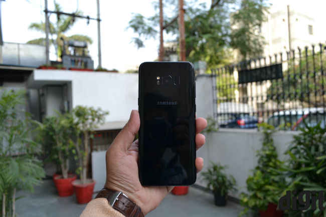
On the other hand, if you are like me and decided to risk it, then you’re in for a treat. Fingerprints will show on the back, but frankly speaking, I really didn’t mind them. My midnight black unit looks great, and it’s comfortable to hold. Well, at least more comfortable than other 6-inch devices. Truth be told, while the Univisium display does make the Galaxy S8+ narrower than other 6-inch smartphones, it’s not exactly ergonomic.
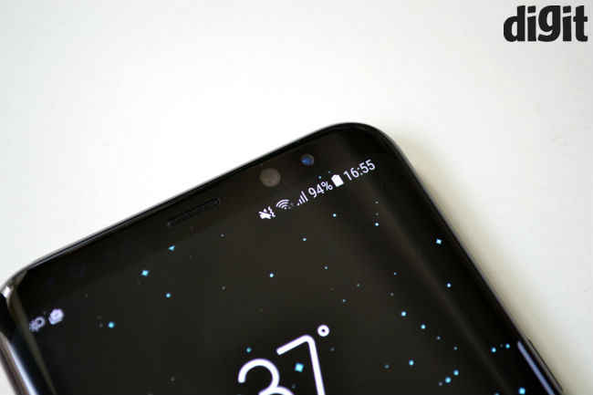
Samsung has indeed proved what it can do with a curved body and an 18.5:9 display. The slight curves near the rear edges also make the phone easier to grip. That is, as much as is possible with its screen. Placed side-by-side, the Galaxy S8+ is more or less as big as an iPhone 7 Plus (review). That’s no mean feat, but on a personal note, the iPhone 7 Plus isn't the best example for design any way.
The buttons
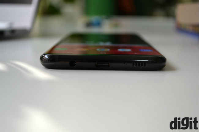
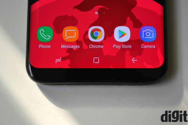
A big part of the Galaxy S8+’s design finesse is in how the buttons are placed on the device. In order to make the phone feel like it was all screen, Samsung finally used on-screen buttons on its phones. The home, recents and back buttons work just like on any other phone, but there’s an embedded home button below the display as well.
So, when watching content in full screen, you can simply push down on the point where the home button should be and you’ll jump back to the home screen. When not in full screen mode, you can swipe up to bring the buttons back in view. The embedded button works in a similar manner to Apple's Force Touch, but I did find it easier to get used to.
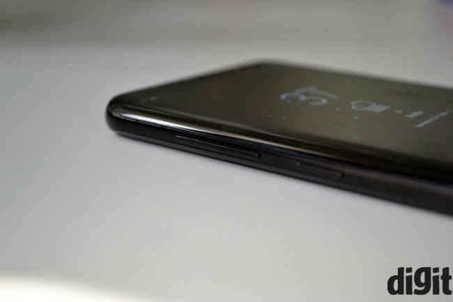
Moving to the hardware buttons, you’ll find the power on/off button on the right, while the volume rocker and Bixby button lie on the left. While all of these are easy to reach on the Galaxy S8, on the S8+ it’s the Bixby button that’ll fall below your finger at all times (unless you have big hands), making you wish there was a way to remap it to the power on/off function.
Slim bezels or no bezels?
There's no real "bezel-less" display, but one can't blame Samsung for calling this one of those. No matter what colour you buy, the front of the Galaxy S8 and S8+ is always going to be black, and for good reason. The bezels are so slim and well hidden that you'll pretty much never spot them. It’s worth noting that Samsung isn’t the first to achieve such a design, but it comes with extra “oomph” due to the curved edges.
Another impact of these slim bezels is that you get a lot of screen real estate, even in the smaller device. They allow the on-screen buttons to feel non-intrusive.
That fingerprint sensor and other biometrics
I have to be honest here. Ever since any of us saw the Galaxy S8 via leaks, the fingerprint sensor placement seemed destined to frustrate, especially on the bigger device. The Galaxy S8+ is just too tall and the fingerprint sensor is too difficult to reach. Combined with the slippery back, it makes for a precarious way to unlock the phone.
When you do reach it, the fingerprint sensor is quick to unlock the Galaxy S8+, but it’s just too difficult to get used to. Given the excellent design language and choices, this is a gaping hole in the phone that’s supposed to make up for the Galaxy Note 7’s misstep.
I tried using the Iris Scanner and Face Unlock features instead, but they’re neither dependable nor seamless enough to be used regularly. You’ll need to aim the camera correctly, which takes some getting used to. Also, the face unlock feature won’t work in low light, while the iris scanner also trips up a tad too often. It took me 7 tries just to register my iris on the scanner. What's worth noting is that Samsung's Iris Scanner is much easier to work with than Windows Hello on Windows-based phones.
Display
700 words down and we’re just scratching the surface with Samsung's design work. Moving to the next phase — the display. If you haven’t done the math already, QHD resolution on a 6.2-inch panel amounts to 529 ppi pixel density. Translation: the display is as sharp as it gets.
More importantly, Samsung has toned down colour saturation this time. To be clear, you still get pleasantly oversaturated tones, but the yellowish hue is not as apparent as before. Black levels are great, which also helps in hiding the bezels. Samsung allows users to toggle the level of red, green and blue colours on the screen, which is something enthusiasts would appreciate.
I saw a reddish tint appear on the display from minor angles, but the same didn’t happen on the Galaxy S8. Given that this is a reported issue that Samsung has responded to, I’m assuming it’s one specific to my unit. I also noticed a rainbow effect on the Edge part of the S8+’s display and this too wasn’t found on the S8.
Univisium aspect ratio
Univisium may finally turn out to be the future, but it's just a fancy spec at the moment. It allows the display to be taller instead of wide, which is the main reason for this phone’s compact form factor. However, content doesn’t yet conform to it. So, at least for the time being you’ll have to deal with pillarboxing. On the Galaxy S8+, Amazon Prime streams video in a rectangular format, with black bars on the Edge part and on the two sides. On the Galaxy S8, this seems limited to the sides only.
UI
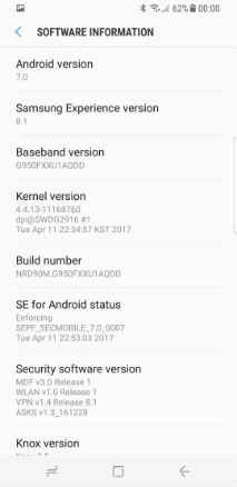
UI design is a big part of designing a smartphone and the Samsung Experience (that’s what Touchwiz is called now) is the best the company has done so far. For the sake of familiarity and simplicity, I’m just going to call it Touchwiz in this review.
UI design is another part of the finesse I talked about earlier. I’m still not particularly fond of Samsung’s always on display, but much like other things on this phone, it looks good. I wish there was more functionality to it, but this will have to work for now. I'm also not completely sure that this is a light UI, but it's lighter than most Samsung UIs I've used before.
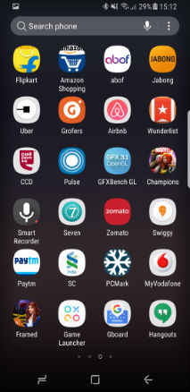
Importantly, Samsung has changed Touchwiz’s colour schemes and icon designs this time. Icons have rounded corners and look sharp, and they're colourful to complement the phone's display. To be fair, the company’s been heading this way since last year, but once again it saved the best for the last.
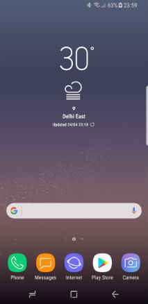
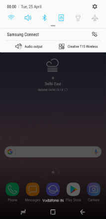
If you’ve used a Samsung phone recently, you would have seen the grouped Settings menu as well. There’s a Search button within settings that makes it simpler to find what you’re looking for. That makes customising the phone fast and extremely easy.
As I mentioned before, Samsung’s Edge features are pretty gimmicky and not really useful. However, the company has made a solid change this time. Its game tools icon appears (when needed) alongside the on-screen keys, making it less intrusive. Similarly, notification icons on top appear just in front of the curve (third photo above), while heads up notifications appear seamlessly and without any stutters. If you have texts on WhatsApp etc, you can reply directly from the Notifications drop-down too, and Samsung has its own tasteful take on how this should happen (see picture below). I wish the reply box was a tad bigger, but this still works.
Next, you get the suite of Samsung and Microsoft apps, neither of which can be removed. There are also a bunch of Google apps pre-installed, including Google Duo, but these can be removed from the phone. There’s also an app called Samsung Connect for smart home controls, while My Galaxy brings coupons and some other services to Samsung’s customers.
Most importantly, you’ll find an “expand” option on apps within the Recents menu. This allows you to fit almost every app to the new 18.5:9 display, and use them in full screen mode. I did have problems using some apps like this, which is probably why Samsung has kept it as an optional feature.
Bixby
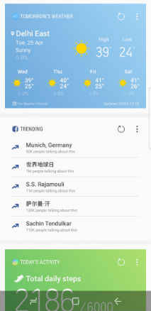
Samsung's AI assistant has been a much talked about feature on these phones, but in India, it's less an AI assistant and more a replacement for Flipboard right now. It takes over the left most screen from Flipboard and can be called using the hardware button too.

First up, Bixby is slow to launch when using the hardware button, which put me off from using it. More importantly, its hands are tied, especially in India. Samsung currently has a tie-up with Pinterest, but that's pretty much all Bixby does. If you use it within the camera app, it'll find photos similar to the ones you pick. If there's text in your photos, Bixby can read that and pick the text out. Shopping features are missing from the country right now, but Samsung should bring them soon. Most importantly, Bixby doesn't have voice support right now, although Samsung has promised to add it soon.
In India, Bixby is pretty much a clone of the Google Now screen on most other smartphones. It shows you information like Alarms, social feeds and News. Like other AI assistants, Bixby will also need time to learn and improve, which means much like the Google Assistant or Apple's Siri, it's a gimmick Indian users will not really find very useful, at least for now. It's there though, as a sign of things to come in future.
Performance
At this point, you know effectively everything there is to know about the Galaxy S8+. But a review wouldn’t be complete without a word about its performance.
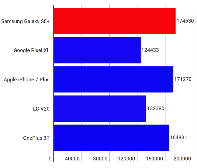
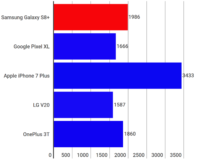
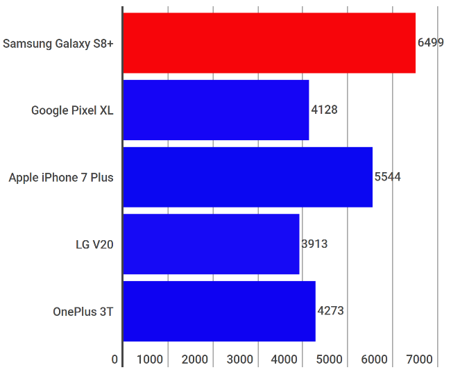
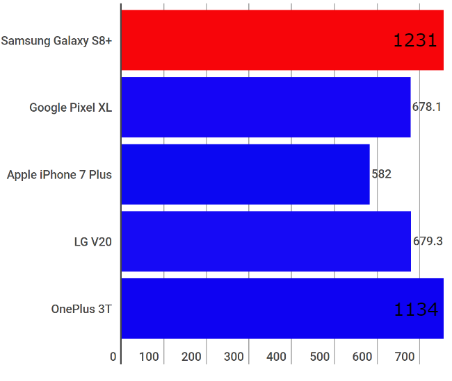
On this front though, improvement is only incremental at the moment. To be fair, that’s true for all OEMs and not Samsung alone. The company’s Exynos 8895 SoC (used on the India model) is faster than last year’s phones, but only incrementally so.
AnTuTu Benchmark
Geekbench 4 Single Core
Geekbench 4 Multi Core
GFXBench Car Chase
The Mongoose cores take care of heavy tasks this time. There are four of them clocked at 2.5GHz, while the Cortex A53 cores handle the simpler tasks, clocked at 1.7GHz. As we saw on the Galaxy C9 Pro (review), the Mongoose cores kick in whenever there’s a UI transition happening, keeping things fast and snappy. However, I did see some UI lags on the Galaxy S8 and S8+. They’re nowhere close to hampering regular or heavy usage, but they’re a little unsightly when they happen. You’ll find these most often when using Facebook’s Instant Articles.
The GPU also does well. Samsung chose a Mali-G71 MP20 manages to clock up 60 frames per second in games that allow it. I found steady 60fps frame rates on games like WWE Champions, while Marvel’s Contest of Champions and Asphalt 8 both ran at a steady 30fps too. These games are limited to 30 fps by the developer, so as to provide top performance on most phones.
Heat levels are also decently managed by the Galaxy S8+. Gaming drove temperatures up to 39 degrees on the body over about half an hour, while 4K video recording makes it hotter. That’s with the room temperature regulated to 24 degrees, so you’ll be heating the phone up faster if you’re out in the 40 plus degree heat we have nowadays. However, none of that is abnormal or worrisome.
Overall, the Samsung Galaxy S8+ brings stellar performance, which is what you expect from such a device. However, one wonders how much this will drop over a year or so of usage. Unfortunately, that's one of the inescapable perils of Android smartphones today.
Audio Quality
The Galaxy S8+ is delivers richer audio than most smartphones, but it's no match against phones like the LG V20 or Sony Xperia XZ. That said, the pair of AKG headphones you get in box would be appreciated by many. The headphones are well beyond what we have come to expect from in-box headphones. They're not quite audiophile grade, but you'll still get clearer and richer audio through them, than you usually do.
Camera
We all expected Samsung to pull out all the stops on the Galaxy S8 and S8+, but the company isn’t embracing the dual-camera yet. Samsung probably wanted to reserve that feature for the Note 8, which would be a very Apple-like thing to do, but hey, this camera doesn’t bring up many complaints either.
Samsung used a Sony IMX333 sensor with f/1.7 aperture this time, and the same dual-pixel technology we saw last time. It’s pretty much the same camera, except Samsung says it has improved the algorithms behind the camera this time. You see this in terms of focusing speeds, which seem faster than before. However, the rest remains the same.
These two sample images have been resized for the web. The gallery below them has full sized camera samples
The camera produces sharp, bright and pleasantly oversaturated colours. The S8+’s camera is more dependable (than the Galaxy S7 Edge) when shooting on the go, thanks to faster focus. Although, I daresay Samsung needs to improve this aspect a little more. Images can also be a bit softer than is ideal.
Overall, the Galaxy S8+ stands to become one of the best cameras this year, but we’ll have to wait for the next Pixel phones and iPhones to determine whether this is indeed the best.
Battery
The larger size allowed Samsung to include a 3500 mAh battery on this one. This isn’t huge by today’s standards, but it achieves reasonable battery life. The PC Mark battery test returns 11 hours and 31 minutes. In the real world, this translates to about 12-14 hours of regular usage. I tested this with half an hour of gaming, some video streaming and regular activities like social networking and about 10 phone calls.
To make it simpler, I streamed three continuous hours of HD video on the phone, dropping the battery from just over 80% to nearly 0. When it does discharge, the Galaxy S8+ charges really fast, so half an hour’s worth of charge will get you very close to 50%, enough to last a full 24 hours then.
What’s interesting is that Samsung claims this battery will retain 95% of its battery life after two years. I’ll have to get back to you on this one, but if Samsung can live up to this claim, it’s going to be a big improvement in smartphone batteries.
Bottomline
So, is the Galaxy S8+ the phone to buy this year? It’s too early to say right now. But for the time being, Samsung has done a wonderful job designing this smartphone, while other improvements remain incremental. It’s sad that OEMs can’t innovate on smartphones anymore, which is why one has to give Samsung credit for at least redoing the design. On other fronts, the Galaxy S8+ is a flagship as flagships go. It dazzles on the outside, but beauty is only skin deep.

