The fight is on. It is really on now. HTC played the first stroke, with that gorgeous HTC One. Samsung responded with the Galaxy S4. Fair amount of criticism has been showed S4's way for the plastic build. The aluminum unibody on the HTC One has taken the benchmark a tad further, without doubt. But, Samsung is instead, trying to compensate for that with a spectrum of features that you may or may not use daily. Performance is undisputable, and the display is one of the better ones around at this time. Not everyone wants an aluminum phone and those who turn up their noses at anything else can buy what they like. But, we would strongly recommend that you don�t let the plastic build turn you away from what is otherwise a very good phone.
Let us start this detailed review by looking at the build and design of the Samsung Galaxy S4 first. At various points in the review, you will notice direct comparisons with the HTC One, for the sake of enabling you, the potential buyer, to understand all the nitty-gritties involved, and make an informed decision.
Build & Design
The Samsung Galaxy S4 does pretty much follow the same design pattern as the Galaxy S III. But, from all the feedback and queries we have received from our readers, the point that the Galaxy S4 is essentially held together by plastic, does seem to take primary attention. We believe that Samsung followed the logic that says “if it isn’t broke, don’t fix it”, because the Galaxy S III was doing very well. The fans will point out that the S III held its own, rather comfortably, against the much better built iPhone – at least in terms of materials used. So, why assume that the S4 will not do the same against the HTC One and the Apple iPhone. But, they do forget one point – HTC One is now, undisputedly, the best-built Android smartphone in the market today. The Galaxy S III, at its time, was not working under the shadow of such an entity, at least in the Android sphere.
 |
 |
 |
 |
 |
 |
 |
 |
 |
 |
 |
 |
 |
 |
 |
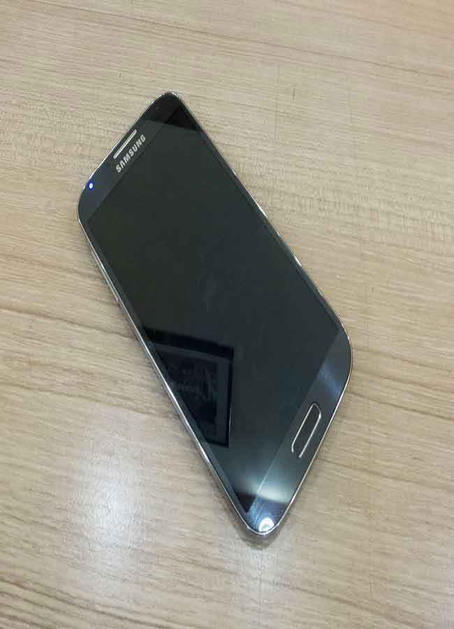
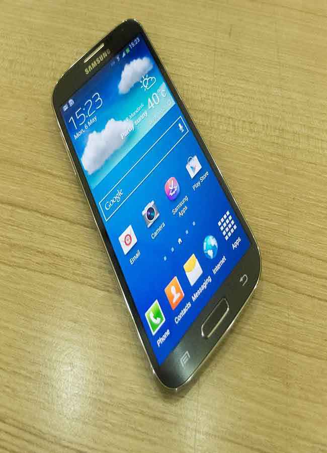
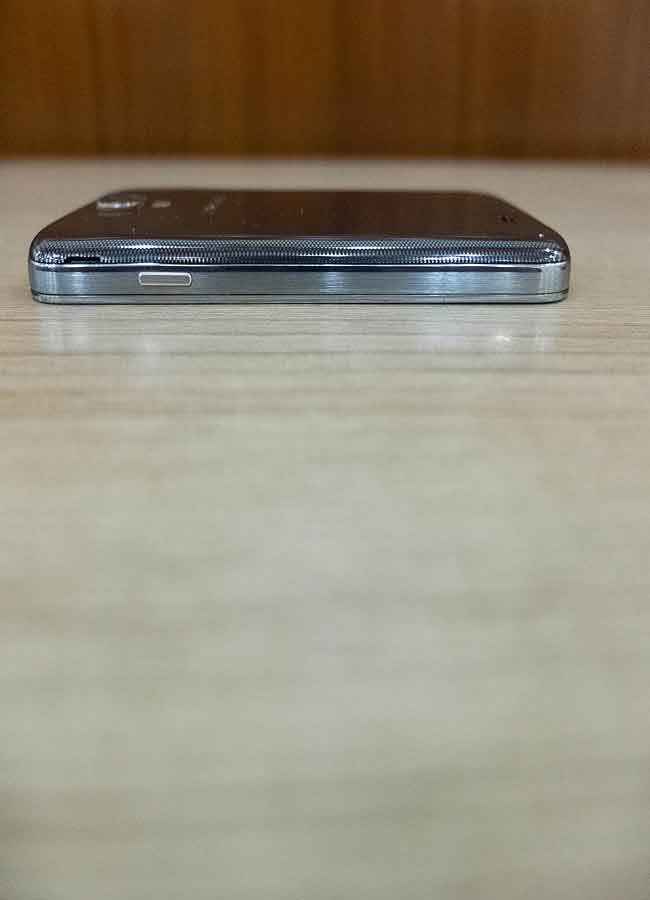
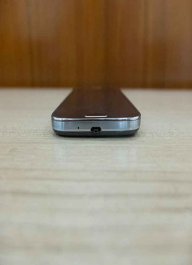
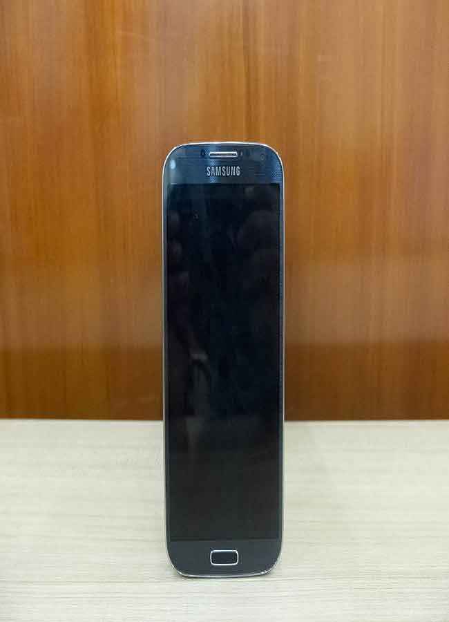
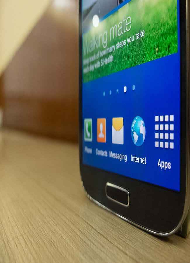
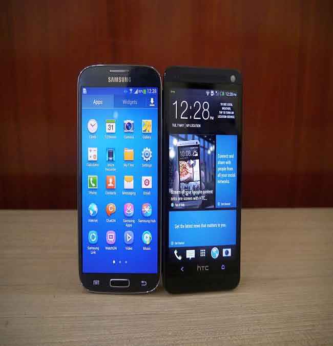
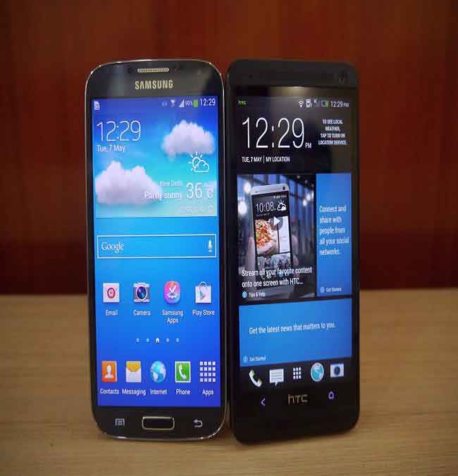
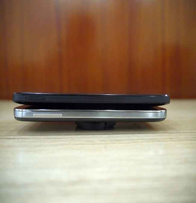
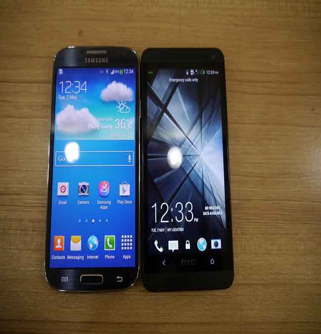
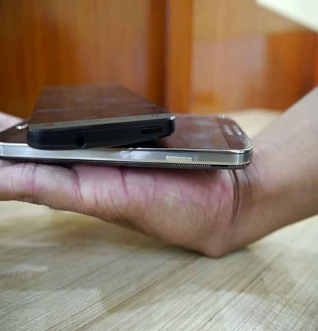
Let us take a look at the phone and the design elements. For starters, it is important to point out that the Galaxy S4 is slimmer and lighter than the Galaxy S III, despite packing in a bigger display and a more powerful power plant. This has been done by thinning the bezel on the left and right of the display. While it isn’t edge to edge glass like on the HTC One, the thinner bezel does look rather neat and gives the phone a modern look. Below the display are two touch sensitive keys and the physical key for home, task manager and the voice assistant. The right sides spine has the power key, while the left spine has the volume rocker. The charging port has been placed at the bottom, as against some phones which have it on the side, and the 3.5mm headphone jack sits on the top. There is a silver band framing the S4, and is coloured to look like metal. But, it is plastic!
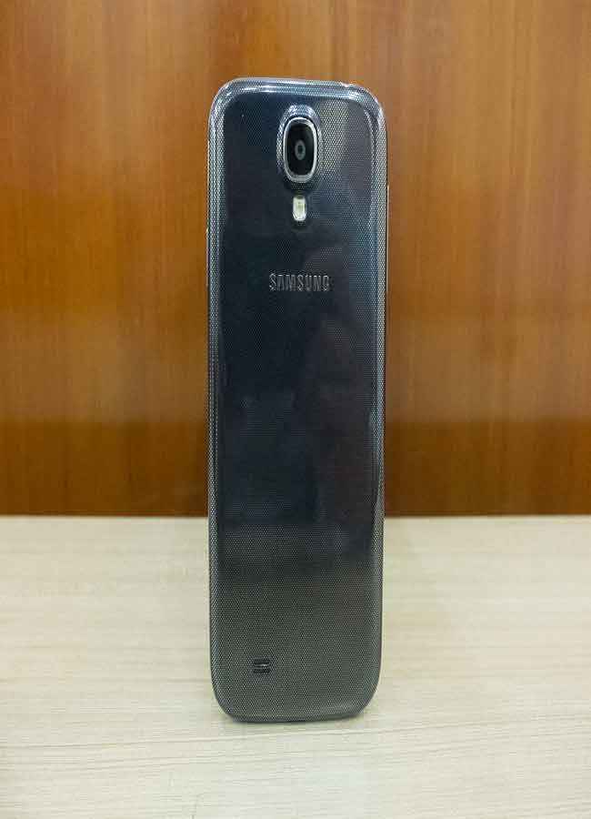
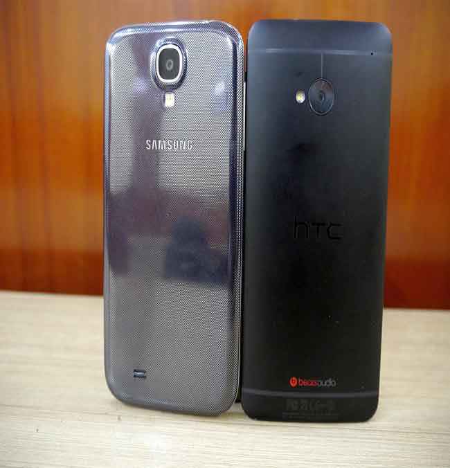
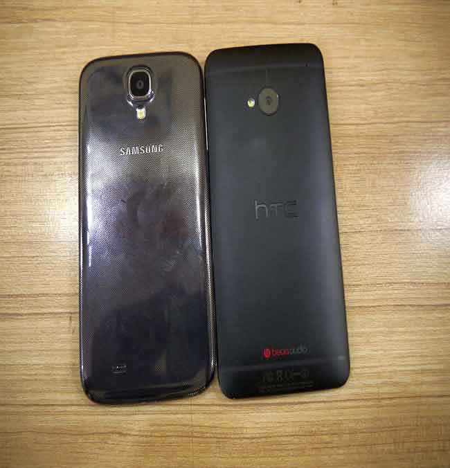
Flip the Galaxy S4 over, and you get the imprint finish on the dark colour finish, that Samsung calls Black Mist. The camera sits towards the top, and we quite like the placement because it doesn’t get in the way of the fingers when holding the phone in landscape mode, ready to click a picture. The Sony Xperia Z, for one, had this problem. However, the camera isn’t totally flush with the rest of the chassis, which could mean the scare of scratching it if you slide it on a table is very much there.
 |
 |
 |
 |
 |
 |
 |
 |
 |
.jpg) |
 |
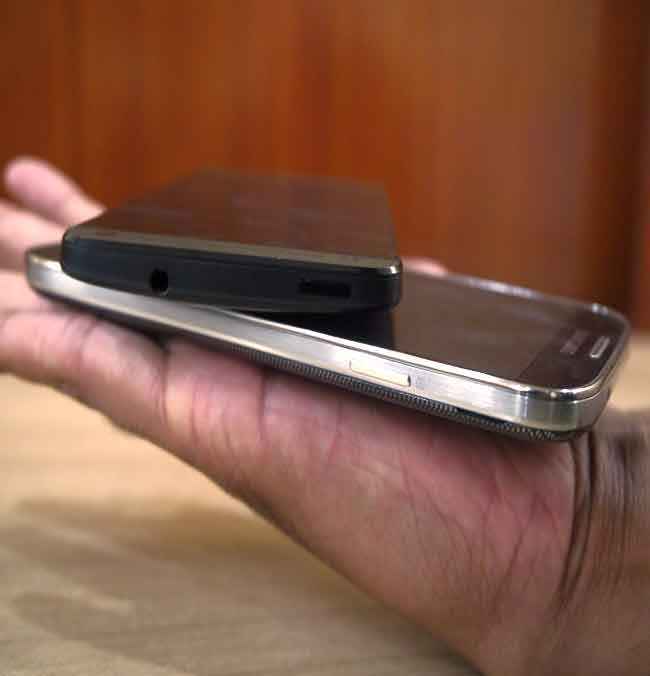 |
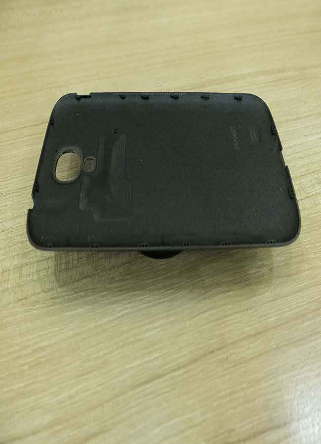
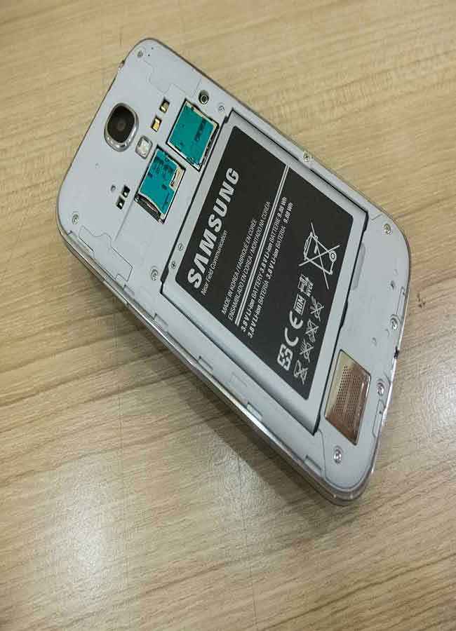
Samsung says that the plastic used on this phone is stronger than the one we saw on the Galaxy S III. The design isn’t unibody, and while some may scoff at that, there are the positives of this design. The biggest being that you can access the battery pack, and that is a real bonus when the time comes to replace it with a new one. Imagine leaving your phone in a service center for a week just to get the battery replaced. The Galaxy S4 feels very light in the hand, lighter than the HTC One.
But, there are a couple of issues with the Galaxy S4. While it is slimmer and lighter than the HTC One, the S4 does tend to slip around in the hand a tad too much for comfort. The slippery back is something you will have to be very careful of, particularly with moist or sweaty hands.
The HTC One does have a lot going for it in the build quality department, and as with most things, there are some aspects that aren’t. We start with the slightly negative aspect first. The One is slightly taller, slightly thicker and only slightly less wide than the Galaxy S4. Do remember that the One has a 4.7-inch display, while the S4 has a 5-inch display. But, the edge to edge glass at the HTC One’s front gives it a very premium feel. The volume rocker on the One is a tad too depressed, with the idea being to keep it flush with the spine as much as possible. It does sacrifice a bit of usability comfort though. If you like exquisitely made stuff, the HTC One is surely a phone that will appeal to you. The clean design with straight lines and the slab look works well for the wider demographic. No playing around with curves or angles in an attempt to look different, and HTC has pretty much let simplicity do the work. The only necessary curve is on the back, to allow for better nestling of the phone in the hand. While this doesn’t have any special matte finish to help with the grip, the One does not slip around as much in the hand as the Galaxy S4.
In the end, it is pretty much down to personal choice. If the plastic makes you crinkle your nose in sheer disgust (yes, a lot of people do that, apparently), then the Galaxy S4 really isn’t for you. The HTC One has universal appeal, since it isn’t really alienating any bit of the demographic. Having said that, the general perception that plastic is cheap isn’t really true. And don’t let that misnomer make you discount a phone that is actually very good once you start using it.
Specifications
While they play in the same price band, and offer largely similar performance, the specs of these two phones are very different. To give you an idea of which phone offers what, we have a table giving you a quick glance at the hardware.
|
Model
|
Samsung Galaxy S4
|
HTC One
|
|
Power Package
|
|
|
|
Processor
|
Exynos 5 Octa 5410
|
Qualcomm Snapdragon 600 (APQ8064T)
|
|
Clock Speed
|
1.6GHz & 1.2 GHz
|
1.7GHz
|
|
Cores
|
Quad-core & quad-core
|
Quad core
|
|
RAM
|
2GB
|
2GB
|
|
Graphics
|
PowerVR SGX 544MP3
|
Adreno 320
|
|
Display
|
|
|
|
Size
|
5-inch
|
4.7-inch
|
|
Type
|
Super AMOLED
|
Super LCD3
|
|
Resolution
|
1920 x 1080 pixels
|
1920 X 1080 pixels
|
|
Storage
|
|
|
|
Built-in Storage
|
16GB
|
32GB
|
|
Expandable (Y/N)
|
Y
|
N
|
|
Camera
|
|
|
|
Megapixels
|
13MP
|
4MP UltraPixel
|
|
Battery
|
|
|
|
Capacity
|
2600 mAh
|
2300 mAh
|
Benchmarks Compared
The hardware on both phones is very different. From the spec sheet comparison earlier in this article, it would be clear that the Samsung Galaxy S4 has the advantage if you are looking at sheer processor specs – GHz and number of cores. However, we wouldn’t assume till we actually scientifically compare the two – with proper numbers. This is where the synthetic benchmarks come in. To not let any device have an unfair advantage, we ran each benchmark test three times, and logged the best score among all three.
 |
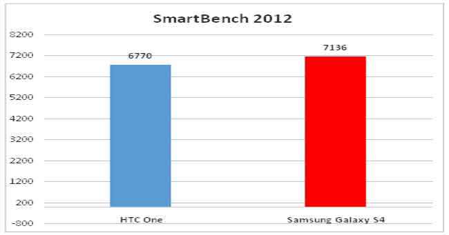 |
These three benchmarks are testing the raw power that the phone packs in. In the Quadrant test, the difference isn’t much, but the Galaxy S4 has a clear lead. That extends further in the AnTuTu benchmark test. Smartbench 2012 pretty much verifies that the Galaxy S4 has the clear lead in terms of raw system performance. Not too surprising, considering Samsung has been very confident that the octa-core Exynos is not only up to the job, but will be unmatched. That confidence has been verified in the affirmative here.
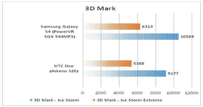
With one aspect verified, it was up to the gaming performance. The Galaxy S4 has the PowerVR SGX 544MP3 chip, while the HTC One has the undeniably powerful Adreno 320.
 |
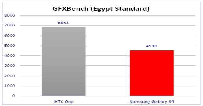 |
In the two 3D Mark tests, the Galaxy S4 leads by a slender margin, but a lead is a lead nevertheless. The Ice Storm test is the basic graphics test, while the Extreme version is the more stressful one that even crashes on a lot of high end smartphones. The performance scores thrown up by 3D Mark cannot really be doubted. Yet, we have the GFXBench test to verify those numbers, and the Galaxy S4 is undisputedly the better performer.
Real World Usage
Benchmark tests only give one side of the story. We used both phones as primary phones, and both have their positives and negatives. Quite frankly, in a real world usage scenario, it is too close to call between the two. The app opening times, the smoothness of the UI and both phones handle the exact same application load with the same dash of smoothness. Quite expected that, considering we are dealing with quad-core and octa-core architectures here, but one thing is very clear – you will hardly see any real performance boost on the octa-core in a typical smartphone usage scenario as you go about doing your work daily. Neither of the phones will feel inferior or superior over the other, visibly so. Hence, benchmark tests are good to compare with numbers, but don’t let them be the sole decision making factor before you splash the cash.
User Interface
The BlinkFeed UI is something that has just come along on HTC phones (well, the One is the first – the likes of the Butterfly and the One X will get this soon), while Samsung has been tweaking TouchWiz for quite some while now. The current version of TouchWiz retains the familiarity aspect of the previous versions, very useful for someone who may be upgrading to the Galaxy S4 from a Galaxy S III or the first generation Note. The traditional multiple home screens, the ability to add and remove widgets – the works. BlinkFeed does seem like a new toy, because it is well…new! And it takes some getting used to. First up, the news feed remains the default home screen. That cannot be changed. The number of home screens that you can have are also limited. The UI has been modified considerably, at least visually, on the HTC One. Not necessarily better in terms of appeal, but definitely slicker and more matter to fact.
The S4’s TouchWiz UI is the traditional Android skin you would come to expect, while the One’s BlinkFeed is something that is very different. Both are fairly flexible to customization and very much usable.
Display
The Galaxy S4 has a 5-inch display with a full HD resolution. This is pretty much in line with the likes of the HTC One and the Sony Xperia Z that are rocking the Android ecosystem at the moment. Samsung carries on with the AMOLED family of displays, and that also includes keeping faith with the PenTile display type that the S III got a lot of flak for. Super AMOLED has unique advantages over the S-LCD family of display the HTC One uses, with lower battery consumption being one. For starters, we really like the crispness of the text and the readability comfort on the Galaxy S4’s display. On the web browser, there are times when you don’t need to zoom the text at all, because it very much readable despite the small font size replicated on the phone’s display. The fact that both displays are playing in the >400PPi category means any minor difference between the two, if at all, isn’t visible to the eye.
At first, the colour richness is much better on the S4’s AMOLED display. Some call the extra rich colours as unnatural, but for most consumers comparing the devices on the shop floor, that is actually something that is attractive. Multimedia playback experience is enhanced because of that, at most times, because of that. However, like with televisions, colour settings are preferences are largely personal.
 |
 |
 |
 |
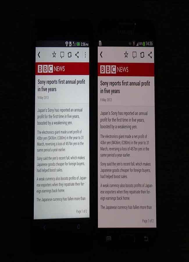 |
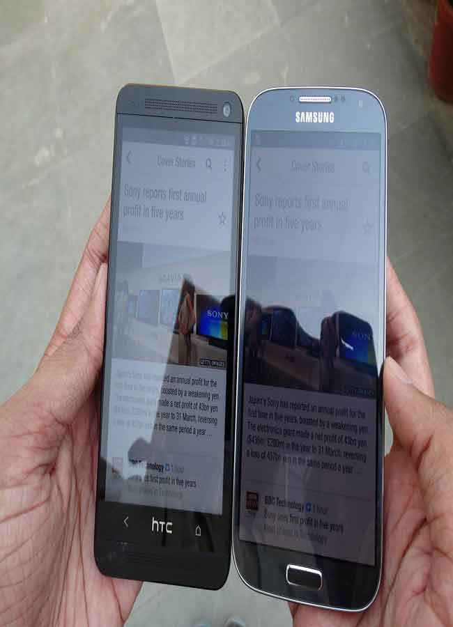
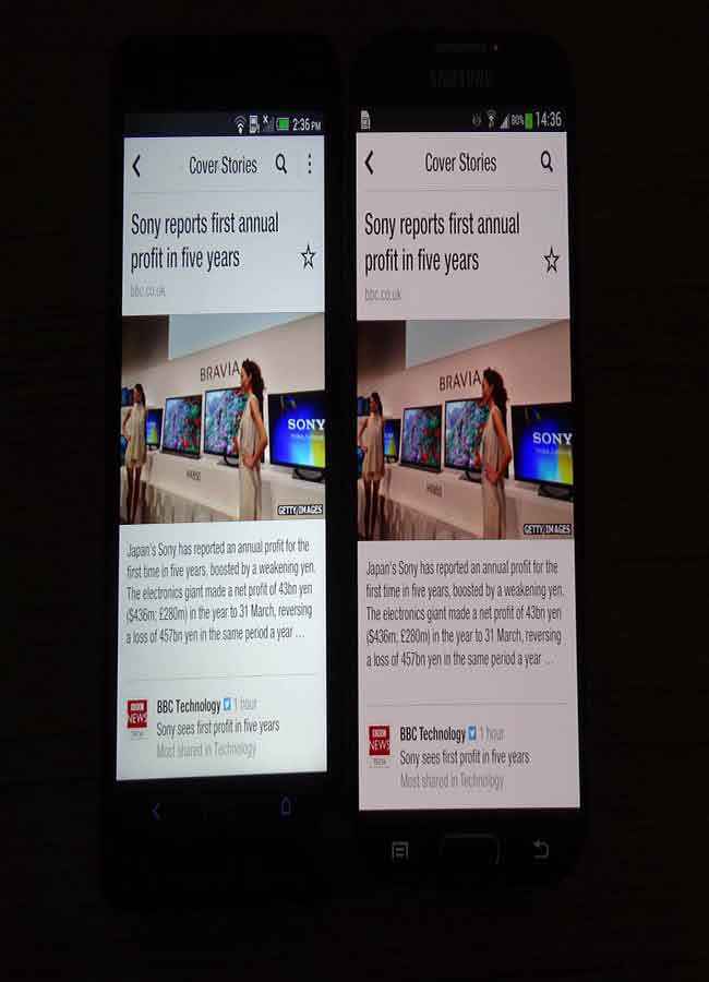
However, compared side by side, it is very clear that the HTC One has better white colour reproduction, which in turn helps most other colours look better. The blueish tinge on the S4’s AMOLED display is the primary reason for this – most visible when you are reading something with a white background, like on the web browser or an app like Flipboard. On the Galaxy S4, you do get certain display color and contrast tweaks, something that not a lot of phones offer. No matter which setting we selected, including the default Adapt Display setting that automatically handles the mode switching, the whites and certain colours still look better on the HTC One.
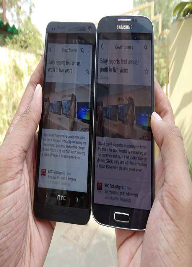
Viewing angles are slightly better on the Galaxy S4. Outdoors, the HTC One has a clear advantage in terms of overall visibility. We compared at 50% brightness and with auto brightness, and the S4 does have a disadvantage in two respects. First is the slightly reflective glass, which the HTC One has smoothly done away with for a large part. The second, at the same brightness intervals, the HTC One’s display is slightly brighter than the S4. While it is not a major shortcoming at all, it is just enough to make an S4 owner feel a tad sad when the friend shows off the HTC One!
All in all, for most users, the display quality is at par, considering they will be using either device as, well, a phone! The Galaxy S4 with the 5-inch display offers that much more real estate for a more spaced out on-screen UI. For the pedantic ones amongst us, the HTC One is a slightly better bet, because the colours are more accurate.
On-screen keyboard
The on-screen keyboard on the Galaxy S4 is a big disappointment. While the key size has been retained from the Galaxy S III, the number keys have been added to the top. However, the bigger screen on the S4 does mean that the keys are a tad too spaced out, which in turn gives the feeling that the individual keys are a tad too small. There is a bit too much spacing between the keys, something that could have been utilized better. While keyboard comfort is something very subjective and personal, I personally did find that the Galaxy S4’s keyboard did take a lot of getting used to, and somehow the fingers never really got used to the overdose of spacing between each.
The HTC One, on the other hand, takes the opposite path. There is no spacing between each key, but each key is big enough that you type comfortably without tapping the neighboring key by mistake.
Call Quality
We tested both the phones on the same 3G operator. The call quality, in normal cases, was at par in both phones. However, the Galaxy S4 held a little more signal amount than the HTC One and even the iPhone 5, at the same time and place. These are small aspects that may make a lot of difference in the long run.
The earpiece quality on the iPhone 5 and the HTC One is at par in terms of loudness and yet remains very soft on the ear, even at 90% or 1005 volume. The Galaxy S4’s earpiece does tend to catch a lot more ambient noise at other end. While the earpiece is sufficiently loud, it is slightly on the harsher side in terms of vocals, very slightly at 90% volume. These are minor aspects, but things which someone spending a lot of money would appreciate information about.
Battery Life
The 2600mAh battery that has been packed into the Galaxy S4 does do a very good job. First up, with all the features like Smart Stay / Smart Scroll active, brightness in Auto Mode and used as a primary phone with about an hour of voice calls in total and 3G connected throughout syncing stuff, this will easily last from 8am at 100% to 9:30pm at 15%. Turn off the Smart Stay and Scroll feature, which keeps the front camera active, and the 100% at 8am becomes 25% at 9:30pm, with all other things remaining constant. Take the brightness off the auto mode and keep it at 20%-30% for indoor use, and you could be getting through to evening tea time the next day on a single charge.
Features
Samsung has packed in the Galaxy S4 with a whole lot of features. There is no doubt that the sheer volume of them will confuse you! And we aren’t sure how many of those will actually be utilized on a regular basis. But, at least you have the show-off value! We will now talk about some features that we feel you should use quite often.
Multi-Window: This is one of the neatest multi-tasking features that we had seen at the time the Galaxy SIII arrived in the market. Samsung has tweaked that further, and for the better. You now have the ability to resize the two windows within the same screen, allowing you to give more real estate to one or the other on the fly. More apps are added to this, which is good. Do check our video to see how the Multi-window feature works, and a little trick is in there as well!
Quick Glance: This is one feature for the early morning, when you are literally squinting to see what is on the phone’s screen. Now, no effort needed to even turn on the display. All you need to do is hover the finger above the sensor that sits to the left of the earpiece (assuming you are looking at the phone, head on) and the display turns on to give you the important information – date, time and notifications for missed calls, messages and mails. There are times when the sensor does not seamlessly detect your finger, but when this feature does work, we feel it is a rather neat one to have. Do check out the video to see how Quick Glance works.
Smart Stay: Okay, so you use the phone to play back a lot of videos. And it is imperative that the world will not let you watch the video in peace. This feature ensures that every time you look away from the phone, the video pauses. Very neat, and it works seamlessly every time. Very useful, and one of those features that you will appreciate as you use the phone more and more.
Smart Scroll: This is one of those features that would do well when you show them off to your friends, the ones who don’t own a Galaxy S4, and specifically the ones who own a HTC One or an Apple iPhone. Smart Scroll works when the sensor detects you are looking at the screen, mentioned in that little notification that pops up at regular intervals. The head up and head down motion controls the page scroll. It works well, but we aren’t sure how often you would want to exercise those neck muscles. This will work only of you are sitting up straight, and kept the phone at the typical book reading distance from the face. Will not work lying down.
Air View: This is a feature that we wish all phones had. First seen on the Galaxy Note II, and worked with the stylus. Now, Samsung has deployed this feature in the Galaxy S4, and your finger is the stylus. Position the finger just above the display, without actually touching it, and a summary of that item opens up as a pop up, and disappears the moment you move the finger. Works brilliantly if you have a lot of mails or messages to sift through to get to that particular one. We saw this feature work brilliantly in mails (though not in the Gmail app), Gallery folders, calendars and messages. We have a detailed video that shows you how this feature works, and how well it works.
Speaking of gestures while we are, we must say that the Air Gesture feature just did not work for us. They are supposed to assist in various scenarios, flipping through gallery images being one. No matter what, these gestures did not work for us at all. While the Quick Glance feature is working perfectly fine means we weren’t doing anything wrong. Maybe, a bit of refinement is needed.
Camera Features: Not to be outdone by HTC’s UltraPixel camera with features like Zoe, Samsung did pack in a lot of goodies into the 13MP snapper the S4 comes with. The dual shot mode activates the front and rear camera, both while you are taking a shot. The image from the front camera – most likely of the person taking the shot – will sit as a stamp on the picture. Neat idea, and implemented well, giving you full control over where the stamp can be placed on the picture. But, how often it can be used is something we are yet to figure out. One rare shot on a vacation where the entire family poses for the camera, and the one clicking doesn’t feel left out!There are a lot of other features that we have talked about in the video. Do check that out.
Samsung Hub: From the separate Hubs earlier, Samsung has integrated all the Hubs into one. Good idea, simply for easy accessibility. Usability remains the same, pretty much. We have a video that explains how the Hub works, and even downloaded some content for consumption on the device.
Camera Performance
The logic put forwards by certain brilliant minds is that a higher megapixel number means it is a better camera, comparatively. However, that isn’t always actually true in real life, and the pictures they click. This neatly brings us to the point of the 13MP camera on the Galaxy S4 and the 4MP UltraPixel camera on the HTC One. To compare between the two, we took a series of shots in various scenarios to see where the two stand.
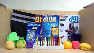
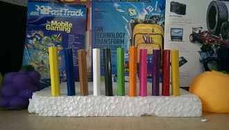
First up, we have a series of shots taken in what is known in the circles as a test scene. The shots have been taken in good light and low light, with a full shot and a close up taken in both lighting conditions. To give you a more like for like comparison with the 4MP clicker on the HTC One, we have also taken shots at 6MP from the Galaxy S4 camera.
 HTC One (4MP) |
-small.jpg) Galaxy S4 (6MP) |
-small.jpg) Galaxy S4 (13MP) |
From these shots taken in good light indoors (seen above), we feel that the Galaxy S4 has a distinct advantage over the HTC One’s snapper. The S4’s images are richer in terms of colour and have considerably more detailing. The images taken by the One’s camera in comparison feels a tad soft and the contrast isn’t very good as well. Both cameras do very well with clarity, something you can see when you zoom in on the “Can Technology Transform Education” text. In case of the Galaxy S4, the 13MP shot is at par with the 4MP camera on the One, but the 6MP shot is significantly inferior.
 HTC One |
 HTC One Close-up |
-small.jpg) Galaxy S4 (6MP) |
-small.jpg) Galaxy S4 (6MP) Close-up |
-small.jpg) Galaxy S4 (13MP) |
-small.jpg) Galaxy S4 (13MP) Close-up |
In low light shots (seen above), the HTC One is much better throughout, be it the full test scene or a close up on that. Clearly, the One’s shot is brighter, and also much cleaner for the most part. Zooming on the test big again is an example of that. The close up of the colourful pencils is another example that proves that the One’s image, while not perfect, is still far superior to that of the Galaxy S4.
 HTC One |
 Galaxy S4 (6MP) |
 Galaxy S4 (13MP) |
Staying indoors, we have taken a shot (seen above) of a frame that holds within it a map. The idea is to compare the crispness and detailing, both as they are, and when zoomed in. Initially, The Galaxy S4’s 13MP and 6MP images looks crisper and richer than the HTC One. But, the slightest of zooming shows a changing scenario – the One’s image remains a lot cleaner throughout, whereas noise creeps into both the S4 images.
 HTC One |
-small.jpg) Galaxy S4 (6MP) |
-small.jpg) Galaxy S4 (13MP) |
The Galaxy S4 has a distinct advantage over the HTC One’s camera in good lighting conditions, irrespective of whether you compare the 13MP image or the 6MP image. Detailing on the S4’s shots (seen above) is much better, particularly if you look closer to the top of the big tree near where the trucks stand. On the extreme right of the image, the partially captured tree is much better captured by the Galaxy S4, and looks clearly blurred on the One’s picture.
 HTC One |
-small.jpg) Galaxy S4 (6MP) |
-small.jpg) Galaxy S4 (13MP) |
This again takes the entire comparison in the favour of the HTC One’s camera, because when we compare the shots of the flower and the plant (seen above), the One’s picture has better colour and more detailing. Focus on the flower, and the S4’s shots bring in some bit of noise, while it remains much cleaner on the One.
All in all, we feel that the HTC One’s camera is a step above the clicker on the Galaxy S4, in most conditions.
Bottom Line
Samsung has been much derided for still persisting with plastic for the Galaxy S4. Particularly when HTC laid its cards on the table with that gorgeous One, all dressed in the aluminum. However, it is important to keep in mind that with the same plastic finish, the Galaxy S III sold like crazy. For anyone who wishes to buy one of these two phones, it will eventually come down to which one you like better. Or the sense of familiarity, in case you are upgrading from an existing Samsung or HTC phone. The performance of both phones is very good, and absolutely neck and neck.
