Samsung Galaxy S III Review
Ladies and gentlemen, this is undoubtedly the most powerful Android smartphone at the moment. And it doesn’t look like anyone is taking that crown away from the Galaxy S III in a hurry. We have to vehemently defend Samsung against all the criticisms regarding the Pentile display and the so-called plasticky build quality. In both cases, the final product is absolutely brilliant, and totally worth the effort.
Design & Build
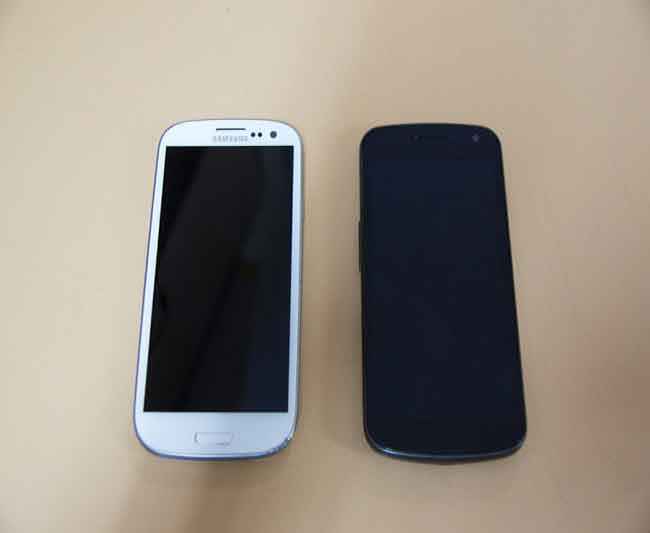
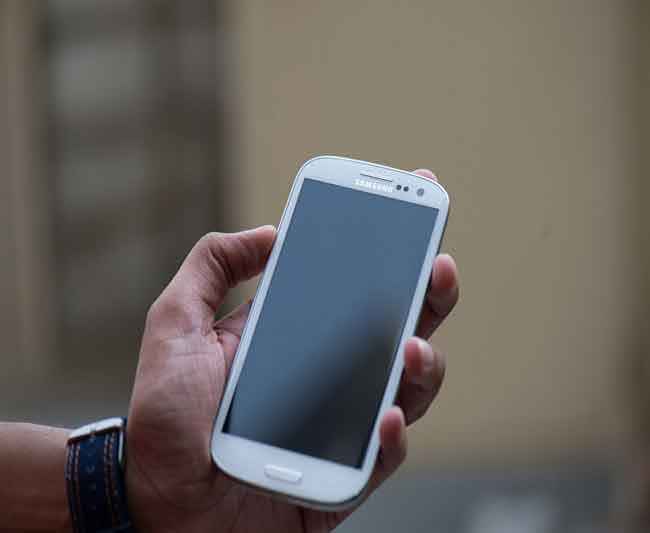
People have criticized Samsung quite a bit and called the Galaxy S III plasticky. We don’t think so! The build quality has a classy feel to it. Allow us to explain. The 4.8-inch display is flanked by a very thin bezel, which inevitably helps keep the form factor within control, and that is critical considering this genre borders on the very thin line separating usable and ungainly.
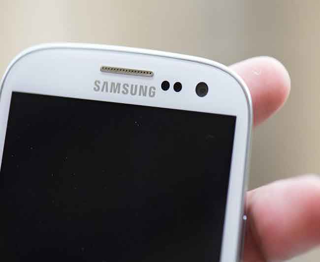
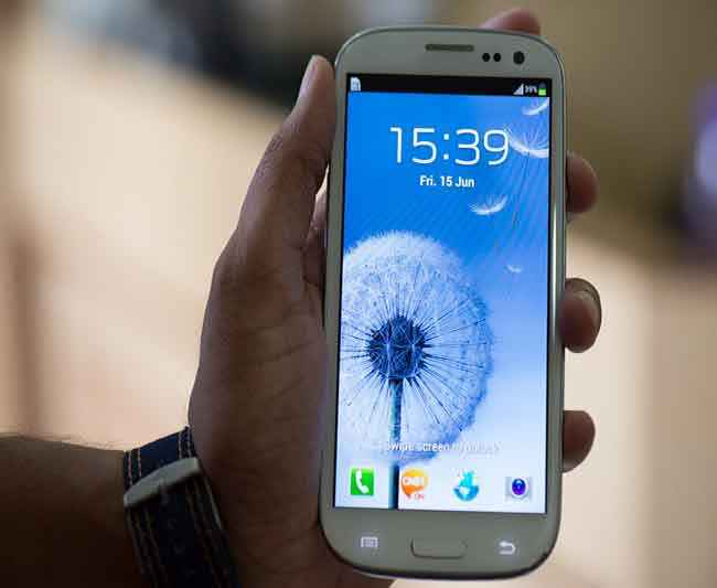
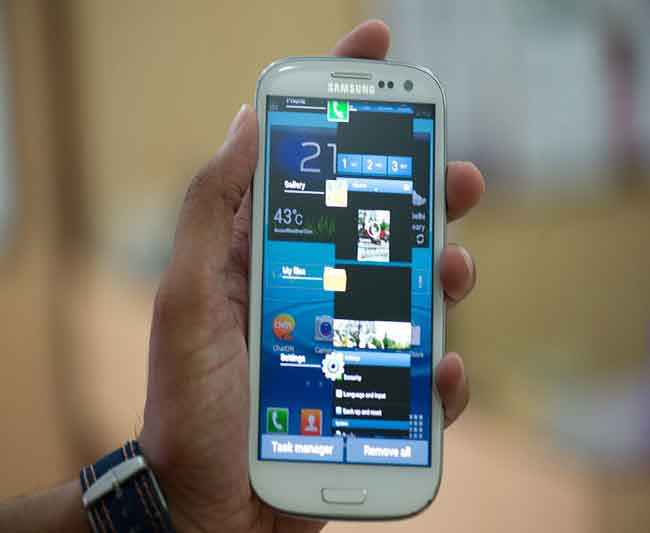
There are two touch sensitive keys below the display – options and return, with the Home key being the hardware one. This one doubles up as the S-Voice and the ICS task manager key. The minimalistic design speaks loudly, so much so that when not backlit, the touch sensitive keys do not give you any indication of their presence. Above the display are what essentially looks like three tiny circles – LED notification, proximity sensor and the front facing camera. The earpiece has a silver finish to it, and a very thin border treatment to the home key as well.
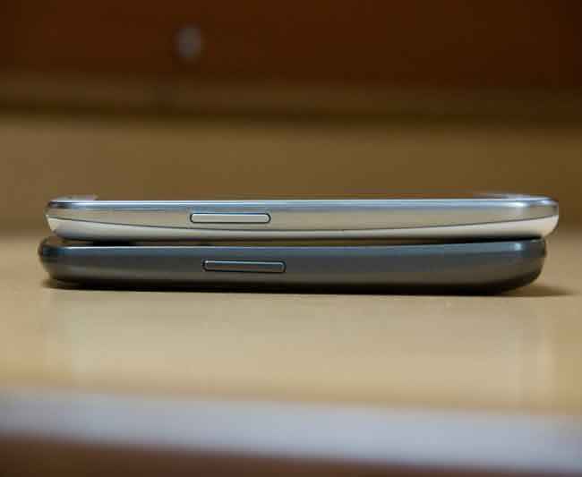
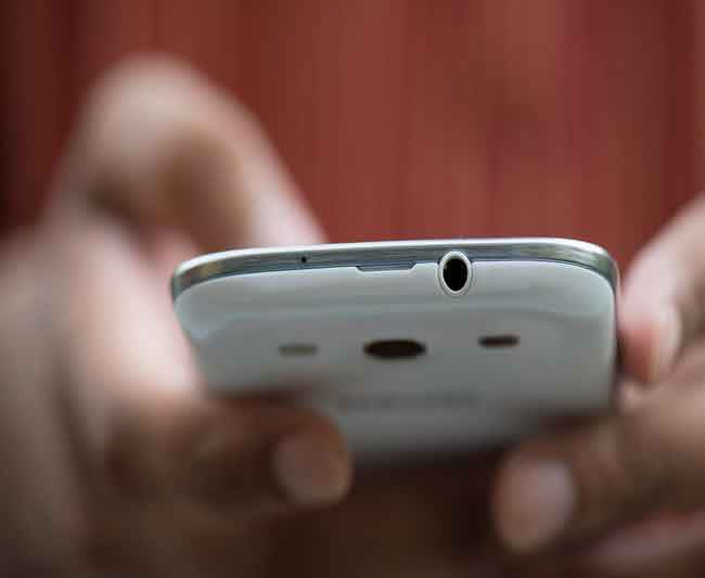
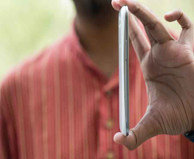
On the right spine is the power key, which has become a Samsung trademark! No hardware camera key, and that is sorely missed – we will get on to that a bit later. On the left spine is the volume rocker. On the top is the 3.5mm jack and on the bottom is the micro USB port. The fake aluminum frame around the phone isn’t appreciated though. That just shows disrespect to the buyer, by faking stuff. Anyone buying this phone already has made his / her peace with the plastic build, and this isn’t going to be fun to discuss at the next drinks party with friends!
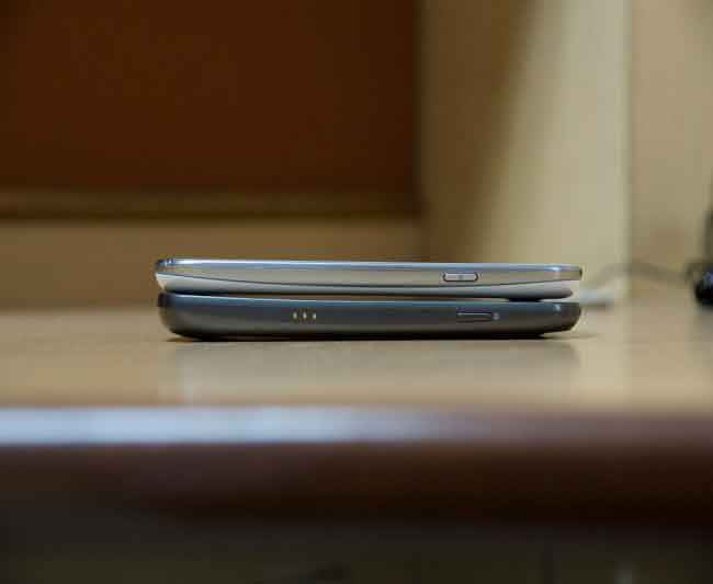
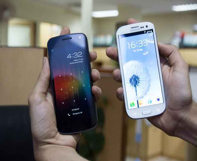
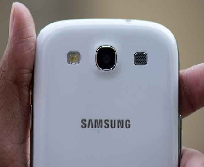
Flip the phone over, and the enamel white finish immediately makes us compare it to the looks of the HTC One X (read our review). The Galaxy S III and the One X both have the polycarbonate finish, but the S III’s enamel finish has a bit more shine to it. In turn, that makes fingerprints quite visible, and will be prone to scratches from car keys, for example, when in the same pocket. The One X has a matte finish, and for anyone who isn’t using a protective cover or skin on the device, the One X will probably remain happier, and unblemished longer!
The Galaxy S III has more understated looks, while the One X has a slightly more aggressive tone. In both cases, the build quality is very good, with the polycarbonate present in both phones. Critical to mention that we do not agree with the so-called plasticky build quality criticisms the S III has faced all along. We had read all those criticisms, but didn’t let that have a bearing on our judgment when we first saw the Galaxy S III.
Even in the first impression story after the launch event, we had praised the build quality of the S III. Now that the review unit is here, all those who doubted my initial opinion are now becoming fans as well, having experienced the phone! The simple fact remains, just because the iPhone is aluminum doesn’t mean everyone will go the same way. If that were to be true, maybe the HTC One X should have received the same amount of criticism.

Visit page two to read about the Galaxy S III's features and specifications…
Features & Specifications
On the spec sheet, the Samsung Galaxy SII comes across as an extremely loaded device. The specs look something like this – Exynos 4212 Quad Core processor clocking at 1.4GHz, 1GHz RAM, the Mali-400MP graphics and 16GB internal storage with a microSD slot for up to 64GB more. One look at the spec sheet, and you know that it matches the HTC One X for the most part, and then just takes it a notch further with the graphics bit.
The 4.8-inch display is 1280 x 720 pixel resolution, and is the Super AMOLED with the Gorilla Glass 2 treatment. Samsung has faced a lot of flack for the Pentile display, but the results in reality don’t have any negative impact on the package. We will explain that in detail in the performance section.
|
Absolutely brilliant display: All the "it is a Pentile display" nonsense doesn't matter
|
Android ICS version loaded on this phone is the 4.0.4 version. While it doesn’t look very different, you can easily make out that a lot of work has gone into the TouchWiz UI. It is not only more functional, particularly with the more workable widgets on ICS, but seems to have been optimized immensely to work well between the hardware and the software. This is one grudge that we hold against HTC and the One X. Sense as a visual element is possibly the most visually UI, but beyond that, it does more harm than good. With TouchWiz, there are a bunch of improvements that are aimed at the “one touch” solution. Slide down the notification bar, and you find a bunch of quick toggles, which can be swiped left and right within the dropdown. The tiny settings icon takes you to the whole settings menu.
Press the volume rocker, and you get the neatly laid out volume sliders for the call volume, speaker volume and the notifications. The lock screen is possibly the most interesting bit – turn on the display, swipe anywhere on the display, and it unlocks. Not without the ripple effect on the display and the water sound, telling you about it’s nature based inspiration every single time! After a while, you may just want to turn the sound off! I think it is safe to say that with the TouchWiz, we don’t feel the need to rush to the Play Store and download an alternative home UI. Running across the base of all the home screens is a set of 4 application shortcuts. Fully customizable, but that cannot be said for the four shortcuts on the lock screen – call, ChatOn, browser and camera.
The pop-up play feature lets you multitask while playing back a video on the phone. This is true for all videos that may be on the local storage, and even network storage accessed via the gallery. Once the video starts playing, tap the Pop-up icon, and the video window converts into a small popup and sits in one corner of the display, with the previous screen visible in the background. You can then slide the video pop-up around to place it wherever. Useful feature, and it works very smoothly. Not sure how many people will really use this feature regularly, beyond the initial “look ma, the multitasking on the S III is awesome” phase.
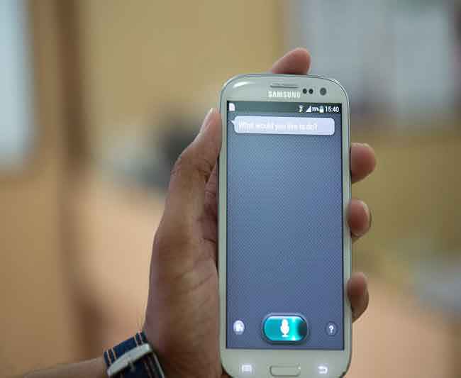
For the India-specific demographic, Siri on the iPhone doesn’t really work, unless you really have too much time and patience to make it understand the accent. Same issue plagues Samsung’s response to Siri – the S-Voice app. To access S-voice, you need to double tap the home key. Now, either tap the mic, and start talking, or say “Hi Galaxy” to wake it up. It is all fair and good to have this feature to act as a sandbag against the boasting of the iPhone 4S totters, but in reality, the current avatars don’t work. And S-Voice definitely doesn’t have Siri’s humour and wittiness.
Smart Stay, on the other hand, is something that works well. It is nothing revolutionary, but the functionality and comfort added to the usage pattern is immense. Essentially, when enabled, the front facing camera will track your eyes (in reality, it is the face as a whole) and keep the display on, irrespective of the time-out setting, as long as you are looking at it. We were testing this, and while the display stayed on as long as we were looking at it, it did dim after a while of no user input. This feature works well, and will be very useful if you are reading a long mail, or an interesting article in an app or the browser. Be aware though, that the battery life will take a bit of a hit, considering the front facing camera will be constantly active in the tracking function.
Another interesting feature is the Direct Dial motion feature. If you have a contact's details open on the display, just bring the phone close to the ear, and the Galaxy SIII will immediately dial the default contact number. For this to work, Motion Activation needs to be checked in the Motion menu in the settings.
Samsung users can sign in with their Dropbox accounts and claim 50GB free storage for 2 years. We take that as a bonus feature, because it will appeal only to a limited demographic. Others will either prefer to expand local storage, or choose to be limited by the 3G connectivity caps on tariff plans and the charges post the cap limit.
Visit page three to read about the Galaxy S III's performance, and our verdict…
Performance
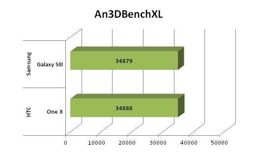
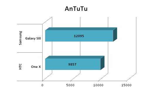
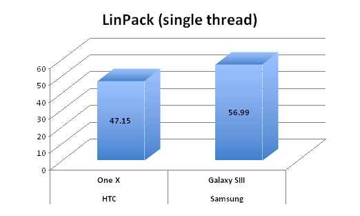
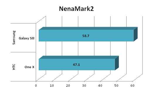
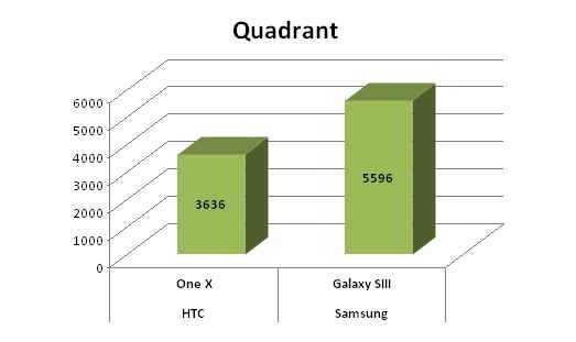
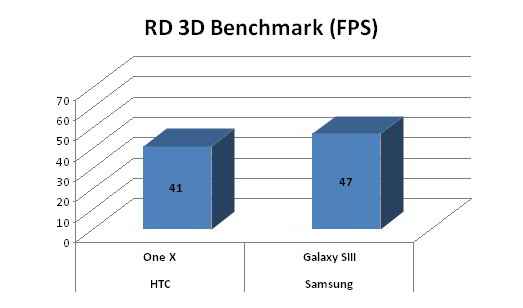
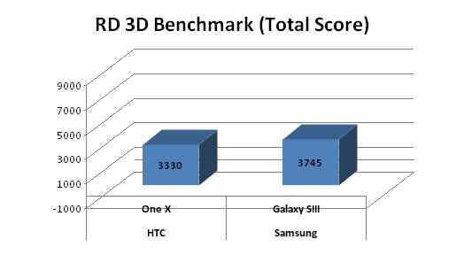
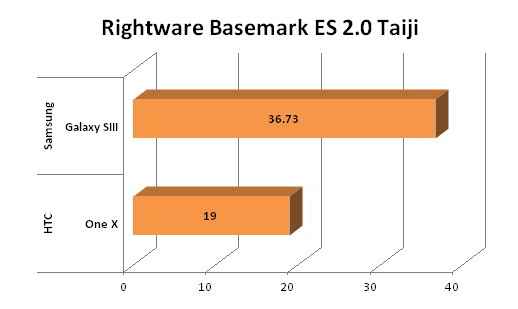
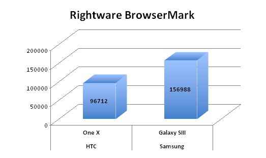
This is a monster, and there really is no simpler way of putting it. It blitzed the closest rival, the HTC One X (read our review), out of the water as if it was a couple of generations old hardware wise! We have a bunch of graphs here illustrating the performance between the Galaxy S III and the HTC One X.
As you can probably clearly make out from the below graphs, the Galaxy S III is beating the HTC One X hands down. Just to keep a completely stable platform, we had the same testing pattern for both phones. First off, we reset the phone to factory settings, just to clean up any preloaded apps and settings.
We connected to Wi-Fi and downloaded the benchmarks on the two devices. Then we turned off Wi-Fi, set screen time out to 10 minutes and ran the benchmarks one by one. No third party apps were running in the background to create uneven system load. The idea is to create an even platform to compare the performance of the two phones.
 |
 |
 |
 |
 |
 |
 |
 |
 |
 |
 |
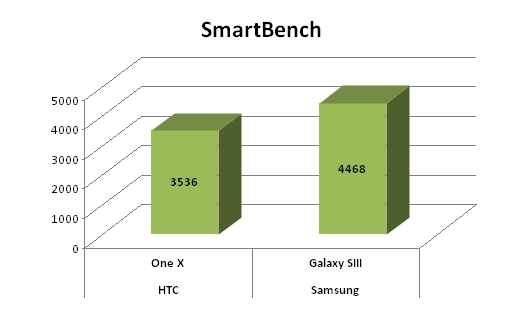 |
The Galaxy S III is powered by a 1.4GHz quad core processor and with 1GB of RAM. Compared to the HTC One X, which also has a quad core processor clocking at 1.5GHz on the Tegra 3 platform and same 1GB of RAM, the S III’s annihilation of the One X did surprise us quite a bit. After all, the hardware is a set of the most powerful ones in the smartphone world at the moment, and not very different from each other. Both phones have the issue of heating up when under a bit of load. For example, if you are browsing the web, the Galaxy SIII will heat up around the middle and lower portion of the rear panel. in both phones, the heating up is very clearly felt, particularly if you don't have a skin or cover wrapped around the phone.
The 4.8-inch Super AMOLED display is possibly one of the best we have seen on a smartphone. Enough has been said about the Pentile issue, but we have to say that Samsung has done a brilliant job with the final result. Compared head on with the One X’s Super IPS LCD2, there is literally no competition as far as colour vividness is concerned. Absolutely no gradation across all the test images we saw on this display. But the real impressive ingredient is the absolute crispness the text gets treated to. The biggest example of that is viewing a web page on the browser, without zooming in at first. You can still read the text, more so because there is no edge noise running a ring around every individual alphabet. Excellent brightness levels throughout, but that is at par with the One X, on the same brightness settings. In automatic brightness mode is a bit darker though. However, where the One X’s display has an advantage is with viewing angles and visibility in bright sunlight.
For a big screen phone, it is assumed that multimedia usage on the device will be more than on a smaller device, mostly because it is more comfortable to the viewing experience. For the Galaxy S III, the display holds it in good stead. Very satisfactory black levels, and even fast moving scenes are quite smooth. We have already raved about the very good crispness of the display, and that shows up with multimedia as well. If you are playing back a video from local storage, you can tweak the colour settings between normal, warm and cool. As if the AMOLED family display needed that!
The big-ish display size means this falls in the comfortable category of smartphones, for those who text and email a lot. Samsung has worked on making the on-screen keypad very slick, and that shows. Typing in portrait mode is precise, and you wont usually make spelling errors. With a similar display size, the One X’s on-screen keyboard seems to be a bit if a letdown. HTC has tried to put too much in one keypad, and that shows with the cluttered and slightly less comfortable look. Unfortunately, swipe to type kind of feature is missing. Having gotten used to that on the Sony Xperia S in rather quick time, I did miss that feature a bit more than most people would!
Irrespective of the lighting conditions, the excellent 8MP camera that takes very good shots. That does say a lot about the quality of the sensor on the S III, which keeps it at par with the HTC One X, image for image. Samsung has sent the S III along with the HDR mode, and that really shows. We have some test images, taken in normal mode and then with HDR activated. You can see the comparison images with HDR off and HDR on. The video quality is quite good as well, with quality befitting an HD res camera and no judder while panning, something that most cameras suffer with.
|
Impressive detailing and colour distinction
|
Outdoor shot – HDR on
|
Outdoor shot – HDR off
|
Impressive battery life from the 2,100 mAh battery, and honestly, better than what we expected from this quad core phone. Let us run through a day in the life of this phone. We fully charged it out of the box. Once it was at 100%, we unplugged it. Connected it to Wi-Fi and downloaded the benchmarks. We ran around 12 benchmarks on the phone, spanning around 2 hours in total. Post that, there were some voice calls. As expected with a new phone, a lot of time was spent watching videos – You Tube and local storage, showing off the brilliance of the display. Someone mentioned text crispness and the marathon of visiting various websites started.
There was the inevitable FB browsing, which led to a long chatting conversation on the FB Messenger. As under the primary phone usage scenario, this one ended up with 46% battery at the end of the day. Quite incredible, but then again not a surprise considering the Galaxy SII and the Galaxy Note offered very good battery life as well. It is a disappointment that the HTC One X only has a 1,800 mAh battery, and the One X would struggle to finish a day.
Bottomline
Not very recently did we crown the HTC One X as the most powerful Android smartphone around. The Samsung Galaxy S III has well and truly taken over that position. It is a bit on the pricier side, with the Samsung eStore selling it for Rs. 42,500, but is available for lesser on the likes of Flipkart.com and HomeShop18.com for Rs. 38,900, as of today. There is absolutely no doubt that the Galaxy S III comes at a premium. Equally, it offers excellent performance, a marvelous display (despite all the pentile nonsense being thrown around), a classy build (no, we don’t think it is as plasticky as people made it out to be) and something that most smartphones don’t offer – a very good battery life. If you have the money, this is the Android phone you should buy.
Do also check out our Digit Top 10 Android Smartphone list, for quick guide to the very best Android smartphones in India!
 |
 |
 |
 |





.jpg)


