Nokia 5.1 Plus Review : Definitely worth the money
The Nokia 5.1 Plus is an acceptable substitute for those who don’t want to spend those few extra thousands on the Nokia 6.1 Plus. It offers the right stuff: an above-average display, camera, performance, and battery life. It’s definitely worth the money.
Apart from those, there are two other keywords that captured my attention: Android One, which means you’re assured of major software updates for two years on Android’s stock, bloatware-free version, and USB Type-C, which means the progressive new connector is finally making it to more affordable models. USB Type-C has hitherto been the preserve of more expensive smartphones, you see. Let’s explore these keywords in this review.
Build and Design
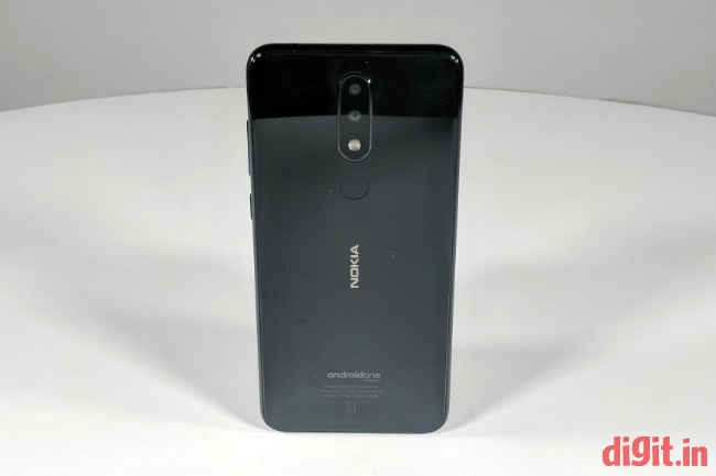
The Nokia 5.1 Plus sports a neat, glossy look in my opinion. It comes covered in 2.5D curved glass on both the front and the back. The corners are curved smoothly. At about 8 millimetres of thickness, the phone is quite slim to look at. On the back, the rear camera area is raised and does not sit flush with the rear surface but that’s all right because you can barely notice or feel the projection. A circular, borderless fingerprint scanner sits beneath the camera setup.
Lifting the Nokia 5.1 Plus is a bit of a slippery affair. Its glass back and smooth sides do little to offer sufficient grip and you’re often left pinching the sides of a resting phone to no avail. It’s the same story when holding the device in your hand. Changing hands and orientation is tricky as the phone threatens to slip unless held very tightly. I’d suggest getting a grippy case for this electronic slab of glass. It’s otherwise aesthetically pleasing enough to draw eyes towards it.
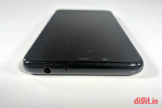
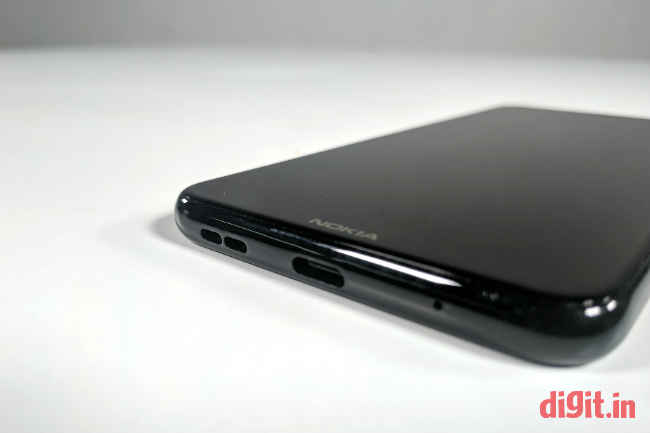
Let’s go around the sides of the phone. The top side contains a 3.5mm jack for headsets (bless Nokia) and a microphone hole. The left side is bare but for the SIM card tray. The right side bears a volume rocker and a power button beneath it. The bottom side has a speaker grille, a microphone hole, and—wait for it—a USB Type-C port. I was truly surprised to see a phone of this price sport USB-C. While it means investing in a new cable for some, it means another step taken in the direction of standardisation for the industry.
The buttons on the Nokia 5.1 Plus’ right side are easy to press and offer sufficient feedback. The rounded corners on the phone’s body ensure it’s always easy to hold and shift between fingers. The glassy front and back attract fingerprints and smudges like a powerful magnet and the phone demands constant Colin wipes to look tip-top. All things considered, the Nokia 5.1 Plus scores top marks in the build and design department, especially given its kind-hearted price tag.
Display and Audio
Much of the Nokia 5.1 Plus’ front face is eaten up by the 5.8-inch display that has an aspect ratio of 19:9 and a resolution of 720 x 1520 pixels. The display has rounded corners that match those of the phone’s body, giving the face of the phone a more pleasing look. A thick notch measuring over 50 percent of the display’s width sits on top of the display to house the front camera, ambient light and proximity sensors, and the earpiece. The notch seems particularly thick and wide when compared with that on the Nokia 6.1 Plus. It also leaves very little space for icons on the left and right. Personally, I detest the notch as it comes in the way of essential information and makes the phone look odd. I detest it all the more on this particular device because the software has no option to blacken the sides of the notch.
The HD+ display is capable of showing colours quite accurately; colours appear neither too light nor too saturated. At around 133 nits, screen brightness is sufficient for most indoor and outdoor spots. However, the surface of the screen can get very reflective in some angles. Touch sensitivity is good and almost every touch is registered at the first go. If anything, I think the resolution of display is a tad low. Even then, it doesn’t really show while watching 720p videos on YouTube. The + in the HD+ resolution takes care of that, I reckon.
Audio through the one-sided speaker is clear but not very loud. It’s loud enough to play that new song you’re really stuck with in a quiet, medium-size bedroom, but underwhelming when you want to show it to your colleagues in a noisy office space. There’s also ample opportunity to block the speaker grille with your finger when you’re holding the phone in landscape mode. The volume and clarity of sound offered by the earpiece during calls on a JIO network seemed to be plenty.
Performance
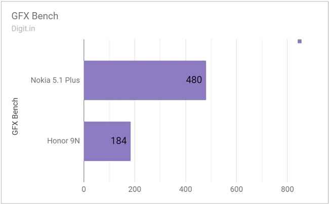
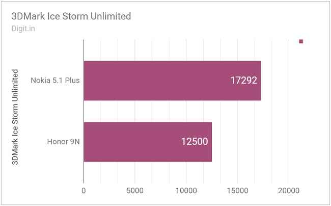
Unlike its more expensive brother, the Nokia 6.1 Plus, which uses a Qualcomm Snapdragon 636 chipset, the Nokia 5.1 Plus employs a MediaTek Helio P60 chipset. There’s 3GB of RAM and 32GB of internal storage for apps to play around with. Luckily, the Nokia supports expandable storage up to 400GB. Graphics is taken care of by a Mali-G72 MP3 GPU. On benchmark tests, the Nokia 5.1 Plus bagged scores very close to our ideal scores. For instance, it scored 1,18,884 on AnTuTu 7.0 and 17,292 on 3DMark’s Ice Storm Unlimited test. On paper, these numbers seem healthy enough, but how do they translate to everyday real-world performance?
Honor 9N is dearer by a few more thousands and runs a dated Kirin 659 chipset
I was able to switch between half a dozen applications without any trouble. Chrome handled over thirty-two tabs without any lag or stutter. It would, naturally, refresh the tabs that were visited less frequently. I was even able to switch between three games with minimal reloading. I’m happy to report that the phone showed no stutters in animation while switching between apps or playing games like Air Force: Joint Combat. However, processing itself wasn’t all that quick. For example, when opened, the items in the Settings screen would take time to populate the screen. While trying to search for items quickly, the keyboard would pop up a second later than expected. Apart from these tiny niggles, the Nokia 5.1 Plus performed pretty well for its price. The fingerprint scanner took less than half a second to authenticate and unlock the phone, which is good. Finding it on the back side was a little hard though, given there’s no tactile border around the scanner.
Space around notches is wasted
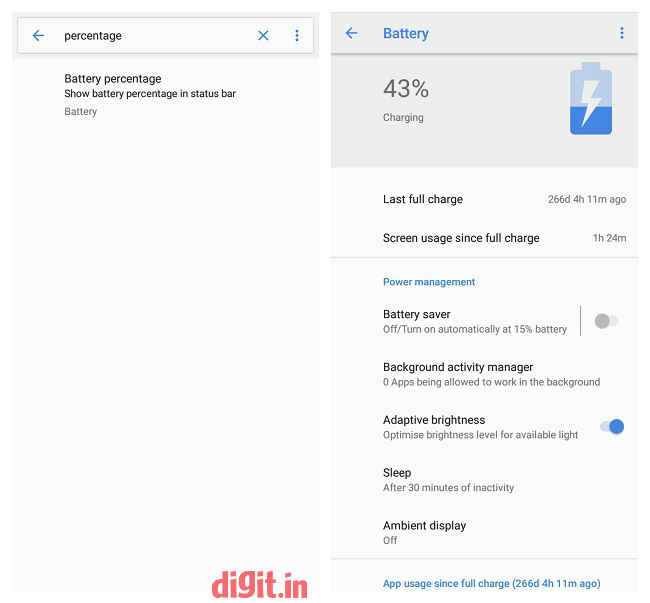
I sorely wish Nokia hadn’t implemented a notch design in the display, like every other phone maker out there because I could tell the rework to make the status bar look and function right was shabby. The display area on either side of the notch is wasted when the phone is used in landscape mode. This is particularly noticeable while watching YouTube videos and playing games. What’s more, I saw occasional glitches in the UI—instances where the navigation bar and status bar didn’t align properly in landscape mode. Also, the search function in Settings showed the option to display battery percentage in the status bar when in reality it was removed completely for the notch modification. In short, Nokia could’ve either done a better job of cleaning up or not given into the whole notch trend altogether. Personally, I’d have preferred the latter because I’m just not a fan of this abhorrent design modification on phones.
The stock Android UI was otherwise a pleasure to use. It came of free of bloatware that many other phone makers decide to include in the phone. The Nokia 5.1 Plus updated to the latet available build of Android 8.1 Oreo when it got access to the internet.
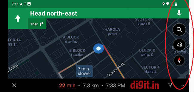
Navigation and status bar alignment glitches occur in landscape mode
Camera
The Nokia 5.1 Plus sports a dual camera setup on the back: a 13-megapixel sensor with an aperture of f/2.0, combined with a 5-megapixel depth sensor. Below it sits a single LED flash. On the front, it’s got an 8-megapixel shooter with an aperture of f/2.2. The real-world output from all these numbers is actually quite agreeable. Photos taken indoors and in daylight with the Nokia’s primary camera have accurate colours and ample brightness, although they tend to get grainy easily. Photos from the Nokia’s front camera too are colourful but miss the subject during auto-focus easily. They’re wide enough for taking photos with friends and family but show no depth of field. In low light, the rear camera manages to capture photos without too many grains but the same cannot be said of the front camera, which takes photos that are quite grainy. Luckily they’re not too pixelated.
Subjects in selfies still a little out of focus
Is it a ghost? Low-light photography not recommended.
Nope, it's a Funko Sotrmtrooper. Shot with flash turned on.
More grains than a bag of rice
The default camera app is easy enough to use but is slow to react. The phone hesitates for almost up to a second to work the shutter when the soft shutter button is pressed for the first time but speeds up with subsequent presses. This lazy reaction time doesn’t work in the phone’s favour because it’s the first shot that usually matters for most users.
The default camera app has a Live Bokeh mode, with which you can take Bokeh-style shots while seeing the output realtime. What you see in the viewfinder screen and in the captured photo still differ though. The app gives you an option to adjust the level of Bokeh effect either before taking the shot or after taking it. The shutter button response gets slower still in this Live Bokeh mode.
Live Bokeh mode with the adjustable effect slider turned down to minimum
Live Bokeh mode with the adjustable effect slider turned up halfway
Live Bokeh mode with the adjustable effect slider turned up to maximum
Additionally, the camera app has a Manual mode for those who wish to play around with focal length, metering modes, white balance, and exposure compensation. The option to switch between the front and back cameras is tucked away along with the rest of the photo options on the top. I wish the button were larger and more conspicuously placed so taking selfies with the app would be a quicker affair. All things considered, the camera setup on the Nokia 5.1 Plus is not bad at all. It’s good enough for everyday photos even if it’s not particularly great for photography enthusiasts.
Battery
The integrated 3,060mAh battery on the Nokia 5.1 Plus is a fighter. It goes a whole day with enough to spare on a single charge with mixed usage that involves a little bit of calling, some browsing, and some gaming and video playback (at least half an hour of it). In the GPS navigation test, the Nokia 5.1 Plus’ battery dropped from 57 to 40 percent after running Google Maps in 100-percent screen brightness for 40 minutes straight. On our standard benchmark test, the Nokia 5.1 Plus lasted 7 hours, 52 minutes.
Settings search says 'Battery Percentage in Status Bar' is available when it doesn't actually exist
Charging, or ‘fast charging’ as Nokia likes to call it, happened from 10 to 100 percent with the screen mostly in 1 hour, 57 minutes. The front and back sides of the phone do not get hot while charging or playing games on battery, which is a big relief for me and you. The USB Type-C compatibility makes plugging in easy because the connector is reversible.
Bottom line
The Nokia 5.1 Plus is the first smartphone in its price range to feature a USB Type-C port, which already makes it a little progressive in design. Additionally, it offers an upmarket glassy body that’s sure enough to grab eyes or at the least look clean and classy in its users’ hands. It has an above-average display, camera, and battery, which gives potential customers enough reason to consider the Nokia seriously.
In addition to all these acceptable qualities, the Nokia 5.1 Plus warms the user’s insides by subscribing to Google’s Android One programme. This means the user is assured of two years of major software updates on Android’s bloatware-free version. Everything considered, I believe the Nokia 5.1 Plus is well worth its price tag of Rs 10,999.
Vignesh Giridharan
Progressively identifies more with the term ‘legacy device’ as time marches on. View Full Profile


