Nokia N900 – a mobile PC experience, seen from a consumer’s perspective Review
This phone can be turned into a beast, but one that is not very easy to tame. If you are not looking for the customizable Linux experience, then many of the other features of the N900 can also be found on cheaper devices.
N-series has definitely not been Nokia’s most successful offering. Down the line, many of the phones in this series have been plagued with issues like sluggish operation, bad battery life and an outdated operating system in Symbian S60. This has turned the smartphone costumers to other options like the iPhone, BlackBerry or the newer Android phones. N900, Nokia’s latest N-series offering, aims to redeem the premium line-up of the Finnish giant. It is basically an internet tablet with smartphone capabilities, and a successor to the N810.
Introduction
Before we get to the review, here is a word of caution. N900 is different! Nokia has taken ‘the other road’. Recently, smartphones have been going the ‘iPhone way’, with a ‘mobile’ web experience, and an interface that is a far cry from the PC. Nokia, on the other hand, has looked back and gone a step in the other direction, by trying to offer ‘PC-like’ experience – especially while browsing – with their new Linux-based operating system ‘Maemo’. It must be mentioned here that this phone has near infinite ability to be customized. But here we will review the ‘vanilla’ version of the phone. That means, the OS is reviewed as it is, with no major tweaking.
Trust us when we say that you ought to give your thumb a much needed rest when you use the N900. While any new phone in the market these days is considered better if it has a capacitive screen or a thumb friendly interface, the N900’s browsing mettle is best experienced with a stylus. So, if you are looking for a phone that is finger-friendly, look elsewhere. But if you are still in deep love with the good old PC, read on and find out if N900 is your perfect new mobile companion.
The box we received was a big impressive matte-black. Nokia takes the cake here really. We like our machines to come in big bad boxes. The discrete packages companies are turning to, just don’t do it for us. Within the box were the usual accessories – charger (miniUSB port), data cable, earplugs and TV-out cable. Nokia were also considerate enough to pack in a converter for compatibility with old Nokia chargers (both the thin-pin and the older thicker pin). The earplugs are excellent, and they are one of the few that come with tangle-free wires, which is a big relief and a huge plus for these in-ears. We would have really appreciated better noise isolation though, and a set of changeable plugs of different sizes. More on their audio quality later.
Build
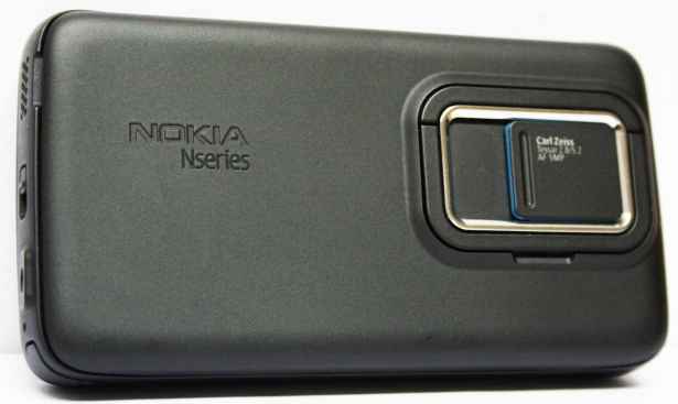
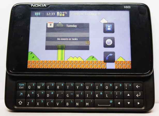
Out of the box, the phone was certainly bulkier than most we have reviewed recently. The N900 juggled across many excited hands, but the opinion was same – “it’s heavy”. When we reviewed the N97, we complained about how the screen sprang open, like it’s “going to fly off”. The N900 placates that phobia of ours by replacing the spring-loaded opening mechanism with a solid manual slide mechanism, very similar to the Motorola Milestone. Also, like the Milestone, a large part of the screen overlaps with the lower half of the slider, making it very sturdy. The screen slides away horizontally to reveal the physical QWERTY. You should know though, that our time spent with the N900’s keyboard has left us with mixed emotions. The keys are well spaced, and it is one of the very few phones where we were able to type, with our fingers comfortable and parallel to the screen. While using other phones, like the E71 or Milestone, we have had to bend our thumbs slightly to type with the tips, but N900’s well spaced and bulging keys lead to a pleasant typing experience with hardly any false presses. But the presence of ‘Shift’ and ‘Function’ keys on just one side leads to an awkward typing experience at times.
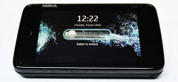
The phone is primarily designed for ‘landscape’ operation. It is in fact a ‘landscape’ oriented phone that also works in ‘portrait’ mode, notably while making calls. So the longer edge is the ‘top’ for a change. It just re-affirms the ‘internet-tablet-that-makes-calls’ tag that comes along with the Maemo operating system. The centre of the ‘top’ edge has a power button, flanked by the volume rocker and ‘camera’ button. The right edge has ‘lock toggle’ and the left has the charging port. The ports are open and lack protective covers. On the upper part of the side edges are stereo speakers that sound very good for a phone that is not really advertised for its multimedia capabilities. The battery compartment gave the reviewer a sore nail and holds beneath itself a 1320 mAh BL-5J battery, SIM card slot and a hot-swappable microSD slot (up to 16GB) to expand the mammoth 32 GB internal memory.
Read on for or review of the phone’s software and interface, as well as its multimedia capabilities…

Operating sytem interface
The phone runs on the new Linux-based open source operating system by Nokia – Maemo 5. Maemo, although gurgling silently for nearly the past four years, is still very nascent. The phone has powerful hardware, sharing the ARM Cortex A8 and GPU with the Apple 3GS, and featuring 256 MB RAM and support for Virtual Memory, which makes this device one of the most able browsing devices and gives it unparalleled multitasking ability.
We found Maemo’s interface very similar to the Android, but way less refined. The phone sports four homescreens that loop around, unlike Android and iPhone, which stop at each end. The homescreens are very customizable, a click on the small ‘settings’ button, which drops down on the homescreen by clicking an empty area, gives you the ability to completely change the homescreen to your taste. You can place any contact, bookmark, application shortcut, or widget on the homescreen. You can drag these around and yes, we were finally able to create a mess on the homescreen as Maemo does not arrange anything in a grid. You can even have any object overlapping the other. Dragging an object from one homescreen to other was easier than what we found on Android or iPhone. Dragging an app onto the thin vertical blue bars on each side of the screen automatically sent it to the next screen. On the top is a taskbar similar to the Android. From the left, it holds the menu button, the ‘device info’ panel and the ‘application’ menu.
The menu button opens up an Android-like menu that has the applications arranged in an uncategorized grid, lacking any folders. The background of the menu is a blurred version of your wallpaper, which is neat. One reason why we termed the device as difficult for use with a finger was the menu structure. It lacks the basic ‘back’ button on any page. To go back to a previous page in the menu, you need to click an empty space. Not very neat or intuitive. While using the thumb, either of these happened to us: we wanted open an app and accidentaly clicked an empty space; we wanted to click an empty space and opened an app. Frustrating and forcing us to unsheathe the stylus!
When multiple applications are open, the menu button also doubles up as the ‘dashboard’ button to open a list of all open apps. This duality is frustrating, as every time you want to open the applications menu, you have to go through the ‘dashboard’ list first, and then proceed to the application menu by pressing the menu button again. The ‘dashboard’ shows ‘live’ screenshots of all the running applications. You can actually see what is going on inside every app, a function similar to that in Windows 7 and the upcoming N8. The multitasking, as we said, is streamlined. We especially loved the puff of smoke that follows the closing of every app!
The ‘device info’ holds indicators like battery life and network coverage, along with ‘Availability menu’ that houses all the IM, social networking and Ovi accounts you are currently logged into. The ‘application settings menu’ shows the name of the current task with a drop down menu that holds most basic settings and actions for that app. This small downward arrow bamboozled us for long as we looked at the usual bottom corners for the options menu, or tried long pressing. We tried wiping the contacts from the phone and to our annoyance, found that it is not able to select all contacts at once, something like a ‘mark all’ in Symbian. Even a feature as common as ’search’ is missing, which makes searching for an app or a specific text message a headache. The interface of menu as we mentioned above, is not very thumb-friendly. These interface hiccups of Maemo would seriously put some users off.
The upper bar also displays the email/text alerts. A yellow balloon comes up and, if ignored, the alert docks in the ‘dashboard’ as another running app and can be accessed later. It is not very distracting, but we would have really loved something like what the Android does, grouping the alerts in the upper bar without any annoying pop-ups.
Probably, the best and, obviously, the most advertised feature of the Maemo is its browser. So, does it really do justice to the “PC-like” browsing that Nokia has been touting the phone for? Well, to be fair to the browser, it does its job commendably. The pages are rendered just as they would be on a PC, with Flash 9.4 support. True to its word, the browser does not open the mobile version of websites like other smartphones and displays the full PC-browser version of most sites. But this has a flip side too. Considering the fact that you wouldn’t always have Wi-Fi connectivity, loading times of full sites will be very large on the pathetic 2G internet we have in India. Moreover, the readability on a 3.5-inch screen can never match that on a full fledged PC or even a tablet the size of an iPad or even a Streak. The browser provides gesture support. Drawing clockwise circles zooms-in, which reduced the need for resorting to the stylus when clicking tiny links on the screen. A capacitive screen would have lead to unmatched browsing experience on N900 as the resistive screen is neither a help with scrolling, nor with gestures, leading to false clicks in both the cases. Sliding your finger across the screen from the left displays a cursor which allows you to hover to open a roll-over drop-down menu, ably mimicking the PC browser again. This cursor can also be used to select text or images to copy them using the Ctrl C combination on the keyboard. A cookie for guessing how to paste! The browser is a good alternative to the PC for most part. However, we personally think that a small trackball on the keyboard would have really knocked the wind out of competitors.
The email application of the N900 is decent, with support for multiple accounts and setting presets for common mail services.
Apps
The phone stands out for the wealth of apps it is already offering. You have two reliable sources and the best of both worlds, with ‘Ovi Store’ and ‘Maemo Select’ (an app store offering select Maemo apps) both offering apps for the N900. We liked the few ‘recommended apps’ we tried at these app stores, especially the games. But the social networking apps are nowhere as good as their counterparts on iPhone or even Android. The built-in Facebook widget just displays a non-interactive scroll of the latest newsfeed, with no ability to even scroll manually. Any click leads straight to browser, where the lack of mobile version doesn’t really help matters, considering what other phones have to offer to the Facebook-loving generation. ‘Witter’ is the best that Maemo offers to access twitter, and it does a decent job.
However, the social networking aspect is helped by the presence of a unified threaded inbox. You can set IM or social networking accounts in the ‘Availability’ area of ‘Phone info’ we talked about earlier. This would import all your contacts from these accounts to the contact book and the IMs sent would appear in the unified inbox in ‘Conversations’.
But what gives Maemo a mammoth plus is the Linux ‘repositories’ that can be accessed through the ‘application manager’. This repositories are free, powerful, open-source Linux-based software collections for the Linux-based Maemo but they may turn out be erratic as these repositories are open and unregulated. There are plenty of tweaks that can change any aspect of the operating system that you dislike. For example, we downloaded a small app that categorized the menu items into neat folders, intelligently putting them in their respective categories. One small program called ‘Headphone daemon’ added a function that stopped music whenever the headphones were detached from the phone. Being Linux-based, you can also port any Linus distribution on it. As the ultra-geeks at our place suggested, theoretically, you can load even Windows on the device (practically, the phone would fall short on resources).
OS summary
The N900 juggled everything we threw at it. The powerful hardware combined with the flexibility of being a Linux distribution gives this raw new operating system an edge over many other phones. Consider the fact that you can easily port nearly any application that runs on Linux, to the Maemo. But this power does not come without a price. The interface of the phone is nowhere as refined as many of the other devices that are available out there. The N900 is a power toy for geeks and Linux-lovers to play around with, to experiment. Don’t expect everything to be placed where you expect. Maemo is still a baby that is growing and has its fair share of unpredictability. So what does this phone hold for an ordinary consumer? The beauty of Linux lies in it being open source. So, if there is anything that you dislike in the phone (except the hardware), there should definitely be someone in the Linux developer community who feels the same and has a way to change that. This may include the way the menu opens, or even the video clip that plays while the phone starts. Everything in the N900 can be changed to your liking. Like the Google Android and Apple iPhone, you are not dependent on the phone company to provide you with a certain software improvement. Also, the Maemo 5 is the last iteration of the operating system, as the paths of Maemo and Intel’s Moblin OS have converged, leading to the birth of MeeGo. Maemo wouldn’t get an automatic upgrade to MeeGo, but Nokia will supply MeeGo and it can be flashed onto the N900 manually.
After spending around 30,000 bucks on a high-end phone, there are some features like music/video playback, camera, GPS, etc. which we often take for granted. Nokia has also done a fair job with these…read on to find out….
Multimedia capabilities
The music player does a decent job. It allows for the creation of playlists on-the-go and is well complemented by the excellent earplugs, which churn out good quality music. The earplugs, however, suck at noise isolation, which is something we expect from all in-ear headphones to some extent. The audio formats supported include MP3/WMA/WAV/eAAC .
The 800×480 TFT screen does a good job of playing the videos indoors, although something like newer OLED would have helped reproduced better colours in outdoor conditions, and saved battery power too. The player supports WMV/RealVideo/MP4/AVI/XviD/DivX video codecs but more video and audio formats can be played easilly on the device, by downloading the compatible media players from the Linux repositories. The videos can be displayed on a bigger screen with the bundled AV cable. It transfers the display of the phone to any device with AV input. Once plugged into the 3.5 mm jack, the phone automatically detects the AV-out cable. If you are checking into some place far away, the phone may entertain you with a few movies but don’t expect HD-like clarity.
The 5MP camera comes equipped with a Carl Zeiss lens and a double LED flash. The lens is protected by a cover, an addition we have always appreciated. There are scene-modes like night, macro, high-speed etc. but it lacks effects like sepia or B/W. The camera however has manual ISO adjustment settings, which is a powerful addition and makes up for almost everything else. The device provides no native application to touch-up the clicked pictures, with only ‘crop’ and ‘rotate’ functionality available. Video is recorded at WVGA resolution of 848×480 @25fps. Again, the video has no settings except a night video mode. A little more tweaking can be done using the saturation and exposure controls. But we expected a little more in terms of effects and editing from the N900 because it has the ability to do it. The camera did great in outdoor test but there was a lot of noise in low light conditions. The LED flash didn’t really light up a dark room but would suffice if you are clicking some close up pics in a night-out with friends. Video recording performance follows a similar trend.
|
Outdoor- not too bad
|
Low light – lots of noise (2)
|
Dark room – poor flash, lots of noise
|
GPS and Navigation
The GPS performance of the device is very good, with the device locking onto the satellite in no time, and operating with a resolution of about 15-20 metres. When we throw in the fact that the sky was very cloudy on the day the device was tested, it gives a lot of plusses to the GPS of the device. However, the version of Ovi maps that came with N900 lacked turn-by-turn voice navigation, which comes as a shock, as this feature is available in many lower end phones such as the E71. Google Maps is not available for the N900, and can only be accessed via the browser. But the browser on Maemo does not support geolocation, which makes the online version practically useless for navigation.

Gaming
There are some good games available in the ‘Ovi Store’ and ‘Maemo Select’ for free. ‘Angry Birds’ is an excellent physics based game that reminded us of the good-old ‘Worms’ series. The motion sensor based ‘Labyrinth’ rendered as well as it did on iPhone and showcased the excellent sensitivity of the accelerometer sensors of the N900. You can also head over to the Linux repositories and download free games, or get one of the many emulators available, and turn your device into anything from the old NES to the newer Sony Playstation 1. We went old school and downloaded the NES simulator, getting back to the good old days of Super Mario. The N900 will eventually get great games because of its powerful hardware and the precious talent of TV-out. Also, the fact that Maemo devices support Bluetooth controllers, like those of the PS3, has us drooling. Currently though, the choice of games is nowhere as wide as that on iPhone and Android phones.
PC Sync
As far as syncing the device with your PC using the Ovi Suite is concerned…. we were shocked to find that Ovi Suite does not support N900. Having given them 30,000 bucks in exchange for not being recognised by the Nokia suite just does not seem right. We hope the next iteration of Ovi Suite corrects this blunder.
Verdict
All in all, N900 is Nokia’s best offering till now. Even though Maemo is in its early days, it is still way better than the touch-driven Symbian S60v5. Maemo will only get better, now that Intel has pitched in its expertise into MeeGo. For now, we don’t really think that this phone is a very good value for money for non-geeks. So if you had decided to go out and get yourself the latest swanky N-series phone, take a deep breath, and think again because if you are not looking for the customizable Linux experience, the other features can also be found on devices much cheaper than the N900. This phone can be turned into a beast, but it isn’t very easy to tame. So if you are looking for an easy interface, reliable ‘approved’ apps, you should not opt for the N900. If you are ready to venture into the open source world with an equally open mind, N900 is a one-of-a-kind device for you. Maemo is a platform you can nurture, customize or, write code for, yourself. The choice between N900 and other smartphones is somewhat similar to the dilemma of choosing between Linux and Windows on your PC, respectively. What spells doom for Nokia is that the masses have, till now, gone for the closed and easy to digest Windows. But the trouble for Nokia is that even another Linux-based device, with something like a trackball or a capacitive touchscreen, may spell trouble for the N900. Ah! This competition, this open clash of sharp swords reminds us why we love open-source.


