InFocus Vision 3 Review : 18:9 and dual camera in the entry-level
With the Vision 3, InFocus seems to have taken a checklist-like approach in building an entry-level phone – including as many high and mid-range features as possible without focussing on the actual performance quality. If you're fine with a device that comes without the bells and whistles and are looking for something that actually performs well, steer clear of this one.
Build and Design
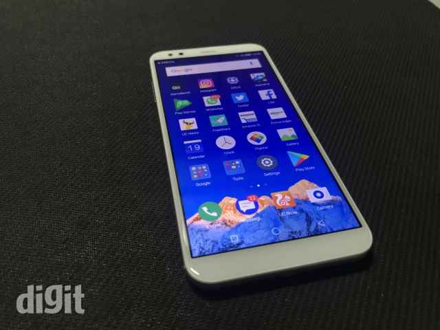
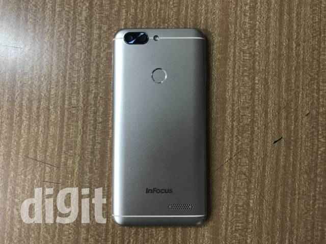
The phone is built with the usual metal-finish on a plastic design that has become quite common on low to mid range phones recently. In terms of build quality, the phone does not offer anything exceptional and even feels a bit plastic-y if you close your eyes off to its metallic sheen. To fit the 18:9 display, the phone does not have capacitive buttons and goes for software buttons instead. The sensors are located on the top, along with a notification LED that you’ll barely notice unless it’s lit. The rounded corners and edges give a good sense of grip. Combined with the 5.72” display in a 6.65” body, the high screen to body ratio is something new to the entry-level segment.
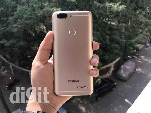
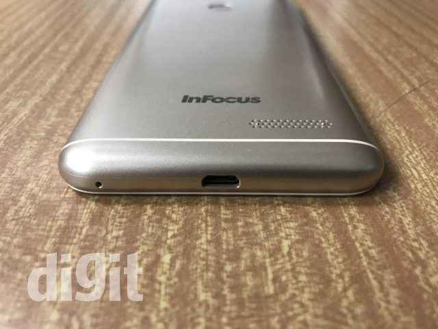
There are a couple of things that are odd about the design. First, it places the volume buttons on the left. That, by itself, is not something bad. But almost every single phone that we’ve used in the recent past has included the same on the right, so it took us a little time to get used to the new placement. Additionally, the speaker grille on the bottom at the back of the phone definitely feels a bit weird, especially if you’re watching a video while the phone is resting on your palm or on a table. A pair of notches jutting out don’t help either.
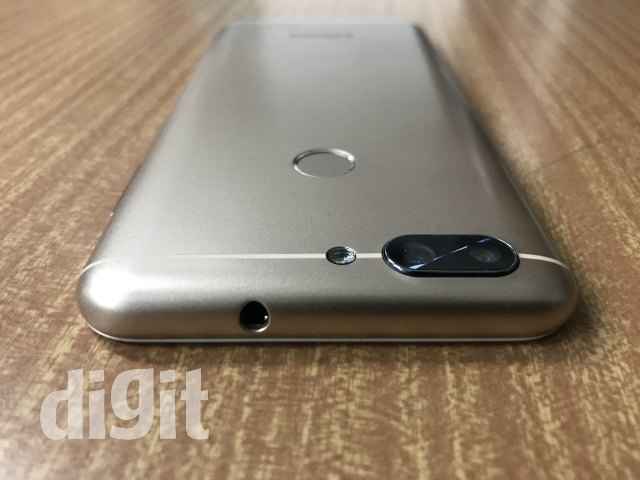
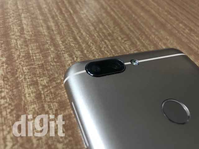
The camera setup is slightly raised from the back of the phone but it is not too significant, especially due to the metal rim on the camera housing that offers a purely visual benefit. The fingerprint sensor itself is not too hard to reach and has its own metal rim, giving the back of the phone an overall classy look, except for the speaker grille mentioned earlier.
Overall, the Vision 3 does attempt to bring a level of finesse into entry-level phones but falls short on the details.
Display
The Vision 3 certainly cuts cost when it comes to the display. While none of the phones in this segment sport OLEDs, the Vision 3’s LCD display doesn’t fare well against the competition. Despite the bigger screen, the phone does not go for a better resolution and is thus stuck at a lower DPI value than its competitors. The low viewing angles and barely average sunlight visibility don’t help its case. Colours on the Vision 3 are a bit washed out, sporting a slight bluish tinge that is not really noticeable. For a phone where one of the USPs is supposed to be the new display, its mediocre performance is disappointing.
Performance
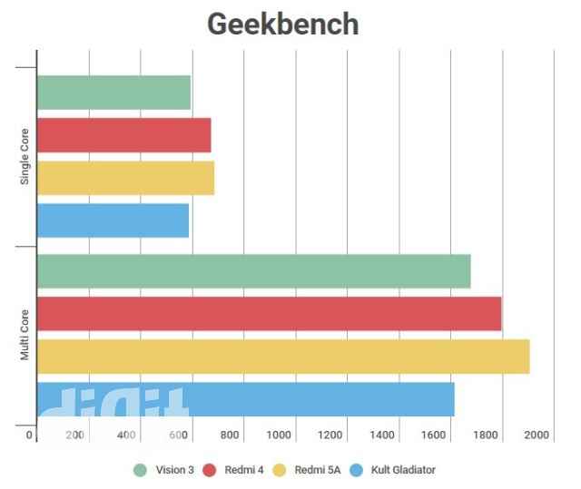
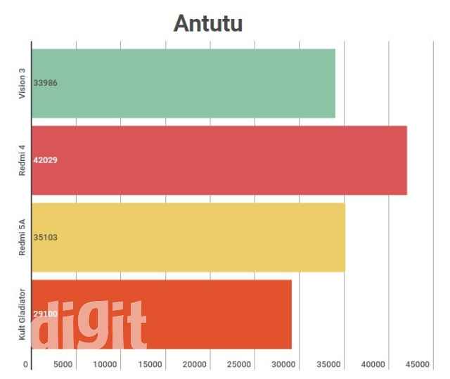
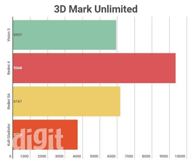
InFocus seems to be willing to cut costs when it comes to the chipset as well, going for the quad-core 1.3GHz MediaTek MT6735. But given that this segment itself is for basic users, that doesn’t make this as significant a problem as it would have been in any other segment. That being said, the lower performance does become noticeable once you have more than five apps or about 20 Chrome tabs open. We had everyday apps like Twitter and Instagram crash on us quite out of the blue. But then again, the limited storage space of 16GB might force you to use lighter alternatives like Facebook Lite anyways.
Right out of the box the phone plays games like Asphalt 8 reasonably well to the naked eye, but with an average frame rate of 20, there isn’t much hope for this one to stay that way for too long. At this price point, you will certainly get phones that will perform noticeably better.
Camera
This brings us to the second USP of the Vision 3, its 13MP+5MP dual camera setup. It wouldn’t be correct to say that this phone is the first one to bring a dual camera in the low-end segment, but it would be fairly accurate to say that it doesn’t keep up to your expectations from a dual camera. While outdoor daylight shots look quite clear and crisp, especially on the wide display, closer inspection will reveal a certain lack of detail around the edges that becomes apparent when you compare it with a slightly better alternative.
In the default camera mode, the colours are a bit washed out. Both the front and the back cameras support portrait mode, which, unfortunately, works only when a human face is in the frame. And even then, the results are not really up to the mark with edges repeatedly being blurred over even when the face is clearly in view – something that you’ll be able to see in real time. There is above-average noise in night time shots and the same creeps into low light clicks to some extent. The camera does let you switch from the standard 4:3 shooting ratio to a full 18:9 shot or a square 1:1 shot, but for both the front and rear cameras it switches to lower resolutions for these alternative shots. The loss of detail in these lower resolutions is quite visible. But one of the good things about the camera is the auto-focus that works almost every single time without significant delay.
Indoor Daylight shot (resized)
100% Crop (Original below)
Outdoor Daylight (original for 100% crop above, resized)
Outdoor Daylight shot (resized)
Low light (resized)
Very low light (resized)
The Vision 3 also supports the Dualfie (which is what they are calling their front+rear camera shots). Strangely, it is named as PiP mode in the camera app itself. The mode does not support any of the other features of the camera and simply lets you switch the position of the front and rear shots.
Overall, the Vision 3 doesn’t sport the best shooters at this price point, despite its dual camera arrangement. It is fairly decent if you absolutely MUST have a phone with portrait mode, even if it is a gimmicky implementation.
Battery
The battery is one area where the Vision 3 would have been expected to give some tough competition to its foes. But even with the 4000mAH battery, the device failed to score more than 7 hours 51 minutes on the PCMark battery test. With average usage, you will need to plug it in at the end of the day if you still want to use it at the start of the next day. The battery percentage dropped quite significantly during the idle state, making its reliability questionable. There is room for a lot of optimisation here.
Bottomline
The InFocus Vision 3 ticks a lot of boxes when it comes to specifications and looks. But unfortunately, those very same specs are a letdown when it comes to actual performance. On top of that the phone ships only with a 16GB storage variant, which you'll definitely run out of after about 6 months of average usage. With no 32GB variant in sight, this one's a miss in the entry-level segment.


