HTC Windows Phone 8X Review
The new Windows Phone 8X is rather impressive. Straight out of the box, the 8X catches your eye with the rather striking design, which blends in the edges and the curves rather well. The polycarbonate build is just brilliant. Carrying on with the positives, the display is rather vivid and the camera does well in good lighting conditions. Now the negatives – battery life is barely good enough to last a day, and the phone�s back tends to heat up if you are gaming. And there is no memory expansion slot, with built-in storage being just 16GB.
Build & Design
HTC has, without a shadow of a doubt, made some amazing looking Android phones these last couple of years. Right from the time of the Legend to the present day with the One X and the One X , HTC phones have pretty much been the best looking phones in their respective price categories.
 |
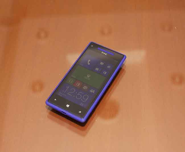 |
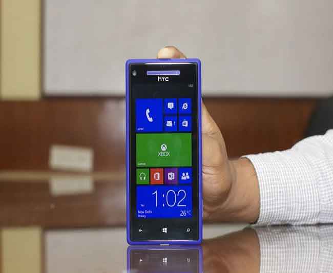
The HTC Windows Phone 8X pretty much walks the same path. This phone is walking the path between looking formal and looking casual, all at the same time. On the front is the 4.3-inch S-LCD2 display. Around the screen is the deep black bezel, with the three touch sensitive keys below the display – return/task manager, Home and search. This look is framed by the actual colour of the phone: red, black, yellow or blue. I personally would be considering the blue or the yellow, if in the market to buy the HTC Windows Phone 8X. This was the formal looking side of the phone.
 |
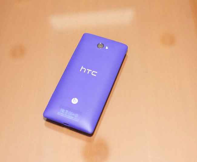 |
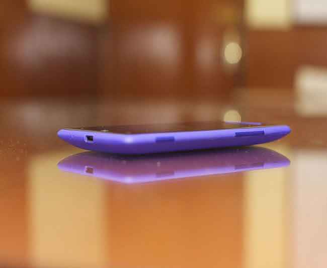
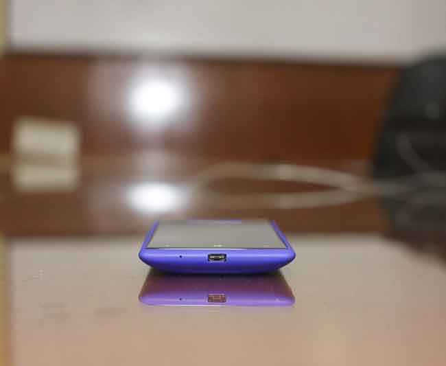
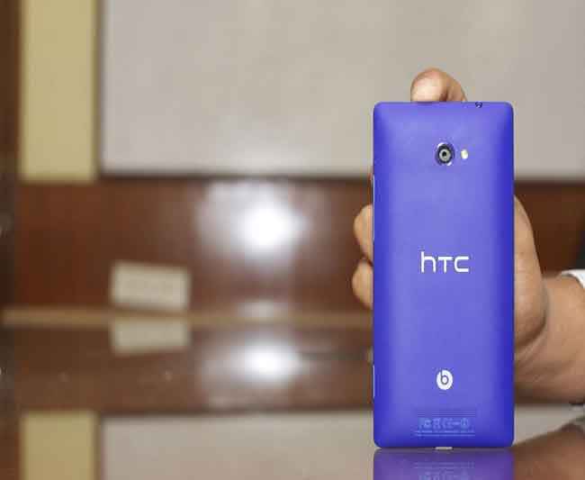
Now, the casual side! Flip the phone over and the polycarbonate finish with the rubberized grip feels fairly premium to hold and use. The curved sides blend the design rather well, with the edgy elements. On the right side is the SIM card slot with the volume rocker and the dedicated camera key. The problem with these, despite them gelling well with the design, is that they are a tad too depressed. A slightly more raised design would have made it easier for the fingers to detect where the buttons are, and negate the need to look down every time. On the back is the camera on top, with the LED flash. The HTC logo is in the middle, in grey colour that blends rather well, at least on the review unit that we received. The Beats Audio logo also loses its trademark red colour, with a non-shiny lighter grey theme this time. Just below that is the speaker, the grille design for which has been done very finely.
 |
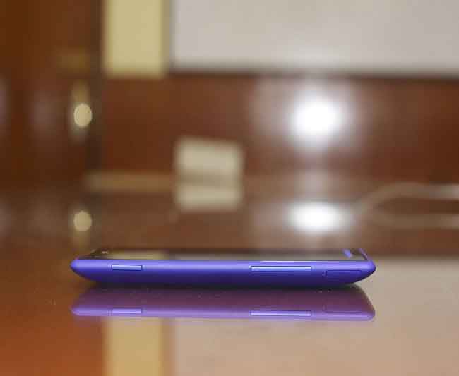 |
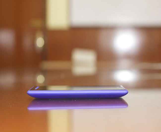
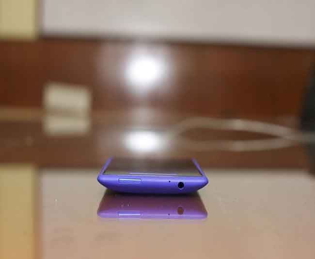
Overall, we like the dual elements in the design of the HTC Windows Phone 8X – the serious side, and the casual happy go lucky one. The result is a very premium looking phone that importantly, feels that way too. It can fit well for anyone – someone who wants a serious phone for serious work to go with their serious un-funny persona, and equally well for the happy go lucky type who want a phone that will catch attention wherever they keep it on the table. The form factor is very manageable for use with one hand, and is easily pocketable as well. The spec sheet says this weighs 130 grams, and in reality, it feels rather light. The unibody design lends it that extra bit of solidity, but the trade-offs include the inability to change the battery and no expandable memory slot.

Features & Specifications
Proudly showing off the latest OS, HTC even managed to fit it in the name of the phone – HTC Windows Phone 8X. It may look the same on the outside as the 7.5 and prior versions it is succeeding, but there are considerable changes on the inside.
For starters, Microsoft has taken a cue from Apple and kept the OS fairly locked up. This means the likes of HTC cannot customize the UI, like they have done on Android phones with their Sense UI. Only very minor tweaks can be achieved, like the weather widget that doubles up as the lock screen. Additionally, there will be notifications for missed calls, new mails and messages on this screen, but this can be customized to be on or off, for individual applications. It is truly brilliant. There are additional apps that HTC has preloaded, like the stocks app, but unlike Android offerings, the OS is fairly untouched. Additionally, HTC has slotted in its apps in the Special section on the application store, but that’s about it.
 |
 |
As with the previous editions of the Windows Phone OS, there are no multiple home-screens – something we are delighted about. What you get past unlocking the display is a bunch of Live Tiles, which are basically blocks that take you directly to an app, and with the Live capability showing you some relevant information right on the homescreen. They can also just be fun to look at, like the Pictures tile or the People’s tile. Swipe and the application list opens up from the right side. The tiles can be rearranged, resized, added and removed as per your requirement. The background on the tiles page and the app list remains black or white, with still no ability to put any wallpaper there. The theme colours do have some options, but that basically just changes the icons and the tile colours.
 |
 |
The notification bar is still rather half-baked, like in the previous version. The time shows up on the right corner at the top, but information like signal status, Wi-Fi etc. remain hidden. The battery icon also remains hidden for the most part, until the battery level starts running low. You need to swipe down on the display to open the notification bar, but it itself doesn’t do any more than be a viewer.
There is a sort of a task manager to be had, a task viewer if you may, when you long press the return key. Swiping right and left lets you see which apps are open. To exit an app, you still need to use the return key when inside the app, but pressing the Windows logo (which is the Home key) sends the app into the background.
Like with the desktop versions of Windows 8, Microsoft has made the Search feature fairly central to the experience. Press the search touch sensitive key, and you can directly search and open apps from there. Quite useful if you have downloaded a lot of apps, and the particular one you want to open now seems to be lost in the clutter.
As a reviewer, I was rather miffed at the inability to take screenshots. This is now a built-in feature with the new Android OS, but is still missing in Windows Phone 8.

Microsoft has preloaded the device with the complete Office suite, but surprisingly misses out on SkyDrive out of the box. You just need to go to the Store to download it. Rather nice to offer the complete productivity suite with the OS, rather than leaving the option with the consumer to download later, something that surely would have cost money.
Speaking of which, syncing with your Windows Live account is rather seamless. Sign in, and the contacts get synced immediately, as does the mail account. Once SkyDrive is downloaded and signed into, the integration becomes deeper. Open a doc, edit on the fly, save it back to the cloud and share it from there, if needed. The People’s app is where the contacts go, with any images you may have stored for them. You can set up groups for your contacts. However, it is fairly diplomatic of the fellows in Redmond to allow an almost similar experience with even Gmail, at least as far as mails and contact sync is concerned. Those being the two primary bits of data you immediately need in a smartphone, you are pretty much sorted. Office functionality does not take a hit either, because you may sign up for a Microsoft account later for SkyDrive, to add the cloud storage functionality as well.
If you are into messaging a lot, then the HTC Windows Phone 8X’s on-screen keyboard will be a delight to use. Yes, it does have its faults – hardly any key spacing and the keys themselves are thinner than ideal, but the precision of this touchscreen is much greater than the sum of the negatives. Typing quickly will be a fairly precise experience.

Returning back to the issue of apps for a minute, and to Bing Maps specifically. Navigation software has been in the limelight ever since Apple screwed up Apple Maps with the iOS 6 update, making Google Maps the undisputed leader in the segment. Users in the U.S. are fairly impressed with Bing Maps, but here in India, they are just plain useless. Maps themselves are weak, with important locations not mapped properly, and address search is best not expected.
Speaking of the Windows Phone 8X’s hardware, it runs on a 1.5GHz dual core processor on the Qualcomm S4 chipset, coupled with Adreno 225 graphics and 1GB of RAM. Admittedly, it will be fighting off the quad-core Android phones in its price bracket, but a smoother OS experience is in offer with these specifications than some of the geekier rival OSes. The HTC 8X comes with 16GB of internal storage, but unfortunately no expandable memory card slot. The 4.3-inch S-LCD2 display has a resolution of 1280 x 720 pixels, but the most impressive thing is the colour vividness and the fact that text feels sharp enough that it may actually look like it is popping out at you. The 8MP camera is fairly good for use outside during daytime, but struggles as the ambient lighting goes down. Even during daytime however, colour handling is a tad inconsistent, with some smudging or some colours being washed out.

Performance
For a phone that has the specs of an Android phone just a peg below the current top-end ones, the 8X along with Windows 8 Phone combine well to offer a rather tasty experience. The benchmark scores not surprisingly put it well ahead of the Nokia Lumia 900, the best Windows Phone of the previous generation. However, what we really like is the ability of this package to not get bogged down, even if you have a bunch of apps open in the background. That is not something most Android phones can boast of, honestly speaking.
Call quality is rather good, when you are in a good signal area. The earpiece is soft but yet is quite loud when you need it to be. It blocks out ambient noise at both ends of the calls rather well, with even disturbances like wind noise pretty well blocked out. However, as even with the Nokia’s previous generation Lumia phones, call quality decreased quite a bit or the call just drops when you are in a low signal area, like in an elevator.
Battery life is a bit of a disappointment. The HTC Windows Phone 8X will just about last a day of usage, with 3G connected, a bit of voice calling, lots of Whatsapp and FB Messenger chats and a generous dose of Facebook status and Twitter updates. The 1800mAh battery, on paper, should have been enough to get it through a day more easily than it did, pointing to what is essentially a bug that can be surely fixed with a future software patch. At the time of writing this, the phone has not received any such update, or a notification for the same.

The display is clearly among the better ones in all smartphones out there. The black level depth and the overall colour vividness and handling is impressive. If the same was to be replicated on an AMOLED family display, the S-LCD2 would lose out in terms of colour warmth, but does have a lot of advantage in making the overall screen sharper and crisper. Edges look well dealt with, with no noise visible even from up close. Text is very comfortable to read and videos are smooth and vivid.
During testing, we were a tad surprised to find certain apps (which we downloaded from the Store) crash or refuse to respond at times, including a couple of the benchmarks. Return back to the home screen and the OS itself is running smoothly. Not a fault of Windows Phone 8 then, but with the apps individually. Updates should solve that problem.
Bottom Line
With HTC’s phones of late, it has always been a case of promising the world, but not delivering it later. Samsung has comfortably taken the top spot in the Android ecosystem, with the Galaxy S III trouncing what was a fairly impressive HTC One X. The moment that happened, the One X always looked like a desperate attempt to claw back the gap to the leader. Which is why the Windows Phone attempt became very crucial for HTC. As a brand, they need to take the early advantage, before the Nokia Windows Phone handsets hit the market. With the 8X, they seem to be hitting the right notes.
The brilliant build quality is something that Nokia offering will surely rival, but might not be able to compete with the slimness and the lightweight package HTC has come up with for the 8X. The phone blends distinct design elements rather brilliantly. The performance is rather good, and we like the simplicity of the entire operating system. This is the perfect OS for someone to consider if they want a phone working properly straight out of the box, without the need of a hundred tweaks to optimize it.
But the Windows Phone 8X does have its faults. The first is the poor battery life, which HTC needs to solve immediately with a software update. The second is the issue with the unibody design, which crosses out the ability for the user to replace the battery. The third is the limitation of the storage space – 16GB built-in, but no expandable memory slot. Yes, there will be additional free Dropbox storage, and you have SkyDrive as well, but with limited 3G plans, how often cloud storage can be relied on for pictures and music is something that is unclear.
Quite clearly, the Windows OS for the phone is evolving. And for the better! While some may crib about missing features, we give it generous points for being simple to use and easy to get accustomed to. If you make an OS that doesn’t come along with a steep learning curve, you probably deserve a party in outer space for that! Microsoft has done exactly that. Sure, a couple of things don’t work as well as they should, but as with any new platform, the first couple of updates should iron out whatever niggles users point out. Windows Phone 8 is on the right path, and if you want to give it a try while not restricted by a budget, the HTC Windows Phone 8X is possibly the best smartphone to try it with.
Videos contributed by: Swapnil Mathur


