There are two reasons to buy this – you want the very best Android phone at the moment but don't really care about the mediocre battery life, and that you hate the iOS platform from the bottom of your heart!
Look & Feel
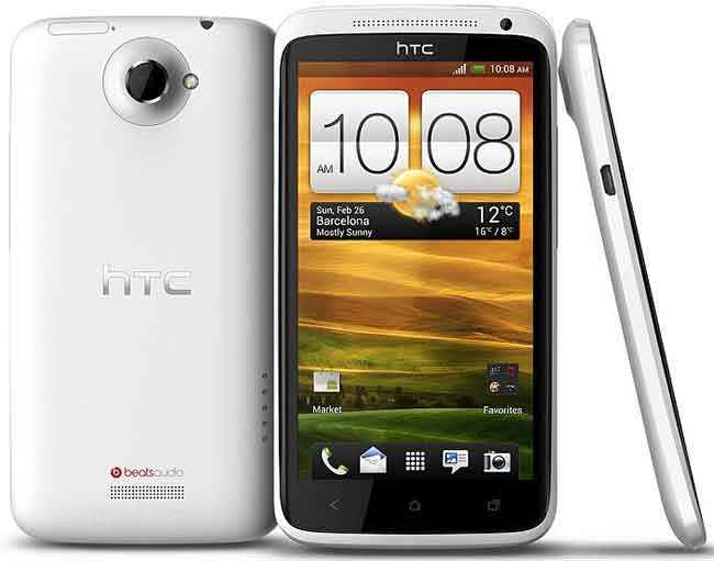
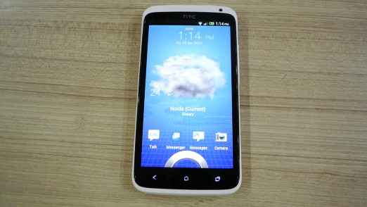
The HTC One X is a looker, and there is no doubting the effort that the Taiwanese manufacturers’ design team has put in for this phone. Judging by the design, the form factor and the quality of materials used, the One X feels quite premium. For a lot of people, a phone with some metal component to the build is an essential indicator to the solidity of the build quality. See and hold the One X once, and all those assumptions will be dispelled. Even though this falls squarely in the big-screen smartphone category, the One X isn't uncomfortable to use or unwieldy to hold.
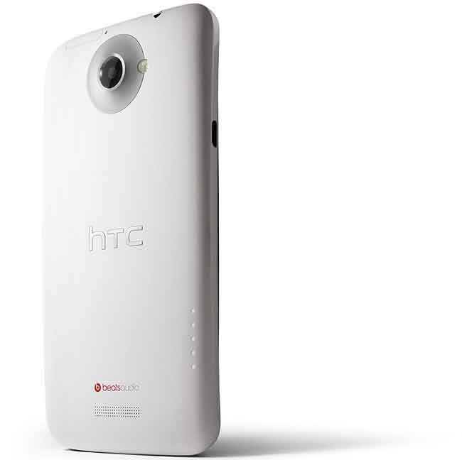
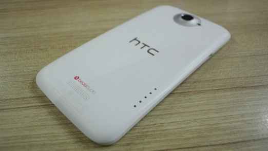
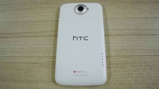
To understand most elements of the design influence, you need to look at the phone placed vertically on a flat surface, from side on. The slimness literally shouts silently. We had praised the Motorola Razr (read our review) for its slimness, and at 8.9mm, the One X isn't far behind the Razr’s 7.1mm. What you will also notice is slight curve on the top and bottom. The only issue with this slimness is that the 8MP camera protrudes out at the back, and when placed flat, the phone rests on a part of the clicker.
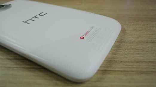
While it is plastic throughout, we believe it is the unibody design that lends it the solidity. We first saw this a few years back on the HTC Legend, and while the design didn’t really catch on then, it never really went away. Off late, we have seen this with a lot of phones, with the Nokia Lumia 800 (read our review) being a prime example. The review unit sent to us had the enamel white finish, which wasn’t glossy and thankfully so, for it isn't a fingerprint or scratch magnet. However, this colour does have the problem of getting dirty very quickly, and you’ll have to be quite careful about that.
The front of the One X looks very minimalistic, particularly when the display us turned off. Amidst the sea of black is a 4.7-inch display and three touch sensitive keys – return, home and what is essentially a task manager. The right spine has the volume rocker, and left one has the micro USB slot. There is no dedicated camera key, which is a bit of a surprise.
To sum it up, the One X is a well-sculpted phone, and clearly, the designers have put their heart and mind into it. It feels like a premium phone to hold and use, which is critical considering what you will eventually be shelling out for it. We would strongly recommend the grey one though, since the white will not be for the cleanliness freaks out there!
Features & Performance
A 1.5GHz quad core processor powers the HTC One X, and this is the first super phone to be launched in India. We still await any news on the LG Optimus 4X and the Huawei Ascend D Quad. Not to forget, this is paired smartly with 1GB of RAM. Logically, it should be a scorcher in terms of performance. To test and compare, we ran a series of benchmarks. And for the sake of comparison, we pitted it against the Samsung Galaxy Note (read our review), which is (or at least was) the fastest Android smartphone till the One X came along (read comparison here). First benchmark we did was Quadrant, and surprise surprise – the One X was slightly slower than the Note. Just to be sure, we restarted the One X and ran the benchmark again. Same result. Logged it while trying the hardest to remain unfazed, we moved to the next set of benchmarks. Not a surprise that the One X blitzed the charts!
In the real-world usage scenario, the One X feels like any dual core powered smartphone, for the most part. However, most apps load quicker, and games are definitely a smoother experience. But why we raised this question about real life performance is because of some statistics – despite having 1GB of RAM, the task manager clearly shows that the free RAM is never more than 250MB. The background processes, and lots of them for that matter, eat up a whole lot of RAM, which basically brings the One X down to the level of a Motorola Razr or a Galaxy Note, in terms of one aspect of the performance. This even we realized once we had a bunch of apps open in the background, and the UI became perceptibly sluggish. Having said that, you would absolutely love the snappiness while playing games or even loading apps.
When stressed, the rear panel does become a bit warm, particularly when gaming or watching videos, the area around the Beats Audio logo becomes a tad warm. Not uncomfortably so, but that will have an impact on the battery life, and you will feel it on your palm.
Visit page two for more details about the HTC One X's features and performance, and our verdict…
Also read,
HTC One X: Performance benchmarks and first impressions
The 4.7-inch Super IPS LCD2 display (1280 x 720 pixels) is definitely among the best we have seen in smartphones, if not the best. The colour temperature is on a lighter side when compared side by side with an AMOLED display, but takes the advantage in terms of wider viewing angles and infinitely crisper text. The best indicator of that is when attempting to read something on a web page, without zooming into the text straightaway. Brightness levels are quite superb as well, and so are the black level depths. We would set this at 20% brightness for indoor use, and that’s pretty much set for a time of good fun!
There is 32GB built-in storage, out of which the user gets about 25GB. However, there is no memory card slot for memory expansion. The HTC One X uses a micro SIM, instead of the standard SIM that we are using in our phones, mostly.
 |
 |
 |
Cameras in most smartphones deceive to flatter, but this one is probably the best of the lot. And it can easily stand up to the one in the iPhone 4S (read our review). No need to change modes between photo and video by toggling the slider, since both are integrated in the same viewfinder and available at one touch. What this does is reduce one step in the process, and saves on switchover time as well. Photo quality is much better than expected, with a whole dollop of crispness and no noise to ruin the final product. Videos recorded on this are an absolute delight to watch.
There is absolutely no jitter in panned shots, and the camera isn't overly sensitive to light changes. However, when zoomed in, you will notice that the colour tends to blow out a bit around the edges of certain objects. Contrary to fear, the video quality or the still images don’t get spoilt in burst mode.
 |
 |
 |
 |
 |
The interface is probably the biggest change over the older gen HTC smartphones, and that’s because Sense 4.0 seems to have built from scratch. Looks like nothing, apart from some widgets, have been carried forward from the Sense we last saw in the Sensation XE and Sensation XL. There is a conscious effort to tone down the visual punch of the UI, something that allows more focus on the redesigned look of Android ICS. There are the seven home screens, but widgets are handled in a much different way – including the way you select them and some can even be resized – Gmail, for example. However, you cant move between screens in a circular fashion, and once you reach screen 7, there is no auto swipe to screen 1. A retrace of steps will be in order.
You have active lock-screens to choose from – weather, stocks, social networks, tasks etc. What carry forward is the active shortcuts on the lock screen, much appreciated. Moving into the apps list, and the biggest change is from the vertical scrolling to the horizontal scrolling. Reminds us of Samsung’s Android smartphones! On top of the app list screens is the option to search and go directly to the Play Store. The key marked with three vertical dots throughout the UI and even within apps is the Menu/Options key. Unfortunately, Sense still feels heavy. If you have a few apps open in the background, the UI begins to lag. However, there is no taking away the sweet visual punch that still remains, despite the conscious effort to tone down!
Battery life is a disappointment. With a quad core processor under the hood and a 4.7-inch display to light up, the 1800 mAh battery will struggle to survive through the day if your usage is anywhere above minimal and light. With Wi-Fi or 3G connected, an hour of voice calls spread through the day, mails syncing and a bit of chatting on FB Messenger, the phone lasted just about a day. You will need to turn down display brightness, shut down connectivity options and not unnecessarily play around with the phone to make it last.
Our Take
This is probably the best Android smartphone you can buy, at least in terms of raw performance. The display is one of the best around, and so is the camera. But what disappoint are the battery life, and the fact that HTC Sense does tend to crash or become sluggish at times. HTC have been at it for so long that it is a miracle that Sense still isn't as optimized as it should be! However, you will be buying a phone that is a premium product, feels that way, and performs that way, at least for the most part. Or else, just get an iPhone!
Contact: HTC India
Email: www.htc.com/in/help
Phone: N.A.
Also read,
HTC One X: Performance benchmarks and first impressions

