The new IdeaPad Z400 Touch gets the expected upgrade – the touchscreen. The machine has been given an uncanny resemblance to the IdeaPad U-series ultrabooks. The performance is good, and the fairly powerful graphics can handle quite a bit of the fun stuff. However, all this excitement is tempered by the poor battery life. For around this price point, the HP Pavilion m4-1003tx seems to be the better deal.
Build & Design: Looks like the cousins!
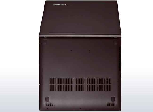
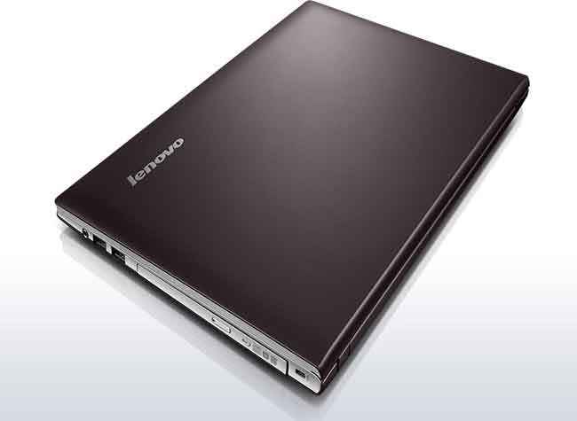
The resemblance to the U-series of ultrabooks is more than evident in the IdeaPad Z400 notebook. The lid has the dark grey colour, and so has the underside. The finish is completely matte and non shiny. Open the lid and the keyboard deck has a light grey finish throughout. No quick access keys to spoil the otherwise clean look around the keyboard.
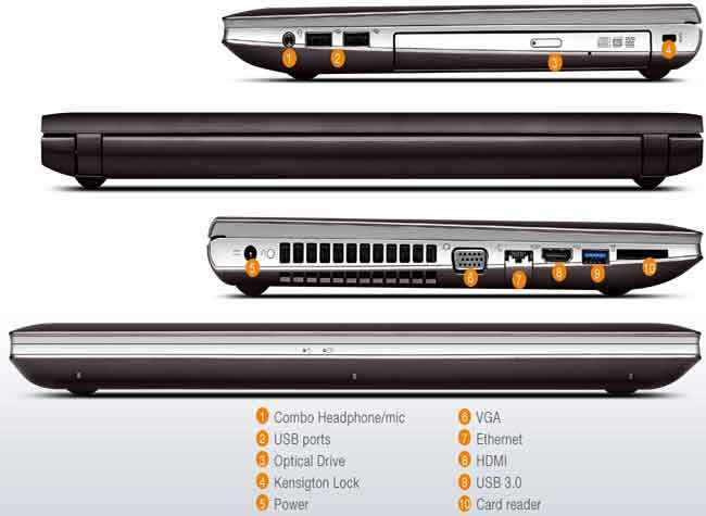
The port placement on the IdeaPad Z400 Touch is spread on the two side spines – the left spine gets one USB port, a memory card reader, HDMI out, Ethernet port and a fairly big cooling vent. The right side spine has two USB ports, the optical drive and the 3.5mm headphone jack.
The IdeaPad Z400 Touch has the same thickness throughout, but the colour themes on the spines gels well with the colour on the base, making it look thinner on the near side and thicker towards the display hinge.
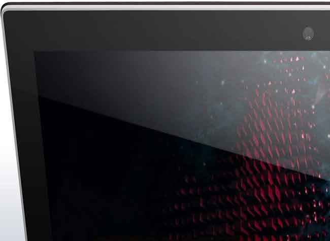
Speaking of which, the IdeaPad Z400 Touch’s 14-inch display ideally shouldn’t take this much space. But the thing to blame in this case is the rather thick bezel around the display, particularly below the display. Had Lenovo cut down on that, the laptop could have had a smaller footprint than it already has.
While the colour combination and the overall design of the IdeaPad Z400 Touch is rather simple and understated, the fact that the machine gets a non-shiny finish throughout means you don’t have to worry about the looks getting ruined by the smudges, fingerprints and dust. In fact, the brushed metal look around the keyboard looks rather neat. On the lid, the finish is almost the soft feel that we saw on the Y500. All in all, a well-built machine, that walks the path of looking universally acceptable.
There are a couple of build issues with the IdeaPad Z400 Touch though, one being the keyboard dips towards the middle, even when you may just be typing normally and not specifically pressing down hard. The second is the placement of two vents near the rubber feet on the underside. When placed on the lap, these two intake vents will be blocked, which depending on usage, could mean that the machine may heat up more and eventually the fan may become noisy.
Apart from these two issues, which are mostly with the implementation and not with the materials used, the IdeaPad Z400 Touch ticks all the correct boxes as far as the rest of the build aspects are concerned.
Power Package: Ticks most boxes
The version of the IdeaPad Z400 Touch that we got for review packs in an Intel Core i5 – 3230M processor clocking at 2.6GHz. This is paired with 4GB of RAM. The graphics capabilities receive a huge boost with the Nvidia GeForce GT635M (2GB) chip. This spec also packs in a 1TB hard drive. Windows 8 (64-bit) is the preloaded on the machine.
By comparison, the HP Pavilion m4-1003tx has the same processor, but with 8GB of RAM. Don’t be surprised if the HP machine has the advantage in terms of benchmark numbers. The m4 also packs in an Nvidia GeForce GT710M (2GB) chip, which should have relatively similar performance to the GT635M, because they are essentially on the same performance level despite different architectures.
Display: A case of two halves
The 14-inch display on the Z400 has the resolution of 1366 x 768 pixels, which is now fairly standard across laptops in this price bracket. In terms of non-multimedia use, the Z400’s display does the job very well. Good brightness levels, and while the display is reflective, that doesn’t remain an issue at brightness levels above 70%. Text is readable, and the overall image reproduction is crisp. For reading text and web pages, this 14-incher is more than comfortable. However, things do take a turn for the worse if you are considering this for media playback. At brightness levels above 60%, the contrast and the black levels don’t impress. And that has an impact on the rest of the colour gamut as well. The display test confirms that the black levels are on the lower side. For the IdeaPad Z400 Touch’s display, it is clearly a case of two halves, one that impresses and the other one that disappoints.
The touchscreen aspect is well implemented, primarily because the display doesn’t rock back every time you touch the screen. Unless you push very hard, the IdeaPad Z400 Touch’s hinge is taut enough to keep the screen in place. However, we still don’t see you using this method while using the machine on a regular basis, and could just be a once in a while, show-off thing.
In comparison to the display on the HP Pavilion m4, the IdeaPad Z400 Touch does have the advantage of being less reflective, which makes using it a tad more comfortable at brightness levels above 70% but not always at full brightness. However, the Pavilion m4 has better contrast and black levels throughout. It is a tradeoff either way, depending on what is more critical for you.
Keyboard: Better, but still a long way to go
We have always felt that Lenovo IdeaPad keyboards aren’t the most optimally designed for a quick burst of typing. The key design, with the curve at the bottom of each key, is still something that tends to get in the way of the fingers. The fact that this curve is less profound in the IdeaPad Z400 Touch’s keyboard on this machine does mean that there is a significant improvement in the overall user experience. However, a couple of things still need to be worked on. First is the placement of the Home, End, Pg Up and Pg Dn keys. This row sits vertically after the row where the backspace and the enter keys are. If your fingers are used to finding the Enter key at the end of the keyboard, this will become a bit of an issue while typing without looking down every time. Secondly, the response is still a tad too soft, and as a personal preference, we always find it more comfortable to use keyboards that offer a sharp response to every key press. However, if you do get used to the feel of the keyboard, the key response is consistent, which makes the job a bit easier.
This is where the HP notebooks, including the Pavilion m4, have a significant advantage. Those keyboards are the closest we have seen a Windows machine come to the precision and experience that a MacBook offers.
The Z400’s touchpad has a thin silver border throughout, and that is a very subtle neat element. The touchpad itself is quite smooth and responsive, and while the right and left click keys are integrated within it, they are clearly marked on the touchpad, which makes it easier for some users. While the touchpad itself isn’t very big, there is still enough space for most multi-touch gestures.
Clearly, the Z400’s touchpad is better than the HP Pavilion m4’s, because if you remember, we had criticized the inconsistent touchpad in the review. No such issues with the Lenovo machine though, and you will certainly not be reaching for an external mouse.
Performance: Smooth, but the rival offers a bit more
With the Intel Core i5 – 3230M processor clocking at 2.6GHz and with 4GB of RAM, the IdeaPad Z400 Touch is certainly up there in terms of what it can potentially offer. In terms of real world usage, the Z400 needs some major cleaning up before it actually works well. Too many preloaded utilities on the machine that bog it down and slow the startup speed as well. With something like Windows Defender already working in the background, we don’t really see the need for something like a McAfee security suite running on the same system, if you aren’t visiting shady sites on the machine. That is one performance hog done away with. Lenovo’s own bunch of utilities are – Energy Management, Easy Camera, OneKey Recovery, Power DVD10, You Cam etc., are totally unoptimized. One streamlined app that holds within it all these features would have been the best option, something on the lines of what HP has tried to do with their Support Assistant. Once you have cleaned out all the trial software and the items off the boot menu, the OS on the machine boots quickly and the overall response is quite quick. Apps open smoothly and quickly, and multi-tasking shouldn’t be an issue.
However, within the same usage scenario, the HP Pavilion m4 just seems that little better because of the better headroom offered by the 8gigs of RAM, as against the 4GB on the Lenovo Z400 Touch.
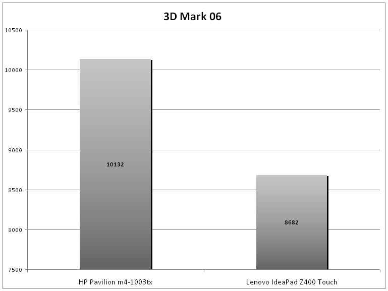
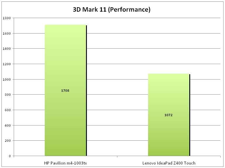
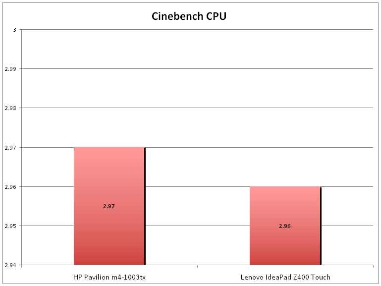
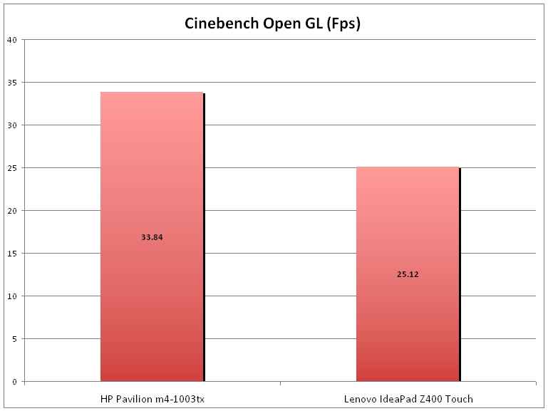
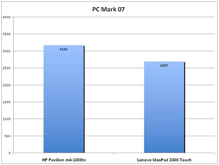
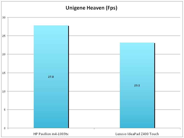
Benchmarks wise, despite the same processor, the HP Pavilion m4 scores better than the IdeaPad Z400 Touch. The primary reason for that is the extra RAM that we just talked about. To give you a better idea of how the two machines compare, we have run a series of system and gaming benchmarks.
 |
 |
 |
 |
 |
 |
Battery life is disappointing, and that is a common element between both machines. The Z400 Touch clocks just 96 minutes in the battery test. We would have been surprised, but the HP Pavilion m4, with the same processor, clocks a slightly better 115 minutes in the same test. Both machines, quite clearly, are not meant for the road warriors, or for anyone who wants good battery life from the laptop they are purchasing.
Buy or not buy: There is one alternative which is a tad better
The new IdeaPad Z400 Touch gets the expected upgrade – the touchscreen. The machine has been given an uncanny resemblance to the IdeaPad U-series ultrabooks. The performance is good, and the fairly powerful graphics can handle quite a bit of the fun stuff. However, all this excitement is tempered by the poor battery life. For around this price point, the HP Pavilion m4-1003tx seems to be a slightly better deal, though it doesn’t offer much better battery life.


.jpg)
