The Taskbar: Renovated after a decade
The taskbar is perhaps the most talked about aspect of Windows 7 — this long stagnant icon since the Windows 95 days has finally seen a significant upgrade. Windows 7 makes the taskbar more than just a way to switch between windows, it has now become a way to interact with and control the windows themselves. In my opinion, its functionality is under-hyped!
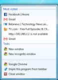
The changes in the taskbar are more than just cosmetic upgrade to square icons instead of wide tabs: the preview functionality is useful for once, and makes managing lots of open windows easier. If the preview isn’t enough, hovering over the window lets you see the active application in its own, with the other windows made “transparent.” A button on the right-most corner of the taskbar lets you take a peek at the desktop through all your windows. Finally, we have the rather simple facility of actually moving around window icons on the taskbar, and the system tray.

Applications can use the Windows 7 taskbar API to provide a wide variety of information and control via the taskbar itself such as:
- Displaying status icons (such as a available / idle / invisible etc. for an IM app, or playing / paused / stopped for a media player) on their icon on the taskbar,
- Displaying progress using a green highlight. The highlight can display the progress information published by the application, and show determinate or indeterminate progress on the icon itself. A yellow highlight can depict a paused process, and a red one can indicate an error.
- Application controlled preview. The preview image shown by an application can be controlled by the application itself, which can result in much more meaningful previews of relevant content, instead of ones of the entire window.
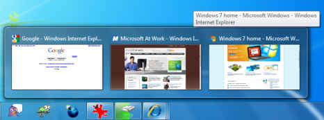
- Tabs can now show their previews straight on the taskbar, and you can use the taskbar to directly switch between, and close individual tabs from the taskbar instead of opening the window.
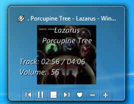
- Thumbnail toolbars are used by applications such as Windows Media Player to display information about the currently playing song in the preview of the window, and provide buttons to control playback.
.png) |
|
| Winamp taskbar icon with triangle icon overlay to depict play state | Winamp taskbar icon with square icon overlay to depict stopped state |
 |
 |
 |
| Winamp taskbar icon showing playback progress as green highlight | Winamp taskbar icon showing playback paused as yellow highlight | Windows Explorer displaying file copy error status using red highlight |
 |
| Windows 7 taskbar showing previews of tabs opened in Internet Explorer 8 |
 |
| Winamp displaying album art, track playback information, and a toolbar of available actions in preview window |
The new taskbar now also superseded the functionality of the older QuickLaunch toolbar by allowing any application to be “pinned” to the taskbar itself. A pinned application appears on the taskbar even when it isn’t running, and gets highlighted while running as an indicator. This makes working with your favourite applications even more easily, as they are now easily available to be launched in a convenient location, and furthermore it will appear in the same location where it is pinned, making working with frequently accessed windows easier.
As you can see the taskbar has grown to accommodate some of the features that were earlier provided by toolbars, and to an extent the system tray. In the current scenario where multi-tasking is becoming increasingly important, the Windows 7 taskbar comes well prepared.
