The official Twitter app for iOS got a hefty update, moving up to version 5.0. And it finally gets good enough to compete with some third party apps out there.
Earlier this year, Facebook finally got more tablet-friendly and now, it seems Twitter too has decided to bite the bullet, or tablet. Yes, the new version of Twitter – Twitter 5.0, for those who like to track number versions – is available for all iOS devices (the iPhone, iPad and iPod touch) but it really shines on the iPad.
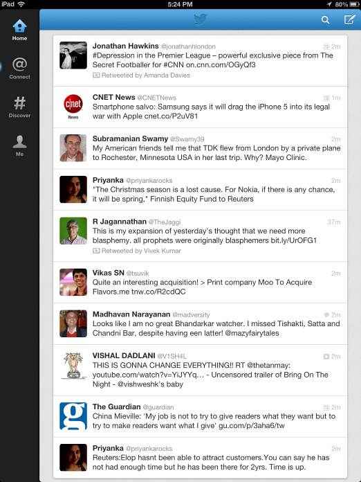
At about 9.4 MB, the app is not the heaviest, although some will wonder as to why an app for a micro-blogging service should even tip the scales at that much. Still, it picks up your settings smoothly, so if you were using an earlier version of the app, you will not need to log in. And the change in the app is evident from the moment you start using it. For, now your timeline seems to be designed to be viewed on the larger screen, with no sign of those expansive borders whose existence seemed to defy all logic of design, at least in portrait mode. The app will open up to show your Timeline, with four navigation icons on the left hand side – Home, Connect, Discover and Me.
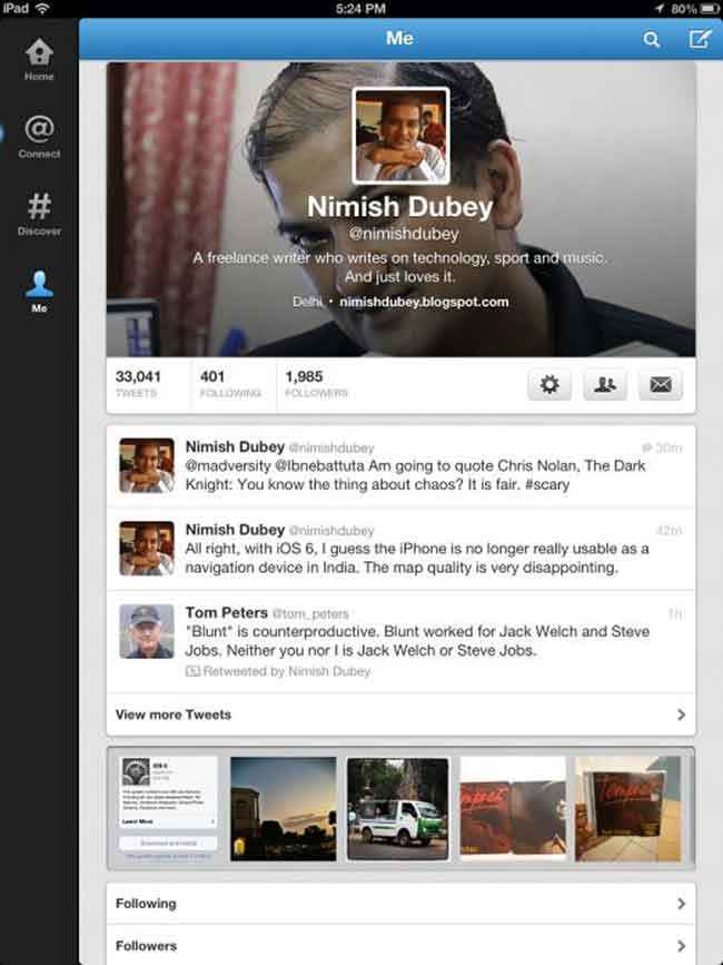
Hitting the “Me” button, shows you your Twitter profile and it is here that one of the biggest changes is the app becomes, well, apparent (pun totally unintended). For now, your profile page actually has a “cover” picture that occupies the upper part of the screen, with a smaller picture in the middle. Honestly, we would have preferred having just one picture, but we guess this format works for those who love having one picture in the foreground and another (generally some awe-inspiring landscape) in the background. Your basic Twitter information is presented just below this “cover photograph” along with icons for Settings (you can change your cover photo here), accounts supported by the app, and rather surprisingly, direct messages, which we really think merited more importance. Then come three of your most recent tweets, followed by yet another tweak – a photostream that scrolls through, showing people the images you have shared. Very neat indeed. You can then check the people you are following, those who are following you, the lists of which you are a member, tweets marked as favourites, drafts and saved searches, and finally take a look at people that Twitter thinks are similar to you. All in all, the Me section is a super summary about a Tweeter, although we are a but surprised at direct messages (DMs in Twitterspeak) being relegated to this far corner.
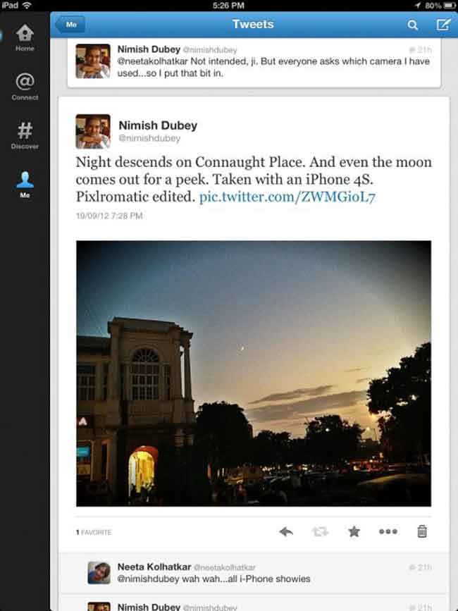
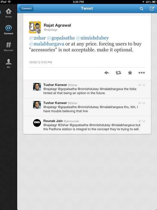
The Profile page might have got the most changes, but there are tweaks on the place where most of the Twitter action takes place as well – the good old TImeline. Tapping on a tweet now shows you the tweet as well as responses, if any, that have been made to it. And in keeping with the photo-friendliness of the new Twitter, if you tap a tweet that has a picture, the picture is shown to you in a much larger former, along with responses to it, all without opening any new windows. We wish the same had been the case with Web links – they still open in an entirely new window, which is a bit irritating. The Connect section has two smaller sections – Interactions (which include both mentions and retweets) and Mentions (which just cover tweets in which you are mentioned). The Discover section comes with information about trending subjects, suggestions on whom to follow as well as activity on the follow front by those connected to you on Twitter.
Best of all, for the most part, the app seems to work very smoothly and make the most of the large screen space that is the hallmark of tablets. Although rather eccentrically, the blank borders came back to haunt it the moment we switched from portrait to landscape mode, giving it once again a phone-y look. We were also concerned that a number of tweets, retweets and responses that we had made a few hours before installing the app just went missing and refused to show up on the app, even though they were visible on the Twitter website and on other apps. We are just hoping it’s an aberration, but must confess to being a bit surprised. Notifications work well, as does the routine task of composing, retweeting and composing tweets. We are still a bit miffed at not getting a panel for DMs though, as many of us actually use Twitter as an SMS substitute.
All in all, this is perhaps the most tablet-friendly version of the official Twitter app yet, and thanks to a very Spartan and simple interface, very easy to use, even though it is not quite as spectacular as some Twitter apps we have seen. Which in turn makes it the first one that we think we could actually advocate using if not ahead then very much alongside some very formidable third party app opposition. A must-download if you have an iPad and are a Twitter addict? Well, as it’s free and works smoothly, definitely. Now, we just need to figure out what happened to those missing tweets…
Available from: iTunes App Store
Price: Free

