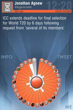
twheel tries to deliver your Twitter feed on iOS devices in an innovative way. It displays them in the form of a circle with individual tweets occupying segments, complete with indications on how important they are. It succeeds to a remarkable extent. A must-download for all ye who tweet, we think.
“Twitter – (r)evolved” is one of the lines being used to promote twheel and when you launch the app, you find out why. At 5.8 MB, it is a relatively light (GRPS/EDGE friendly) download, and while signing up, you will have to give it an additional clearance apart from the user Twitter permission. But getting back to the launch of the app – twheel presents your Twitter account as one circle with different sectors containing individual tweets of those you are following. To see a tweet, just tap the sector. The sectors are in orange colour by default but change to grey once you have tapped them – you can also rotate through sectors by dragging your finger across them, which is sort of cool, and works best when done at a slow pace.
However, there is more to twheel than a whole new interface. Look closely at the tweet sectors and you will notice some of them being partially white. The whiteness indicates just how popular a tweet has been, by taking into account the number of times it has been retweeted. You can favourite a tweet by just pulling its sector outward. To do more actions, just tap on a tweet’s sector, and you will see options like retweet and message displayed below the tweet – again in the form of a circle. To go back to the previous menu, just tap the centre of the circle.
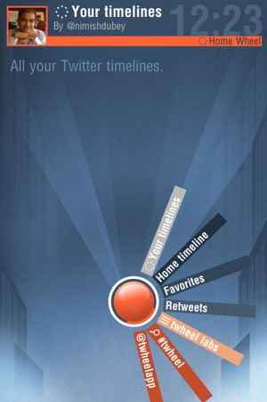
The main screen also gives you the option to send new tweets and view your own profile information, search for items, and view all your timelines (you can also do this by long pressing the centre of the circle on your home timeline or your homesceen), which is neat. What we love is the fact that no matter where you are, tapping the centre of the circle inevitably fixes things, unless you see an exit option somewhere. Yes, it takes some getting used to and we are not sure that flicking through tweets arranged in circular fashion is more convenient that seeing them in the conventional colum/row format, but we do love the ease with which one can mark favourites or even just pick out which tweets are popular at just one glance at the twitter wheel.
Our main reservation about the app is the fact that it is not really as smooth to navigate across as other Twitter apps. One has to keep hitting the centre of the circle of tweets to go back to the main screen, and that sometimes takes a bit of time. What’s more, if you are the types that follows a lot of frequent tweeeters (news sites, media people, etc.) you could find your circle divided into so many tiny segments and getting refreshed so often that selecting a single one might be a problem, especially on a handset. And while the whole “move your finger to go through the tweets” concept is cool, it is a bit laggy in execution. We often found tweets getting highlighted after our fingers had gone over them – even on a 3G connection. Also, the app has a tendency to crash, especially if left running in the background.
That said, these are early days. We cannot help but confess a liking for twheel and its innovative interface. It is still too unusual for us to use it as our primary Twitter client, but should it get smoother, it definitely could become that. In fact, even in its currently slightly rough and ready condition, it is very much in contention.
Get it from: iTunes App Store
Price: Free

