Windows 8 is a bold innovation, melding the worlds of tablets and PCs. Its excellent touch input, an app store, and better performance are compelling, but the changes will be too drastic for some and as a completely new product, a few rough edges remain.
But there’s a learning curve, and one that has and will exasperate many first-time Windows 8 users.
Users of Windows versions from the last dozen years or more will be greeted with something completely unfamiliar: The newfangled Windows Start screen, featuring Windows-Phone like tiles that display info based on the apps they represent. Touching or clicking on a tile, as you’d expect, opens the app, but it’s after this that the perplexity sets in. To really get going with the OS, you need to know a few gestures, either mouse or touch. This contrasts with using an iPad, which most people could pick up and use without needing to know about any special actions.
Still, I’d argue that the learning curve for using Windows 8 is not as steep as a lot of articles would have you believe, once you have these few tips under your hat. Much has also been made of the OS’s slant toward touch input, and it’s true that Windows 8 makes interacting with your finger on the screen a fully functional, smooth option. After a couple days’ use, I found navigating the OS nearly as fluid using mouse and keyboard, though some actions remain awkward.
To bring back a large measure of the comfort factor to longtime Windows users, one of the Start screen’s tiles, Desktop, returns them to a warm and fuzzy land—a Windows Desktop. This desktop “app” not only looks pretty much identical to the familiar Window 7 interface, but in fact lets you run any program you could run in Windows 7.
A Tale of Two OSes
This duality between new-style (formerly known as Metro) interface and apps and the traditional desktop environment is just one to be found in the new operating system. Another is between Windows 8 and Windows RT, the latter of which will only run the new style apps and desktop apps specifically updated for it (such as Microsoft Office). RT is designed for devices, usually tablets, such as Microsoft’s own Surface RT, centered on mobile processors using ARM designs. These make for lighter, longer-battery life tablets. But there are serious limitations with Windows RT, which you can read about in 6 Things You Should Know About Windows RT.
This two-in-one operating system is a radical departure from competitor Apple’s approach. The Mac and iPad maker brings its phone OS up to the tablet as a completely separate entity from its computer OS. Microsoft, by contrast, wants to bring the full capabilities of its desktop OS to the tablet. Microsoft has often used the phrase “no compromises,” meaning you get the best of both worlds, but a lot of desktop users may feel that their Windows 8 interface is compromised in favor of touch tablets.
A further breakdown of Windows 8 (not RT) is between its two main flavors—Windows 8 and Windows 8 Pro. A much simpler choice than we’ve had with past Windows releases’ edition overload. Pro adds some corporate support (joining network domains and the like) and support for Windows Media Center. This review is based on Windows 8 Pro running on an Intel-based Samsung tablet and on laptops running the same.
Windows 8 brings more than just an interface and app-running capability. It’s also a set of services, courtesy of the new Microsoft Account (which any Hotmail, Xbox, Messenger, or Outlook.com account can supply) and SkyDrive. When you log in to any Windows 8 PC, your settings, (new-style) apps, email account, color-theme choice, and more will be replicated. This eases setup when you get a new PC. You’ll also get online storage and file syncing that can be used by apps as though it were local storage. Apps and sites can also take advantage of single-sign on, thanks to the Microsoft ID login, saving you from repetitive account setups.
The Windows Store, where you acquire new-style apps, will use your Microsoft ID to keep track of your downloads and purchases, which, as with Apple’s Mac App Store, you can install on any other computers after logging in. The Store also keeps track of which apps need updating. It will list pages for old-style desktop apps, but those must be installed on the desktop and don’t get the update and multi-install features.
Before delving into a detailed analysis of Windows 8’s interface and features, let’s take a moment to enumerate what the new OS offers upgraders:
- Much faster startup time, and improved overall performance.
- New Start screen with live tiles that update with app info such as arriving emails, news items, weather, and stock tickers. Default apps are included that provide all this.
- Syncing with all your PCs through Microsoft account sign in. This capability syncs personalization preferences, Internet Explorer favorites, backgrounds, WiFi passwords and more with cloud-connected accounts.
- New App Store. The apps sold here will run on both Windows 8 tablets and full PCs. The apps will have to pass standards, and can be updated and installed on multiple PCs in your account (just as with the Mac App Store). They’ll also get the ability to connect with other apps for services like email or social network updating.
- SkyDrive cloud storage that any new-style apps can use.
- Improved battery life for laptops as well as tablets.
- File History—automated backup and versioning utility.
- Faster Wi-Fi reconnect times.
- A much improved browser, Internet Explorer 10, with far better support for the new HTML5 standards and faster performance.
- New Task Manager and more informative file-moving dialogs.
- Trusted Boot. This prevents malware from loading before the OS, on systems with UEFI boot. In general, security in Windows 8 is much tighter than in Windows 7 (though we’ve heard that song before).
- Built in Consumer apps—People, for social network contacts; Photos, Mail, Messaging, Calendar, and Video.
- Xbox Music—a free streaming music service similar to Spotify.
- Storage Spaces—Lets you easily use multiple drives as one large virtual pool of storage.
- ISO mounting. The OS can now make a disc image file appear as a drive.
You’ll get all this and more for a mere $39.99 upgrade from Windows XP and later. And don’t forget that Windows 8 runs on any hardware that can runs Windows 7. It will also be able to run any programs that run under Windows 7, unless you opt for a Windows RT tablet, which will only run (some) new-style Windows 8 apps.
Visit page two to read more about Windows 8, from the New Interface to the Cloud Connection….
Already familiar with Windows 8? Get yourself a chance to win guaranteed and exciting prizes.
Copyright © 2010 Ziff Davis Publishing Holdings Inc
Getting Started with the New Interface
When you start up Windows 8 for the first time, you’re treated to a mini-tutorial on using Windows 8 during initial setup: Simple text and diagrams show you how to swipe in from the sides of the screen (if you’re on a tablet) or to move the mouse pointer to the corners of the screen if you’re using mouse and keyboard. Once users digest these two simple gesture types, they’ve got a lot of what’s needed to operate Windows 8 under their belts.
When you first run the OS, you need to go through a four-step setup—Personalize, Wireless setup, Settings, and Sign in. Each step is very simple and uncluttered, using the readable Windows 8 sans serif Segoe font.
The choice of colors is one reason Microsoft decided to go with a new Windows logo that didn’t specify set colors. You just tap one of the 25 choices along a bar, and the background instantly changes to reflect your choice. The only other choice on this Personalize setup page is to enter a name for the device.
The Wireless setup is a matter of tapping your Wi-Fi SSID from the typical list showing signal strength bars, with an optional “Connect automatically” check box that’s checked by default. You can actually skip this step, but that will limit your Windows 8 experience. Hit Connect, and then you’re asked for a password if your router requires one. For a deeper dive into networking in Windows 8 read, Windows 8 Wireless Networking Secrets Revealed.
The Settings page of this initial setup process is more complex and text-heavy—unless you just use Express settings. That choice sets the device to automatically install updates; turns on malware protection; sends Microsoft usage data; lets apps access your location, name, and account picture, enables network sharing; and sets the localization to U.S. English. If you instead choose Customize, you are simply taken through a page for each of these choices.
Signing In
Next comes signing in to a Microsoft ID. It’s optional, but you’ll lose several benefits if you don’t. In order to download apps from the Windows Store and take advantage of the SkyDrive cloud service that stores files and photos and syncs your settings with other machines, you need to sign in. You can sign into a “local account” instead, but as I noted you’ll lose a lot of advantages of Windows 8 and apps designed to use these services. One of these is the ability to directly email from within an app, such as the Photos app—something I’ve used often.
Even after you do log in with a Windows ID, you are asked for a mobile phone number or alternate email address, about which the setup says, “We’ll only use this info to help you recover your password and keep your account more secure.” Nevertheless, it seems similar to the way Facebook tries to verify your identity.
The Windows Start Interface
After you’re done setting up and signing in, you finally get your first look at the Windows 8 Start screen. This grid-like display of brightly colored rectangular “live tiles” is where you launch any apps, control settings, and enter the more traditional Windows desktop. The tiles are “live” because they flash information from the apps they represent—Mail shows the latest inbox items, Finance shows stock quotes, and so on. If you find these distracting, luckily you can turn it all off in PC Settings | Notifications.
Speaking of Settings, one of Windows 8’s rough edges is that there are two Settings areas—the new-style Settings page accessible from the Charms, and the traditional Control Panel. And unfortunately, there’s no link from the simple settings page to the advanced panel.
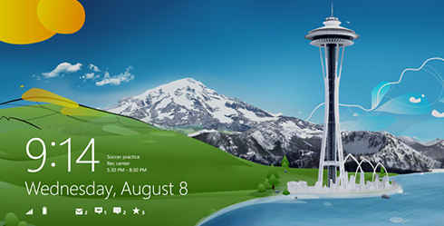
After a shutdown and restart, you’ll see the lock screen (which will be familiar to any smart phone user). On this you can see battery charge, Wi-Fi signal strength, and notifications for email and any other apps you’ve allowed. You can optionally boot from a USB stick or other external device or disc by changing a PC setting. To dismiss the lock screen and launch the Start screen, just swipe up on a touchscreen or tap any key on a keyboard or your mouse button.
Visit page three to read more about Windows 8, from the Gestures to Backup and Storage…
Already familiar with Windows 8? Get yourself a chance to win guaranteed and exciting prizes.
Copyright © 2010 Ziff Davis Publishing Holdings Inc
Gestures
A key Windows 8 concept for touch input is that the sides of the screen are for Windows, while the top and bottom are for the app you’re running. Swipe in from the right side, and you’ll see the Windows 8 “Charms”—or icons that give access to basic OS functions, including Search, Share, Start, Devices, and Settings. Using the mouse, you get to the charms by moving the pointer to the upper-right corner of your screen and down or the lower-right corner and up.
Swiping from the left edge of a touch screen or touch pad switches you to a previous running app, but also lets you pin a sidebar showing the apps content (formatted just for this space). You can easily swap the large and small views by swiping down from the top and moving the resulting smaller window. Swiping up from the bottom or down from the top opens an app’s own menu, also called the “app bar.”
Windows 8 offers an advantage over both iOS and Lion—the ability to use a swipe gesture to “snap” another running app to the side of the screen. In iOS, you have to completely switch out of one app to take a look at another. This snap action works for multiple desktop apps, too: when you snap the desktop, you’ll see a stack of thumbnails, and you can choose one to occupy the partial screen section.
Another advantage of Windows 8’s touch implementation for tablets is that you can do nearly everything with your thumbs. This makes sense for the way you hold a tablet. The gesture of swiping to show a sidebar populated with a second app works for full-blown Windows desktop apps, too. Of course, when in the desktop, you can use as many overlapping windows as you like, just as in Windows 7.
Semantic zoom is another helpful innovation. By using a pinch gesture on the Start screen, the app icons shrink, but not in the simple way you zoom out on a photo, the tiles resize to remain readable, and your groups of tiles stay together, all visible on one screen. This lets you do things like moving an app’s tile from the first to the last page without a lot of scrolling. Semantic zoom can also be implemented in apps; for example, when you pinch on the Sports app, the display condenses to a top-level menu.
Entering Text with Touch
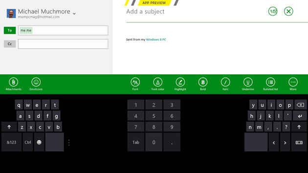
Windows 8’s on-screen keyboard springs up from the bottom of the screen whenever you touch a text entry field. It’s a very versatile tool, more so than other mobile operating systems’ equivalent. You can either use a full keyboard, a split keyboard suited to thumb entry, or stylus handwriting recognition mode. Unlike the iPad’s, Windows 8’s thumbing keyboard is resizable, with a small, medium, and large option. You also get system-wide spell correction. But I wish I could split the virtual keyboard with an unpinch gesture, as I can on the iPad.
Another input method supported by Windows 8 is pen input. In my testing, my writing was accurately converted to text. The stylus also makes sense if you want to use the desktop interface on the road without benefit of keyboard and mouse. Though touch still works on the desktop, it’s smaller controls are less suited to that type of input.
The on-screen keyboard doesn’t appear when you’re entering text in Desktop mode, but, thankfully, a keyboard icon in the system tray pops up the touch-screen keyboard. Now let’s look at what you can do with an actual keyboard and mouse.
Keyboard and Mouse Functions
Microsoft’s philosophy for mouse interaction with the OS is that the corners are key—previous versions of Windows’ Start button were in the lower-left corner, every app’s X to close its window was in the top right corner, the most important menu item was at the top left, and the Aero Peek button in Windows 7 is in the lower-right corner.
In Windows 8 you can scroll through the Start screen’s tiles simply by nudging the mouse cursor against the right side of the screen. You can also scroll the Start tiles with the mouse wheel, which I find handy.
Fans of keyboard shortcuts won’t be disappointed: Windows 8 includes a ton of very useful shortcuts, many of which take advantage of the Windows key. Hitting this by itself at any time takes you back the Start screen, and hitting it again returns you to your running app. The venerable Alt-F4 now closes any kind of Windows 8 app (as does slowly swiping to the bottom of the screen)
Of particular interest to the tech journalist is the new screen capture feature, Windows Key PrtScn. This automatically saves images of the screen to your Pictures folder. A final very useful option is Ctrl-Shift-Esc, which opens the task manager.
Visit page four to read more about Windows 8, from the Default Apps to Multi-Monitor Support…
Already familiar with Windows 8? Get yourself a chance to win guaranteed and exciting prizes.
Copyright © 2010 Ziff Davis Publishing Holdings Inc
Default Apps
Windows 8 comes with several useful preloaded new-style apps built by Microsoft, including Mail, Calendar, Internet Explorer 10, People, Photos, Maps, Messaging, Video, Music, and Camera. A few apps get their info from Bing—the slickly designed Bing app itself, News, Travel, Finance, and Sports. The last in particular shows off a couple neat Windows 8 interface tricks. A right-click (or two-finger tap on a touchpad, or swipe down on a tablet) opens the app’s menu, which now shows large, touchable buttons for each sport—NFL, NBA, MLB, and so on. It offers a simple, clear way to get to the content that interests you. Some of the included apps draw heavily from features of Microsoft’s search engine, Bing. The Travel app lets you see info on destinations, panoramas, and travel articles.
For Windows online services, you get Xbox Games, Xbox Music, and SkyDrive cloud storage apps. A new version of Skype comes with Windows 8, but I didn’t have time to evaluate it for this review. What I’ve seen of it looks good: It’s integrated with the People app, and offers live tile updates.
View all 29 photos in gallery
The Music app adds support for Xbox Music, which lets you stream a huge selection of popular music for free. Music can keep playing in the background while you’re doing other things on the tablet or PC. And if the machine slips into lock screen mode, the volume buttons bring up the music controls—pause play, next song, and so on. Similarly, you can buy or rent movies in the Video app via Xbox Video.
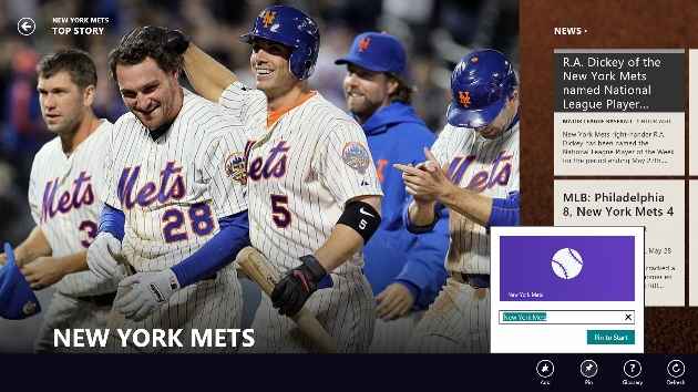
Another nifty thing you can do with apps is to pin subsections to the Start screen, rather than just pinning the whole app. So, for example, I could pin just the Mets team page of the Sports app, or just the MSFT stock symbol page from the Finance app. This lets me see important info like the team’s last game score or the stocks latest price right on its Start screen tile. The Mail app lets you pin a particular inbox, and the People app lets you pin a particular person’s updates.
Internet Explorer 10
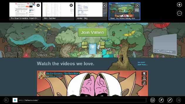
The rumors that the new-style Internet Explorer 10 browser will support Adobe Flash turned out to be true. Well, partly true. Yes, you can go to the very popular sites that make use of Flash, but don’t expect that little hotel in Eleuthera’s Flash-heavy site to work. The Flash support in new-style IE will only display sites that are vetted and approved for a compatibility list. So Vimeo, yes, but Sunshade Resort, probably not. New-style IE10 uses a subset of Flash 11.3 optimized for touch, power, and security. This means you don’t get rollovers, but this limited Flash support will work on both Windows 8 and Windows RT.
Internet Explorer, like Windows 8 itself, is a tale of two browsers, the new-style Windows 8 and the desktop version. So, even though Flash is limited on the new-style IE, its fully functioning on the desktop version. There’s also a new navigation option called Flip Ahead. This lets you swipe or the next most likely page on a Web site you’re browsing, without actually requiring you to click on the Next button or link. This feature, which echoes one available in the Opera browser, is turned off by default, so you’ll have to enable it in IE’s settings. Oh, and it’s new-style IE only, not desktop.
IE10 also improves vastly on IE9’s HTML5 support. On the HTML5Test.com site’s measure out of a maximum score of 500 based on the number of HTML5 features supported, IE10 gets 320 points, compared with 138 for IE9 and 437 for Chrome 21. The increase puts IE10 well within the realm of “modern” browsers.
Finally, and controversially, IE10 will have Do Not Track turned on by default. The feature, designed to protect consumers from being profiled by prying ad networks, is available in Firefox and Safari, but not Google’s rising Chrome browser.
Visit page five to read about Windows Store, Picture Password, and more…
Already familiar with Windows 8? Get yourself a chance to win guaranteed and exciting prizes.
Copyright © 2010 Ziff Davis Publishing Holdings Inc
The Store Is Open
Windows 8 introduces an app store, called the Windows Store, that’s similar to Apple’s two app stores for iOS and Mac OS. The Windows Store makes apps more discoverable for the users, and for the developers, it makes their apps more visible, and even lets them take home a larger cut of the proceeds than the Apple stores do.
Other advantages of the Windows store include simple one-click installation, the ability to install on multiple machines, and unified updating. This last means that the Stores tile notifies you how many apps need updating, and all the updates are handled by the Store. One advantage of the Windows Store over Apple’s stores is that it allows trial versions before you buy.
The Store also lists non-new-style Windows 8 apps, or traditional desktop apps, but the entries for these don’t include an install option. Instead, they link to the software publishers download site. Of course, this means you don’t get the multiple-installation rights and the updating you get with new-style apps. But the same hold for Mac apps you acquire outside of the Mac App Store.
When in the Store you can just start typing to search for available apps, just as you can start typing to search for installed apps when you’re at the Start screen. But unlike the Start screen, you can’t simply nudge the mouse cursor against the side of the screen to move through the store sections.
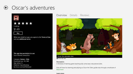
The Store is starting to fill up with apps, with somewhere around 5,000 expected at Windows 8 launch, the majority of them free. Prices range from $1.49 to $999, but the most expensive I’ve seen is a medical app called EMR Surface, at $499.99. The developers get a 70 percent share of the profits up to $25,000, after which they get 80 percent—10 percent more than Apple’s stores. Of course, there’s a far larger iOS audience of purchasers at this point, with over 200 million devices purchased–far, far more apps in the Mac App Store, too, unsurprisingly.
The Windows Store is somewhat less browsable than Apple’s stores—you have to page through the tiles to get to subsections, rather than being able to simple choose a category from a link on the main page. Another missing piece is a Web version of the store: iTunes Preview lets you read an app’s info page without having to be inside the actual store app. For a look at some of our favorite Windows Store app picks, read Eight super, free apps for Windows 8.
Picture Password
Picture password is a tablet-only option, a clever feature that saves you from having to type on your touch screen. To create a picture password, Tap Settings, then More PC Setting, and choose Users. From here, you can not only create the picture password, but also switch to a local account (without SkyDrive benefits), change your regular password, or create a 4-digit PIN that lets you quickly start, much as you can with iOS devices.
The first step is to actually choose your picture. Something with several objects and shapes is best. You then simply draw any combination of three circles, taps, or lines. You then repeat the pattern to confirm it, and, voilà. The first time I tried to sign in, my “password” wasn’t accepted, but it soon became second nature. The feature shows how deeply Microsoft has been thinking about touch interfaces, letting you log in with gestures rather than character entry. And for those worried about security, Microsoft has done the analysis that shows there are over a billion possible gesture combinations for this type of password.
Multi-Monitor Support
Microsoft has done some work on the multi-monitor support in Windows 8, and, indeed, using a two-screen setup seems ideal for one typical Windows 8 scenario: A tablet running the OS that docks into a workstation with keyboard and a larger monitor. With multi-monitor, the user could keep the Metro start screen on the smaller tablet screen, while the tradition desktop and all its business apps are displayed on the larger monitor.
Windows 8’s multi-monitor support even improves on what you get in Windows 7. You can use different background images on each monitor, stretch a wide image across them, and even play a slideshow using multiple monitors—for example one showing landscape-oriented photos, the other portrait. Windows 7 and earlier only allow the taskbar to live on one display (unless you were simply mirroring displays), but Windows 8 will let each screen get its own taskbar, either including all apps or just apps running on that display. An interesting point is that all these options are available only from the Desktop Control Panel; the new Windows 8 Controls still offer a less tunable “Project to a second screen” choice.
All of the monitors can display the Start, the Charms, or switch to other running apps by moving the cursor to the appropriate corners of the screen. You can even drag and drop new-style apps between monitors. The new Windows version also extends the sensitive area of screen corners, making it much easier to invoke the Charms or other screen-corner actions.
I tried all this multi-monitor goodness using a Samsung Series 9 ultrabook attached to a gorgeous 46-inch Samsung UN46ES8000F TV. The extended desktop image would have looked better with two similar-size monitors, and I could mix and match new-style and desktop apps on either screen. The ability to invoke the charms from either monitor was welcome, but sometimes slower than I’d like.
A little practice made this easier, but invoking the Charms or running app list does involve two separate motions. And my cursor did spill over to the left-hand monitor sometimes when I was trying to bring up the running app list. Swapping apps on the monitors was a snap with the Windows key–PgUp shortcut, but I couldn’t drag and drop new-style apps to the other monitor. I also wish you could launch apps from one screen’s Start page to another monitor, thus using one as a dashboard and the other as the work display.
Visit page six to read about the Cloud Connection, Devices, Backup/Storage, and Conclusion…
Already familiar with Windows 8? Get yourself a chance to win guaranteed and exciting prizes.
Copyright © 2010 Ziff Davis Publishing Holdings Inc
The Cloud Connection
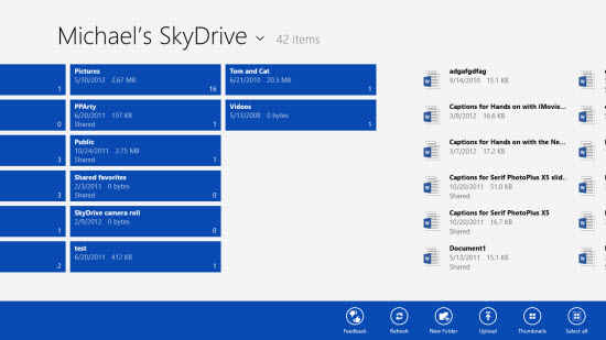
SkyDrive is Microsoft’s online storage service that offers anyone a free 7GB (25GB for longtime users). The new OS makes SkyDrive cloud storage and syncing service available to any Windows 8 app that wants to use it and that you allow to use it. The SkyDrive app itself gets a small start screen tile, and the app’s own interface uses pages of tiles. This makes sense for touch interface, but I’d like to be able to switch to a more concise list view. You can’t pinch to a semantic zoom view, but an app bar choice, Details, does offer a slightly more compact view.
Windows 8’s cloud capabilities go way beyond this simple SkyDrive app, and, indeed, you can always hop onto the more powerful Web interface of SkyDrive. The system integrates messaging and sharing throughout, using whatever communication services you’ve enabled. As with Chrome OS, when you sign into any Windows 8 PC, you’ll see all your same personalization, settings, and even apps.
SkyDrive now offers a synced folder, too, thanks to a desktop utility you can install in Windows 7. So any new or changed files in the synced folder or any of its subfolders will be accessible from any other device logged into the SkyDrive account. Unfortunately, this syncing isn’t built into the new-style Windows 8 SkyDrive app—you have to install the syncing utility in the desktop mode.
Devices
The Devices charm is accessible by swiping in from the right on a touch screen or moving the mouse cursor to the upper right corner. From here I only saw the multi-monitor setup choice, but heading to the Devices section of PC Settings let me check for new hardware and connect Bluetooth mice, speakers, keyboards, and the like. It also lets you prevent device software from being downloaded when you’re using a metered mobile connection.
When I plugged a USB memory stick into the Windows 8 PC, a notification asked me whether I wanted to use it for backup, view its files or take no action. This new type of notification for Windows 8, or “toast,” also pops in from the upper right if, for example, you have an incoming instant message. When I plugged in an SD card loaded with photos, the OS knew enough to ask if I wanted to import the photos, and even created a new Album in the Photos app for the newly imported images.
Backup, Storage
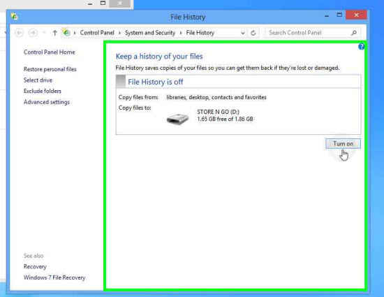
Finally, a couple of new tools that all Windows 8 users, tablet and desktop, can take advantage of: File History, and Storage Spaces. The first is similar to the Mac’s Time Machine. By default, it makes copies of your Libraries (documents, music, pictures, and videos), desktop, contacts, and favorites. File History checks these places every hour for changes, though you can set this down to every 10 minutes or up to daily.
Storage Spaces gives users who might not be comfortable with setting up RAID drives an easy way to add disk space to their systems. It creates a pool of virtual drive space that looks like a single drive letter to the user. It can also duplicate your data on multiple drives to protect in the event of a disk crash. Look for in-depth articles on both File History and Storage Spaces on PCMag.com in the coming days.
Windows 8, Before It’s Too Late
Microsoft needed to do something drastic to head off the “post PC” world. The company, (like every tech analyst) saw the writing on the wall that tablets were the way of the future. Why not leverage its billion-plus user base to get some skin in the game?
Windows 8Despite the new emphasis on touch input, Windows 8 doesn’t leave existing desktops and laptops out in the cold—far from it. If you want faster startup, a new class of lightweight, easily obtainable apps, but aren’t afraid of getting used to a somewhat different way of interacting with your computer, then upgrading makes sense. And those aren’t the only benefits upgraders will get. They’ll also get a new, simple backup and file versioning tools, better multi-monitor support, and storage spaces to ease using multiple hard drives.
Windows 8 is probably the most-beta-tested operating system ever released, and it feels sturdy in day-to-day use. And yet, it’s still basically a version one. Tablet apps for Windows 7 and Windows RT trail competitors in number, and the new OS doesn’t feel quite as polished as our Editors’ Choice, Mac OS X Mountain Lion. If you’re not comfortable with change, then this upgrade may not be for you. But Microsoft gets big points for the audacity of the release, and I do recommend the upgrade if you don’t mind a slight learning curve and want to reap all of Windows 8’s many benefits.
Already familiar with Windows 8? Get yourself a chance to win guaranteed and exciting prizes.
Copyright © 2010 Ziff Davis Publishing Holdings Inc



.jpg)
