Camera+ is one of the many substitutes for the stock iOS camera app. But which should you go for? After going through a ton of free apps and somewhat pricier camera apps, we’ve settled for Camera+, which originally set the standard for what a standalone camera app should be like. With independent focus and exposure settings, Camera+ also allows engaging the shutter with the volume button, a feature that they had to remove some years ago at the request of Apple, but it is back now. The app has a decent editing suite and a ton of export options, so you won�t feel secluded from your favorite social networking sites. Camera+ definitely is a fully loaded app, but is it worth your 99 cents?
User Interface
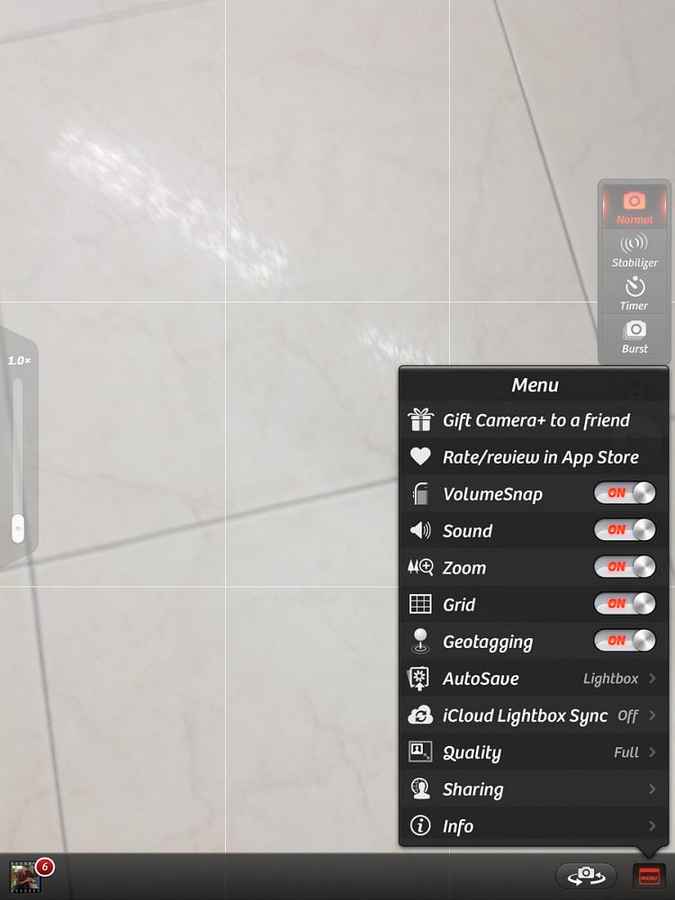
Camera is best known for having one of the simplest UI’s for a camera app that gives such an amazing set of features. When the app is launched, it takes you directly into the shooting mode. On screen, there is usual grid along with a shutter button, a settings button right next to it and a menu button to enable/disable various shooting options. The left of the screen is a little slider that adjusts how much you would like to zoom (digitally).
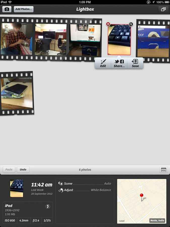
The Lightbox and the Edit window are also pretty straightforward, with each button being very clear about what it does. One of the reasons Camera became so popular on the iPhone was because of the minimalistic and intuitive user interface without compromising on features.
Features
Every bit of Camera is feature rich, be it the Shooting Screen, the Lightbox or the obvious Editing Window. The primary feature that makes Camera so much better than the stock camera is the ability to set the exposure and focus point independently of each other. This is done by placing two fingers on the screen, which creates a square box for setting the focus and a circular aperture image for the exposure. Moving the two is how the values are set and not by dialing in numbers.
We found that on the iPad, it was somewhat difficult to maneuver these two points with just one hand. Often, we ended up merging the two together, causing both the exposure and the focus to end up in the wrong place. This is even harder to do when you’re holding the iPad upright to shoot a portrait or a landscape scene. In all, if you have big hands, then you should be able to do this with some amount of ease, but those with small hands might need to get creative.
The menu for Camera allows choosing the volume buttons as shutter button, probably one of the most important options. We like it as shooting with the iPad in landscape orientation is slightly easier. The second most important feature is the ability to select whether the images shot go directly into the camera roll, stay in Camera ’s own Lightbox area (for later editing) or get saved in both the Lightbox and the camera roll. Saving directly to camera roll is good if you don’t plan on indulging in creative editing (along with saving space).
The Lightbox is sort of like a vault for images, where we could also easily decide the fate of the image we just shot. The Lightbox serves as an image gallery, or limbo, where the image either waits to be sent into the editing module, or uploaded directly to social networking sites. The interface is extremely neat and tidy, and features large, graphically simple icons for what to do with the image. The really cool thing about this app on the iPad is that thanks to the device’s extensive real estate, the Lightbox has a section at the bottom for displaying the EXIF data and location information for the photographs selected.
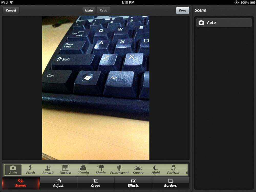
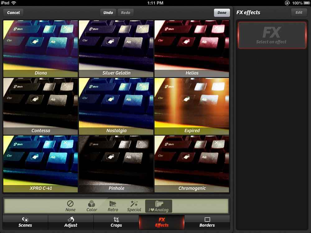
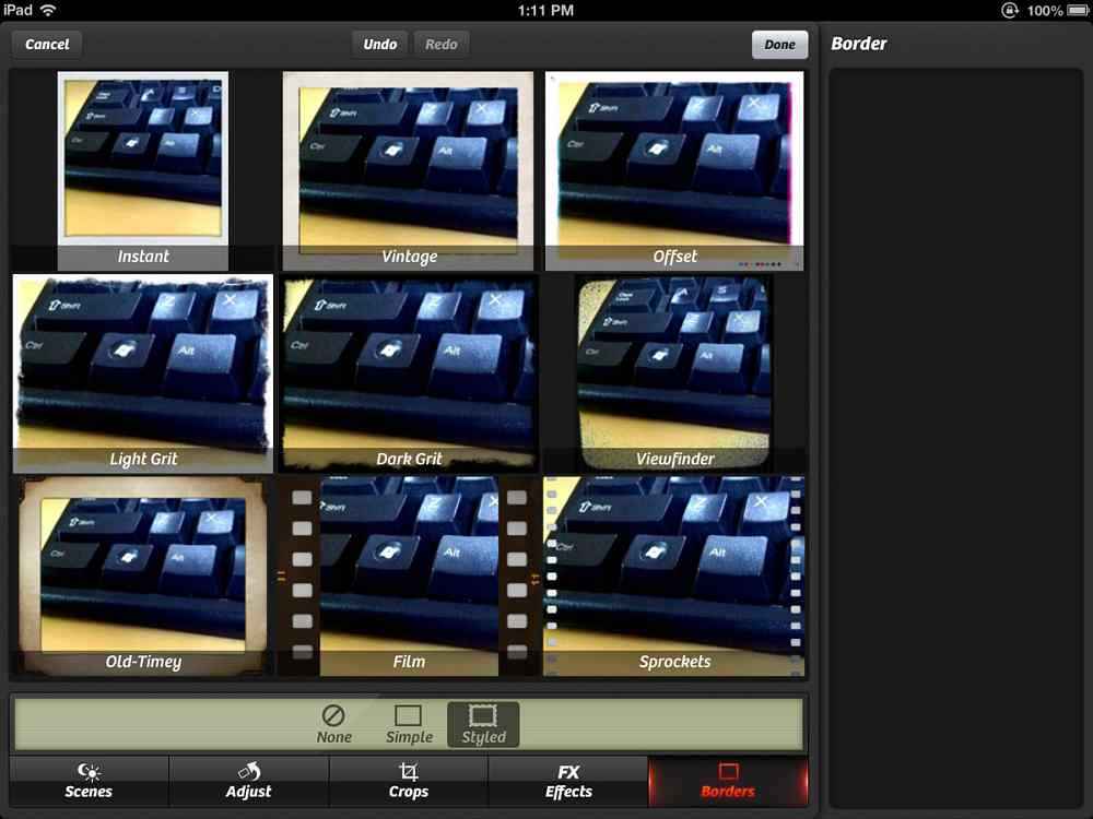
If the image is sent off to the editing module, there are several interesting features here too, while most come over from Camera for the iPhone, some are absolutely new. The suite offers five types of editing capabilities; namely Scenes, Adjust, Crop, Effects and Borders. The “Scenes” mode essentially tweaks the colors and contrast of the image depending upon what sort of “scene” the image was shot in. While the choices of scenes are aplenty, we were not too fond of the fact that we couldn’t decide how intensely the effect was applied, making it an “all-or-nothing” sort of a feature.
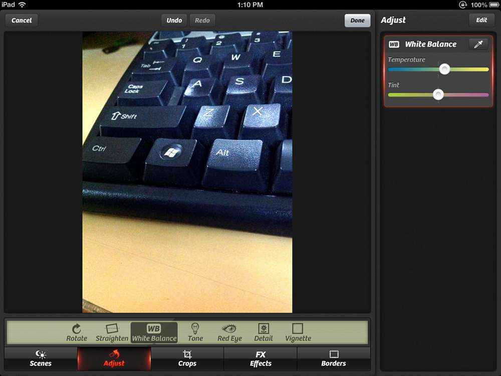
The “Adjust” menu on the iPad is where some major differences lie. The iPhone version contained options to only flip the image several ways, but the iPad counterpart offers white balance adjustment, red-eye reduction, straightening, detail extraction and vignette options. While these are all new capabilities, currently exclusive to the iPad version of the app, what is also unique is the ability to layer these effects. Layering the effects is pretty nifty and works just like layers in Photoshop, but unlike them, Camera does not allow setting specific transparency level for each layer.
The Effects menu offers 5 primary styles of effects with 9 settings per effect. Again, the amount of effect applied to the image cannot be controlled, which left us a little disappointed.
|
Effects
|
Borders
|
Verdict
After the editing is over and done with, the image is sent back to the Lightbox and from there on, the image can be exported to camera roll or sent off to social media, email or to a printer.
So, why should you buy Camera ? Not necessarily for its editing capabilities, but for the fact that it allows taking the image with the focus and exposure set independently.
There have been innumerable occasions when we’ve had our photo turn out bad because the lighting wasn’t forgiving and the stock camera app wouldn’t allow us to play with exposure much. This is where Camera excels. Then there is also a built-in stabilizer, which doesn’t actually make the camera steady, but measures the hand-shake and shows a green light when the shake is low enough to take a good crisp shot. Thought this can be a little frustrating in low light, in good light and even dusk-like light, it works pretty well.
Camera for the iPad can be downloaded from here, and the iPhone version from here, both for $0.99, which we feel is a steal for an app as versatile as this.


