Adobe Proto is definitely meant for design professionals on the move, where they may not always have access to a system. The ease of use due to gesture based control makes creating wireframes a piece of cake. At Rs. 494 it may seem a lot, but it is certainly worth your time and complete value for money, if your work involves making wireframes.
Features and Performance
As soon as you click on a new project, you are promted to select the layout grid based on the width which can range from a desktop, tablet or mobile layout. Sadly, you cannot set a custom width, which could have been nice. But you can change the pixel width of the columns and gutter.
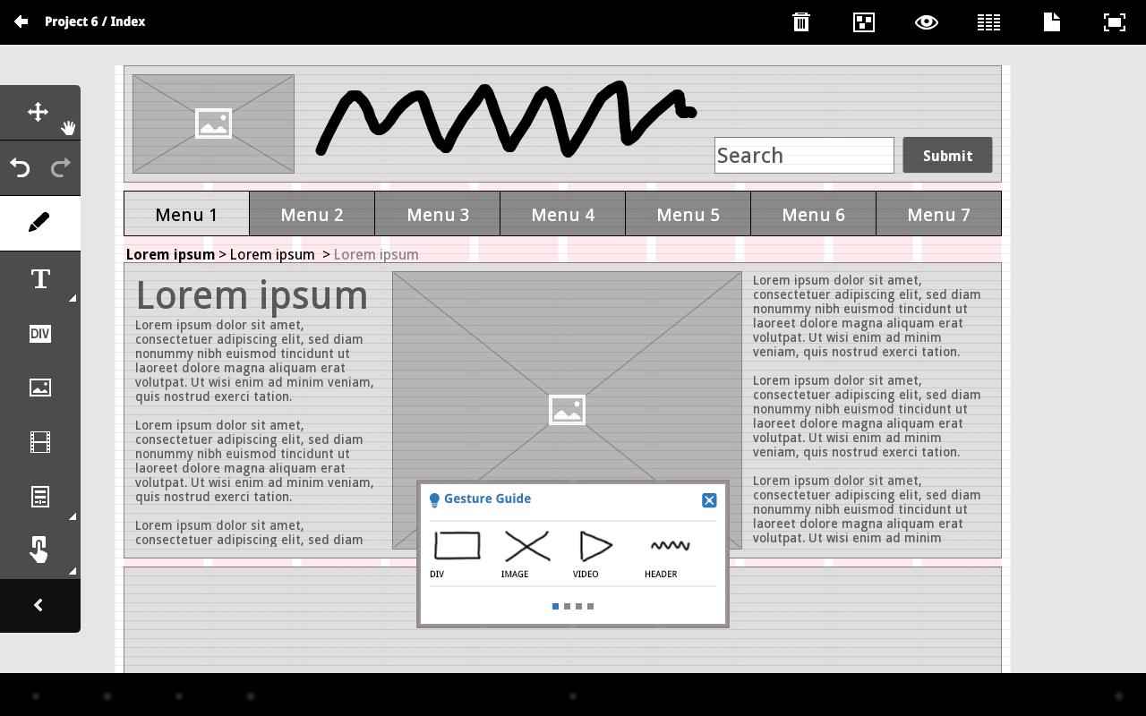
The interface is clean and only has the vertical tool bar on the left hand edge alongwith an operational panel on the top right hand.
You will have to familiarise yourself with the gestures, if you want to skip using tools for certain tasks. So let us see which gesture performs which function:
- Rectangle: it creates a box withing which you can add other elements.
- X (Cross mark): Image box
- Triangle: Video box
- Horizontal Waves: Headline
- Vertical waves: Paragraph
- Dragging three/four fingers from – top down / left to right: gives you four vertical / horizontal navigation bars
- Plus: for adding a table
- arrow: breadcrumbs
So if you master these gestures, you are left with very few elements that you will need from the Tool bar on the left. Each element has its own contextual menu which can be activated by tapping on it. Things such as navigational bars, tables, buttons, text boxes etc get their respective menus where in you can further customise the element. For instance, on tapping the nav bar, you can modify its size, the font, number of nav bars you want (upper limit is 10) etc. In a table, you can change the number of rows or columns. And so on. You can change the default text in each of the elements by double clicking on it and then typing out the real text.
Another interesting aspect about Proto is linking to pages. So say you want Home to open a new page, News to open another page, etc. The you have to link that element to the respective page, as seen above. To see the links work, you will have to go in the preview mode denoted by the eye symbol.
You do not get the option of layers in Proto, so for instance if you want text to flow around the image, then that will not happen.
After you are done with your project, it gets saved automatically and is shown in the homepage. You can send it to the Creative Cloud web server, if you plan to access this Project via some other device. All you need to do is tap on the Creative Cloud icon on the top right hand edge and upload. You can even duplicate a project and keep a backup on the cloud while you work on the original on your tablet.
Verdict
Adobe Proto is definitely meant for design professionals on the move, where they may not always have access to a system. The ease of use due to gesture based control makes creating wireframes a piece of cake. At Rs. 494 it may seem a lot, but it is certainly worth your time and complete value for money, if your work involves making wireframes.

