
We finally have recieved the Xiaomi Mi3 review unit, allow us to take you through the Mi3 in terms of looks design, some of its features and size comparison with other smartphones.

The simple brown box comes with the phone, charger+charging cable and starter guides, both of which are in mandarin and not english (atleast with the retail box that we recd)

The very first unique thing about the Xiaomi MiUI is the fact that there are no app drawers, all apps reside on the home screen. You can create folders to segrgate your apps, but otherwiise, all installed apps are spread across the home screen, similar to Apple iOS (if you were to draw a comparison)
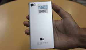
The back has a good quality silver finish, the extra smooth finish does make the phone very slippery, especially with the rounded edges, there is hardly any gripping surface on the phone. The phone feels very light and well-balanced. It is not top heavy.

The reflective screen is quite a finger print magnet.
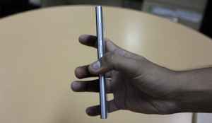
The Xiaomi Mi3 isn't particulalrly slim, at 8.1mm, it feels manaeable and the rounded edges add to the ergonomics.
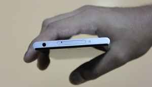
The top has the headphone jack, the phone takes regular sim cards (not mini/micro/nano). The tiny four hole grill next to the sim port is used for noise cancellation
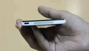
The largish speaker grill at the bottom along with the micro USB port for charging.

Size wise, the Xiaomi Mi3 is a fairly large device for a 5-inch device. We have placed the Samsung Galaxy S4, LG Nexus 4 and the Motorola Moto X (in the same sequence) for size comparison. The fat bezels at the top and bottom make the device unecessarily longer, similar to the Sony Xperia Z2/Z1. We aren't a huge fan of tall smartphones.
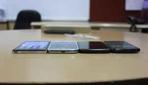
Another shot comparing the thickness of the Xiaomi Mi3 with Samsung S4, Nexus 4 and Moto X.
Xiaomo Mi3 build and design report card
Pros: Well built, quality finish, nice screen with good viewing angles, excellent touch response and super smooth glass finish for effortless swiping.
Cons: Kinda large device for a 5-inch screen size, screen is a finger print magnet.
Bottomline: For its asking price of Rs. 13999, the Xiaomi Mi3 does feel well-built and premium, for its asking price.
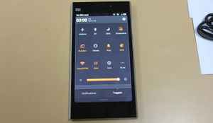
Moving on the the UI, the quick settings drawer is quite ellaborate and you can fine tune it to include/exclude shortcuts and toggles to various settings and features.
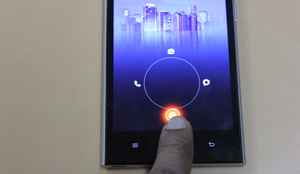
The home screen unlocking gesture gives you options to unlock the device straight into apps, you can configure them as per your wish.

Yes, you do get notifications LED and you can also choose the LED color (white, red blur, green)
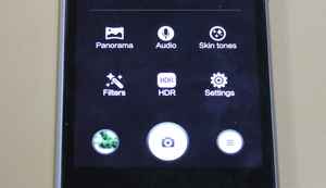
Here is the camera UI, the camera UI offers exhaustive features in terms of both presets and advanced settings for tweaking ISO, Whiteblance, etc.
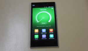
The custom MiUI offers lots of additional apps and features that deal with important areas of the device- you get an app to manage security, battery life, etc. Here you see the security app in action.