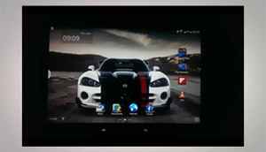
The 10.1-inch Super Clear LCD panel gets a massive resolution bump up to 2,560 x 1,600 pixels. You really will find it very difficult to find a 10-inch tablet with such a brilliant display, in terms of native brightness, crispness of text rendered and the colour richness without any particular shades popping unnaturally, one problem we always noticed on AMOLED displays. The display goes well beyond Full HD resolutions, and that makes this tablet very much future proof.
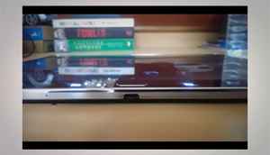
The plastic on the spines just looks bolted on as an afterthought. And the port covers over the SIM and microSD card slots feel flimsy at best.
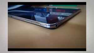
The Note 10.1 (2014 Edition) has much more compact dimensions than the version it succeeds - 243.1mm x 171.4mm x 7.9mm and weighs 535 grams. While the weight reduction is massive, generation-wise, it still is heavier and bigger than the Apple iPad Air (240mm x 169.5mm x 7.5 mm; 478 grams).
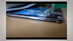
The S-Pen sits in a bay on one of the side spines, and blends in rather seamlessly.
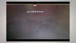
The glossy plastic has been chucked out of the window, and in comes the soft leather-like textured material. While the previous edition had a strip of chrome at the top, the latest one gets the leather-like finish throughout. Technically, this material is polycarbonate plastic, but the fact that it doesn't look or feel 'plasticky' makes all the difference. Without a shadow of a doubt, the soft finish helps immensely when gripping the tablet, something that was an issue with the slippery polycarbonate body of the previous tablet.
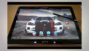
In terms of brightness levels, the Note 10.1 registers a Luxmeter reading of 1654, while the iPad Air’s 9.7-inch screen registered 1522, both at 100% brightness with the same content on the screen. And it is that base that the Note 10.1 builds on. Between these two displays, the whites look purer on the Note 10.1, and so does the text for the same content. Where the iPad has the advantage is with the slightly softer colours and the warmer tones, if one prefers that.
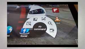
Remove the S-Pen from its bay, and the Air Command window pops up automatically. Or you can press the button on the pen with the tip hovering just above the screen. This circular command centre opens up a lot of options - Action Memo, Scrapbook, Screen Write and Pen Window.
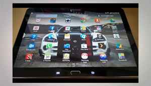
The slightly redone user interface looks very good, but the horizontal scrolling in the app drawer still remains. Icons look a lot better spaced out though, with improved utilization of on-screen real estate.
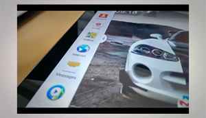
Multi-Window is one of the most interesting features in the Samsung Galaxy Note series of devices. The compatible apps show in the pull out menu, that sits on the left side of the display.