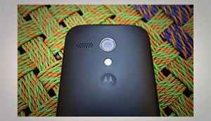
We finally have managed to get our hands on the hotly awaited (and delayed) Motorola Moto G. In this first slideshow story, we focus on the design, build, screen quality and our overall impressions of the Motorola Moto G. Over the course of next 15 slides (yeah, it’s a long slideshow), we have also compared the Moto G with Nexus 4 and Nexus 5 in terms of size and overall feel of the device. In case you guys were hoping for a comparison with other Android smartphones in the same price range, rest assured, the Moto G is evidently better in terms of design and build quality over the rest of the pack.
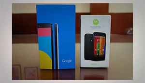
The Moto G packaging sort of reaffirms the fact that Moto G is a “budget” Android offering from Motorola/Google. The tiny box does not hold any surprises in terms of what’s inside, you just get the bare essentials with the Moto G.
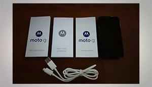
You don’t get headphones with the Motorola Moto G. The tiny box manages to occupy a starter guide, a safety guide, directions on how to open the back-panel (nice!) and a USB cable. Even the mandatory wall charger is sold separately. Motorola obviously had to cut corners to keep the sticker price low and they surely will have to ensure it stays low in India, hoping buyers will ignore the missing essentials at its price point. 10K for 8GB and 12K for the 16GB will surely rock the Micromax/Xolo boat and send the right (warning) signals to the tier-I brands.
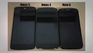
In the above image, we’ve compared the Moto G with the Nexus 4 and the Nexus 5, just to give you an indication of how tall and wide the device is. Moto G is a very comfortable device to use in terms of single handed operation and it won’t stick out of your pants, attracting unwarranted attention. That said, the size difference between the Moto g and Nexus 4 is purely statistical, in real-world usage, they are almost the same in terms of size. Though, the Moto G is carries a lot of bulk and weight compared to the Nexus 4/5 (thickness comparison in the next slide).
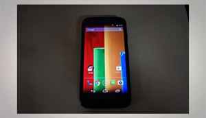
The 4.5-inch IPS screen with 1280 x720 pixels ensures that you are always staring at a sharp, bright screen. With 326 ppi, the pixel density of the Moto G equals that of the iPhone 5s. Just to put things in perspective.
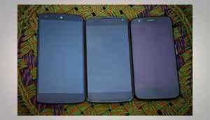
Another pic of our three favorite Android smartphones, starting with Nexus 5 at the extreme left, ending with the Moto G (on the extreme right). And, that’s the Nexus 4 in the middle.
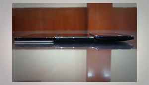
The Moto G is a fat phone. Just in case you didn’t realize, it’s the one at the extreme right of the frame. It is cleverly designed, the tapering effect/treatment towards the edges does a good job of ensuring that the Moto G does not come across as a thick, clunky and heavy Android slab. But a shot like this will expose the chubby nature of the phone. In case you are starting to write-off the Moto G, dismissing it for a “fat phone”, we’d strongly suggest you to handle the G for yourself before making that decision. In our books, the Moto G is bulky, but it still passes the muster in terms of being acceptable and putting enough efforts to hide the bulk.
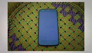
1) The front panel design is so Nexus, so Google. Flush, an all-glass front with the earphone, front camera and all sensors (proximity, light...) integrated within the one-piece unit. It looks classy, consistent.
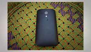
The rubberized (removable) back panel is a nice touch. While the back panel is a thin (very thin) plastic sheet, it gives a feel of solidity and looks handsome. A far cry from most of the shiny back panels found in similarly priced phones
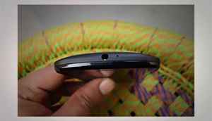
The headphone jack on top along with a microphone, the microphone on top should aid in capturing audio.

1) The micro USB port for at the bottom along with the microphone for voice communication (calls)

On the right side, you have the volume rocker and the power/wake-up button. The buttons are well proportioned, offer good feedback and sit tight (no wobble, they won’t remind you of owing a budget device)
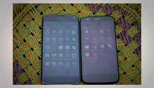
Looking at the screen visibility, under bright outdoor conditions. We compared it to the Nexus 4, a device that does an above average job under bright light. The Moto G screen is a hair (or two) below the Nexus 4 in terms of screen visibility. The red tint across the display has more to do with the quality of glass used on top and not the quality of display panel. Though, whichever way you look at it, the display certainly didn’t bowl us over with its outdoor visibility.
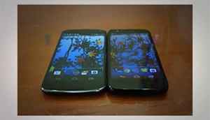
The next test is around the view angles, with an IPS display, view angles are never going to be unacceptable. You won’t find massive color shifts or ugly glares.
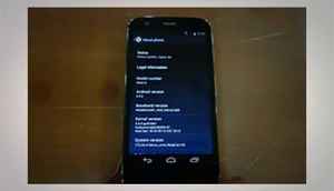
Finally, just for academic reasons, a screenshot of the Moto G running on KitKat 4.4.2
Note: Lenovo just bought the Motorola Mobility division. Yeah, Motorola just got sold...