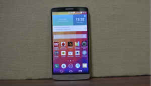
The best design is what?
The flagship smartphone market has some formidable devices right now. The Sony Xperia Z2, HTC One (M8) etc. are all very good smartphone, which perform well and have very good design. But good design doesn't necessarily mean a metal body or sleek looks. Perhaps the most important part is the phone's form factor. Flagship devices tend to be big, with screens above 5-inch, which makes the form factor even more important.
The material chosen for the body does make for a good design element, but an ergonomically built smartphone will always be better than one that has metal all over but is tough to use. There are other factors too and the LG G3 excels in this department. Here's how.
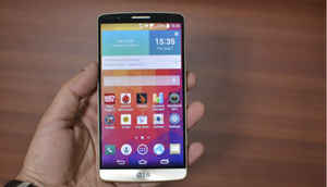
Oh so light..
At the offset, you'll notice that this smartphone is very light. With a 5.5-inch screen, you expect a smartphone should be much heavier than this. It weights 149 grams, but that doesn't tell you the real story. The LG G3 feels comfertable in the hand and in the pocket. It is not as light as the iPhone 5S, but there are many that are smaller than this but much heavier.
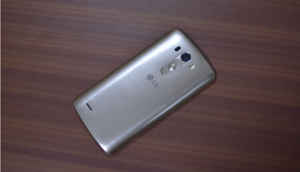
Brushing past metal..
Next is the brushed metallic finish to the LG G3. Don't get me wrong, this is not a metal body, but you wouldn't be able to say that by looking at the phone. LG has developed a special film, which takes away the plastic feel of the smartphone. Would I have preferred a metallic finish? Yes. Do I mind what I have? Definitely not.
Also, it holds up well against keys and some other material. The plastic has also allowed LG to make the back removable, which is one of the better things about the Samsung Galaxy S5. This means you can remove the battery and the SIM and micro-SD go inside.
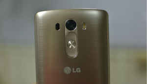
Back buttons..
If you're not used to the rear buttons that LG introduced with the G2, you may find this a little cumbersome. But, once you do get used to it, you will find it very useful. What does this do? It adds to the ergonomics, if only by a little.
The fact that the buttons are at the back means that you don't have to change your grip to press them. So, your phone is less prone to fall out of your hand because someone happened to bump against you while you were doing something with the buttons. Like I said, it's a small thing, but that's how close the competition in the market is right now.
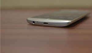
The curve..
One of the reasons I like the Moto X is because of its curved back. I think that makes the phone very comfortable to use. The same goes for the LG G3.
Let's face it, this phone is big and it's not exactly meant for single handed usage. But the curved body makes it that much easier to use with one hand. Also, it gives you a better grip over your device.
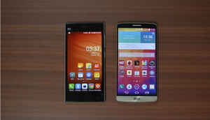
Bezel'led'
Here you see the LG G3 placed next to a Xiaomi Mi3. While the former is a 5.5 inch phone, the latter has a 5 inch screen. Still, you would notice that the G3 is almost the same size as the Mi3, albeit wider. But how is that possible?
Look at the bezels. The slim bezels that the company has kept on the G3 allow it to keep the phone small, even with a bigger screen. You wouldn't complain if your Quad-HD screen is wide, but you would if your phone itself is huge.
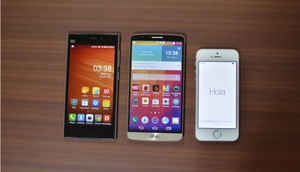
Amongst the best..
Here you see the LG G3 flanked by the iPhone 5S on the right and the Xiaomi Mi3 on the left. There are other flagships, like the Sony Xperia Z2, Samsung Galaxy S5 and others, which lay a claim on the consumer's pocket. But in terms of form factor none of them got everything right, while LG came close, very close.
The iPhone 5S has too small a screen, while the Xiaomi Mi3 should have had a smaller overall size. The Xperia Z2 again feels a little big and heavy to me and the Samsung Galaxy S5's perforated leather back doesn't make it look premium.
Without trying to sound biased, amongst the flagship smartphones that we have right now, the G3 probably has the best design that you can find. The screen is a little too wide, but then, no one's perfect.