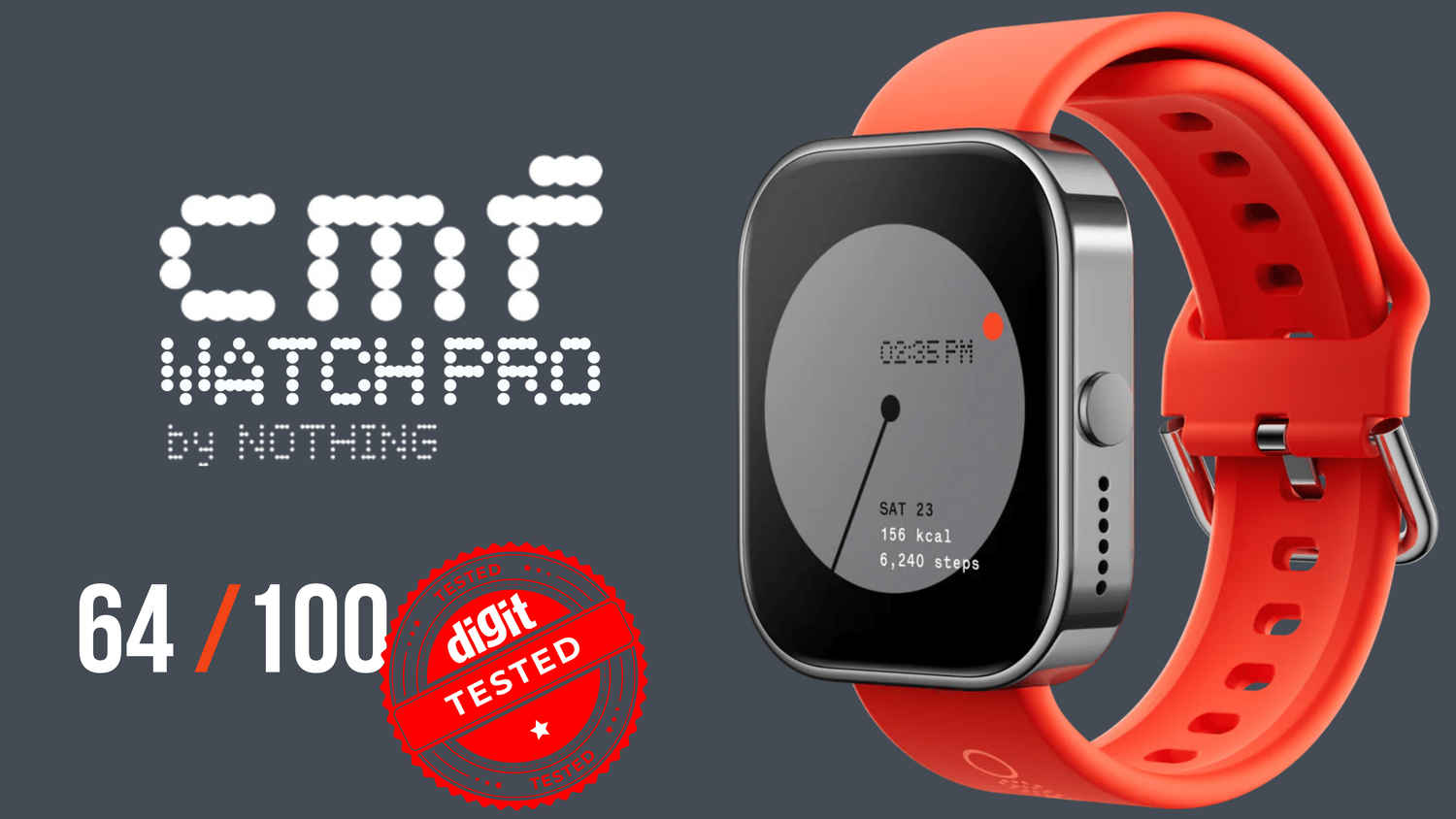
cmf Watch Pro review – Caution: Work in Progress
- Great app design
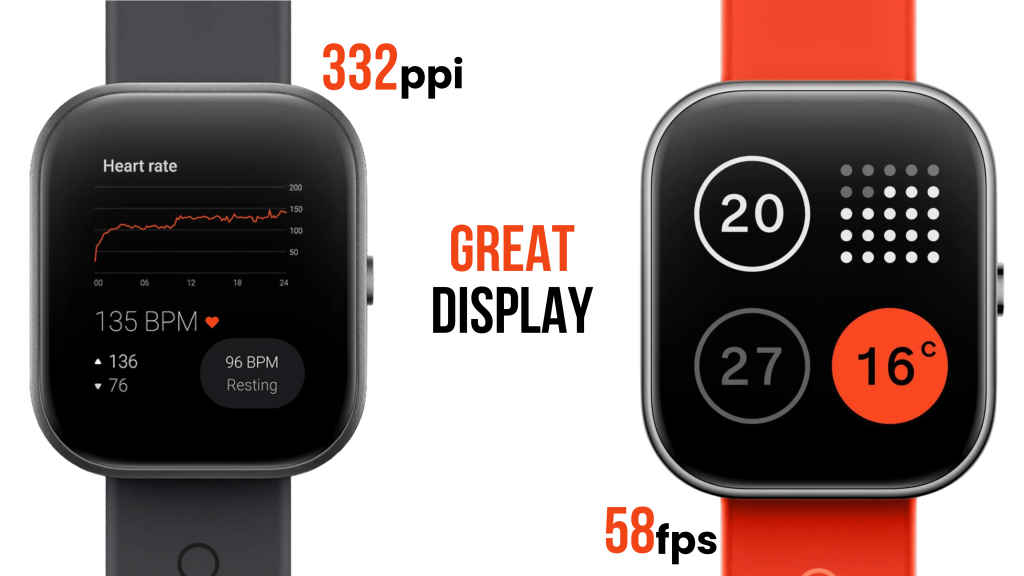
- Good display and visual aesthetics
- Sturdy and hefty build quality
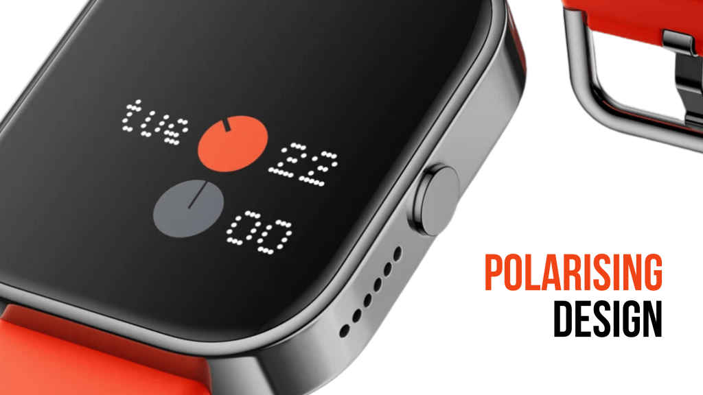
- Polarizing design language
- Low step tracking accuracy and Calorie count
- Low haptic intensity
- Underwhelming specifications for price bracket
The cumbersome (yet sturdy) strap design, broad bezels and thick body could be a somewhat polarising design aesthetic for users. The cmf app – while slick-looking, in Nothing’s traditional minimalist style – seems to sacrifice some practical detail for the sake of minimalism. The overall performance of the Watch Pro is also strictly mediocre, for the most part. All in all, the cmf Watch Pro feels like an open beta prototype, rather than a finished product. It’s a decent smartwatch on a budget, but considering its competition, it still leaves a lot to be desired. Nothing to write home about, really.
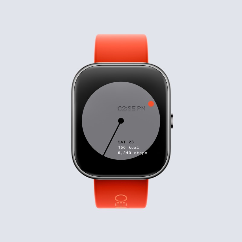
Colour. Material. Finish. In industrial design terms, “CMF” usually denotes the chromatic, tactile, and decorative character of products. We’re not 100% certain that that’s what Nothing had in mind when its new sub-brand was founded. However, take one look at the cmf Watch Pro’s premium-looking bright orange strap and chrome body, and one can definitely hazard a guess.
Features
Straight out of the box, the Watch Pro comes with a fairly standard set of features seen in most smartwatches.
There’s a 1.96-inch AMOLED screen that sports a 410 x 502 display with 332 PPI and a 58 FPS refresh rate. It comes with a removable 22 mm silicon wrist strap in bright neon orange. Its 340 mAh battery is charged with a proprietary charging cable (comes in the packaging) and advertises an impressive 13 days of typical use, and claims 45 days when in power saver mode.
The cmf Watch Pro comes with an IP68 rating along with 110 sports modes, 24-hour heart-rate and blood oxygen monitoring. It also monitors your sleep, stress and reminds you to stand up and drink water regularly. Sporting Bluetooth v5.3, the watch can take calls via Bluetooth; and though the advertised AI noise reduction of its built-in mic isn’t the greatest, it’s nice to have.
All-in-all, the watch comes with some good hardware and like we said before: a fairly standard set of features we’re used to seeing in smartwatches from the budget segment.
Build & Design
The cmf Watch Pro balances a rugged build with what can only be described as a polarising design. People who like less flashy, sober designs may find themselves detesting the shiny frame, wide bezel and neon orange strap, which screams ‘I’m right here. Look at me!’
Personally, while the wide bezel and chrome frame did feel a bit dated – as did the rather large speaker openings and the early 2000s silver button – the overall look and feel of the watch didn’t bother me, as such. The out-of-the-box strap also has an unusual design. While I quite liked how secure it sits on my wrist, others in the office did find it cumbersome to put on.
The watch weighs in at about 47 grams, which is a tad heavier than other smartwatches in its category. Its sleek AMOLED display is protected by a tough glass panel. Its aluminium alloy frame and hard plastic back have a reassuring sturdiness to them. Despite its slightly heavier build, the build of the watch does allow you to comfortably use the watch in day-to-day activities without worrying about damaging it.
To be honest, I was worried about how well its IP68 rating would count for, considering those really large speaker holes. However, after using it for over a month – through regular exercise, hand-washing and showers – the watch held its own, as did its speakers.
Performance
In terms of performance, the cmf Watch Pro did a strictly decent job, considering its price point and segment. Its heart rate, step count and SpO2 tracking accuracy matched up to the best of our testing standards. In fact, in terms of SpO2 tracking, the watch did a better job than some premium smartwatches. Its 14-day (ish) battery life is also higher than most smartwatches in the market today, which is a definite plus.
Its health tracking did leave a lot to be desired, though. Its calorie tracking falls short. The watch displayed a 65.51% accuracy in our 2 km walking tests. Considering the Hammer Conquer (our Zero1 Best Buy winner this year) manages a 75.81% accuracy at a price point that’s 40% lower than the cmf Watch, this does seem like something the brand may want to try and improve upon.


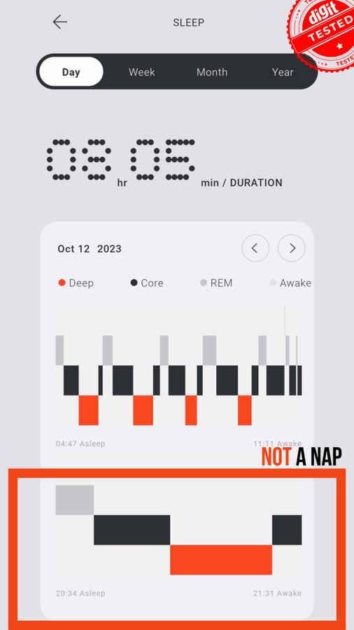
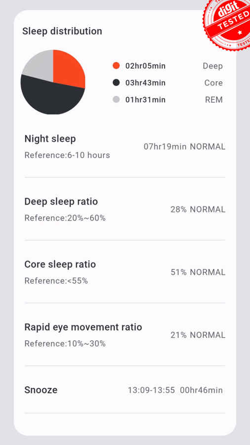
Sleep tracking was problematic and erratic. This could be due to the teething pains that new products usually face, but at the time of testing the watch (which is about two months after launch) the watch wasn’t very good at tracking sleep. Some of these issues are app UI based (which we’ll double back to in the next section) but there were a few times when I took the watch off and kept it on a table for an hour or two here and there, which the watch promptly logged as short ‘naps’ – which did seem like a glaring problem for anyone who uses their smartwatch for regular sleep tracking.
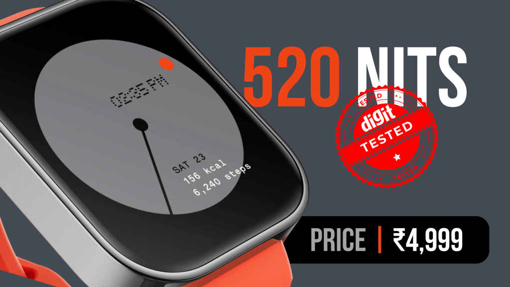
Additionally, the watch’s display also tested a maximum brightness of 520 Nits, at least 80 Nits lower than the brand’s claimed brightness of ‘600+ Nits’. However, compared to other watches in the segment, 520 Nits is still quite bright.
I should also mention that the cmf Watch Pro’s haptic intensity felt somewhat dull. This shouldn’t be a problem for most people; the watch’s notifications and alerts catch your attention most of the time. But if you’re someone who uses their smartwatch as a morning alarm, you would find the cmf’s vibrations to be on the gentler side of things. There is an audio alarm, though, that could make up for this drawback.
App UX/UI
Having gone through multiple smartwatches in my search for something that stands out, I do think that having a well-designed companion app does improve the overall experience of the smartwatch. For an empirical mind, it’s important to have detailed data that’s efficiently presented; and equally easy to both pore over and glance at. Simply put: a smartwatch’s app should sport a clean design and easily accessible data.
To this end, the cmf Watch App is slick and neatly designed, following Nothing’s now-recognisable dot-matrix aesthetic. The app’s elements are in shades of white and grey, with a dash of orange to highlight important bits of information. Users who prefer a dark UI may find themselves disappointed, but you can’t disregard the app’s look and feel. It’s beautifully minimalistic and very intuitive to use.
And yet, the attempt at staying minimalist occasionally takes away from a few features that people may consider important. For example, when sleep tracking, one can see when they have woken up during the night, but the app doesn’t let you see exactly what time you’ve been awake. Which is important for people tracking their sleep patterns and trying to figure out what’s disturbing their sleep. Similarly, when checking historical data, there isn’t a convenient way to jump to a date. One needs to manually tap their way back day by day to get there – storage of historical data does seem to be negated by the sheer inconvenience of getting your hands on it.
Should you buy the cmf watch Pro?
That’s the loaded question, isn’t it? Looking at the budget smartwatch market today, I wouldn’t say that buying the cmf Watch Pro is the smartest choice. The brand may take another iteration or two to really crack it (if history is a good judge of patterns) but as of now, it’s not there yet.
Based on the reactions to the watch that we’ve been seeing online, most of the reviewers who are really praising the watch as a breakthrough for its price tag operates in markets where most ‘budget’ smartwatches available find themselves in higher-priced segments. Maybe I’m over-analysing here, though. It’s entirely possible that some people are just easily enthralled.
Don’t get me wrong, here in India, the budget smartwatch segment has its share of underwhelming performers. However, when you’re spoiled for choice, the law of probability says that you would undoubtedly find a larger share of diamonds in the rough. And it doesn’t really help the brand that its first budget smartwatch is priced a couple of grand higher than most of its competition.
Tl;dr? Having weighed its features and performance, if you’re looking for a budget smartwatch that does a good job tracking your fitness and looking smart on your wrist, we’d be more comfortable directing you to something like the Hammer Conquer or the Redmi Watch 3 Active over the cmf Watch Pro – at least in the Indian market.
Verdict
To summarise: the cumbersome (yet sturdy) strap design, broad bezels and thick body could be a somewhat polarising design aesthetic for users. Additionally, the cmf app – while slick-looking, in Nothing’s traditional minimalist style – seems to sacrifice some practical detail for the sake of minimalism. The overall performance of the Watch Pro is also strictly mediocre, for the most part. All in all, the cmf Watch Pro feels like an open beta prototype device, rather than a finished product. It’s a decent smartwatch on a budget, but considering its competition, it still leaves a lot to be desired. Nothing to write home about, really.
cmf Watch Pro Key Specs, Price and Launch Date
| Release Date: | |
| Market Status: |


