Oppo F3 Review : Selfies, anyone?
The Oppo F3 is an average smartphone, except in terms of selfies, where it excels. It’s not the best phone overall, with the Moto G5 Plus, Xiaomi Redmi Note 4 and some others being better overall performers.
All this is done on the back of a few phones, of which, the Oppo F3 and F3 Plus seem to be the forerunners. There are other phones in the company’s arsenal as well, but at the moment the company’s focus seems to be on selfies. Not just Oppo, other Chinese OEMs such as Gionee and Vivo are also ringing the same selfie bell at the moment, with large and wide advertising campaigns. Now, whether you want a selfie centric phone is up to you, but in our books, a phone should be more than just selfies, and while the Oppo F3 Plus did impress us, we are yet to see whether the smaller Oppo F3 can retain the same charm.
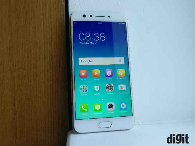
Selfies: Dual-camera, doubly good?
The Oppo F3 Plus was the best selfie centric smartphone we tested this year and the Oppo F3 tries to imitate it. There is a similar 16MP + 8MP dual camera setup at the front for solo and group selfies respectively. Like the F3 Plus, the 16MP camera here has 76.4 degree FOV and the 8MP camera has 120 degree FOV. Even the f/2.0 aperture is kept the same. That said, there are differences in the camera quality. The F3 tends to shoot slightly oversaturated colours, whereas the colour captured by the F3 Plus are nearer to being neutral. However, quality of overall images, including details, dynamic range and depth of field, remains almost at par, with the F3 Plus edging ahead in some pictures.


On its own, the Oppo F3 has good details, colours are pleasantly oversaturated, and noise is kept to acceptable levels. Photos are slightly soft, to remove skin blemishes and make selfies look better, but whether you like that will be a subjective opinion.
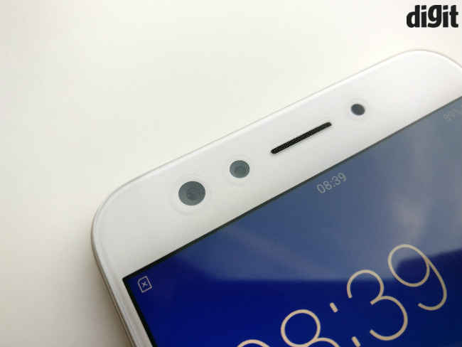
Compared to the Gionee A1, which has been the best phone for selfie aficionados available under 20K, the F3 is better. The Oppo F3 not only captures better details and colours in normal lighting conditions, but does a better job overall in low light as well. Photography enthusiasts may still find images lacking proper details and softer focus is somewhat annoying. But, at the end of the day, the Oppo F3 is now best selfie smartphone in the sub-20K range. There are some niggles, like the camera occasionally takes a little time in post processing when you are taking bokeh images or when switching between various filters, but these things are not really deal breakers.
Primary camera: Good, not great
At the back, the Oppo F3 uses a tried and tested 13MP sensor, which takes good pictures for the most part. I observed decent colour reproduction and dynamic range, but softer photos, that seem to be produced by the same algorithm as the selfies. In the case of the rear camera, it’s more of an issue though.

This also means that while images look fine on the phone or even on a laptop display, one can easily see noise at native resolution (4160 x 3120). The noise levels rise further in low light, but images are good enough to share on Facebook. Yes, there are phones with better rear cameras at the same price, but this is amongst the better ones too.
Images taken by the Oppo F3
Build and Design: Smaller, yet the same
Oppo has always followed a pretty decent design language and build quality, and that doesn't change with the Oppo F3. However, compared to the F3 Plus, the build quality does feel a bit inferior. The F3 Plus was built with more finesse and polish.

That being said, in the sub-20K smartphone bracket, there are only a few phones that are better built better, with the Xiaomi Redmi Note 4, Gionee A1 and Nubia M2 Lite being perfect examples. The Oppo F3 is slimmer and lighter than the older Oppo F1s, putting it at par with most selfie phones it competes with. Now, one may complain that the phone looks like the old F1s or like any other phone in the market, and they won’t be wrong. Unfortunately, Oppo seems to be unwilling to innovate on its design. The Oppo F3 is good looking, but not new.
Display: Nice!
The Oppo F3’s display is truly nice, and that’s about as vague as you can get about it. The fact is there’s nothing really special to be written about this display, but it’s not something to be trifled with either. In practical terms it has has vibrant colours, good touch response and very good viewing angles. If you want to go into numbers, it is a 1080p in-cell IPS panel, and it’s one of the best in the business.
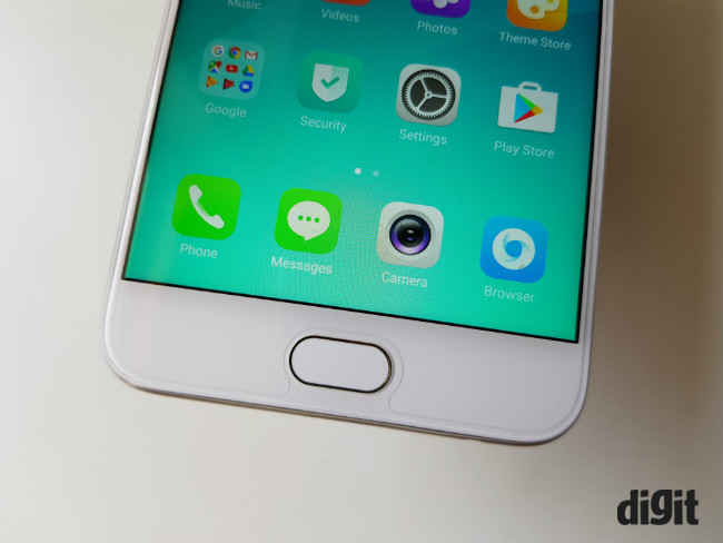
That being said, it could have been better too. The colours are not as vibrant as the Gionee A1’s AMOLED display, although it has higher resolution and at 765 Lux, feels brighter. I would also like to point out that the auto-brightness is well calibrated and there is a blue light filter as well for people who read or browse at night.
UI: iOS inspired
Nothing has changed from the last time we saw this UI. It is the same ColorOS 3.0 as the one we saw on the Oppo F3 Plus. Layered on top of Android 6.0 Marshmallow, which is the first misstep anyway. After all, why is a phone in 2017 still using a two-year-old OS? Yes, the industry at large is doing it, but that’s only a sign of OEMs taking advantage of lack of consumer awareness.

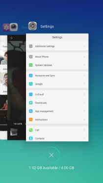
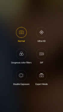
Other than that, ColourOS looks and tries to function like iOS. It’s easy to understand and quite colourful. For the convenience of familiarity, the icons designs and the settings layout is very similar to iOS. However, the quick toggle menu is still a drop down from the top. Oppo has also included gestures and things like app cloning so that one can easily make use of dual SIMs to use dual Whatsapp accounts for example. There is a theme manager, a RAM booster app, lock-screen magazine feature, cloud backup and a secondary app store. The UI also offers a set of simple yet good looking apps for music, videos, clock, photos, weather, file manager and even email.
Performance: Lacking the punch
Under the hood, the phone is powered by a MediaTek MT6750T SoC, which is paired with 4GB of RAM. Now, this SoC has been around for more than two years and has been used by more than a dozen smartphones, some of which are as inexpensive as Rs. 8,000. The point is, it is not a very performance oriented SoC and that shows here. While the phone can handle almost all kinds of apps, one notices occasional stutters and sluggishness. This became quite apparent when I tried gaming on the phone. Games like Asphalt 8 ran at below 30 fps, while those that weren’t capped to 30fps, were usually getting as far as 40-45fps. It’s not particularly unplayable, but the experience is sub-par to say the least. You see lags and frame drops often.
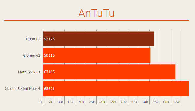
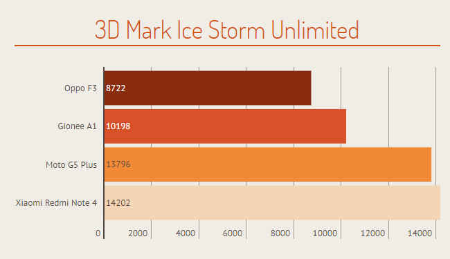
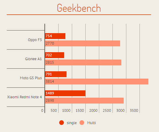
There were also occasional app crashes and the camera app sometimes takes a little more time to take a selfie, which is supposed to be the prime feature of this phone.
On the other hand, call quality is decent and audio volume via the single speaker at the bottom is adequate. But, like every other smartphone in the same price bracket, audio quality is nothing worth writing home about. Via headphones, the phone really shines and offers good overall output.
Battery: Just enough
The 3200mAh battery on the phone can keep up with even the heaviest users and would last a normal work day easily, with at max 30 minutes of gaming. If you are not into gaming or don’t use navigation that often, the phone will definitely last you more than 12-15 hours in a day. Once you put it on charge, the phone gets fully charged under two hours and does not support any kind of fast charging, including Oppo’s own VOOC charging technology. It seems VOOC is another feature the company is reserving for its flagship devices.
Bottomline: For selfies only
To sum it all, the Oppo F3 takes the best selfies of any phone under Rs. 20,000. However, it’s not a very good overall performer. Consider it for selfies, but the Moto G5 Plus, Xiaomi Redmi Note 4 and the Coolpad Cool 1 are better overall performers.
Hardik Singh
Light at the top, this odd looking creature lives under the heavy medication of video games. View Full Profile

