Xiaomi reveals MiUI 6, boasts of a flatter design but UI appears similar to iOS

The new version of MiUI follows a flatter design philosophy. While many might see an uncanny resemblance to iOS, the new UI also seems to sync with upcoming Android L's flatter and simpler UI design language.
Chinese smartphone maker Xiaomi has found itself in the news for a lot of reasons lately. From inexpensive smartphones with great performance to impressive UIs to "spying" on users, Xiaomi has been all over the place. MiUI though is one of the more interesting talking points about Xiaomi and we, like many others, have been interested in when the next version of the UI would come. Well, it’s out. Xiaomi has announced the next version of its UI, MiUI 6, bringing some interesting elements. Company VP Hugo Barra also confirmed to us that the MiUI 6 is currently under the beta program, with quite a few users from India. He said that the UI would come to all of Xiaomi's international market at the same time later this year, with the exact timing to be announced.
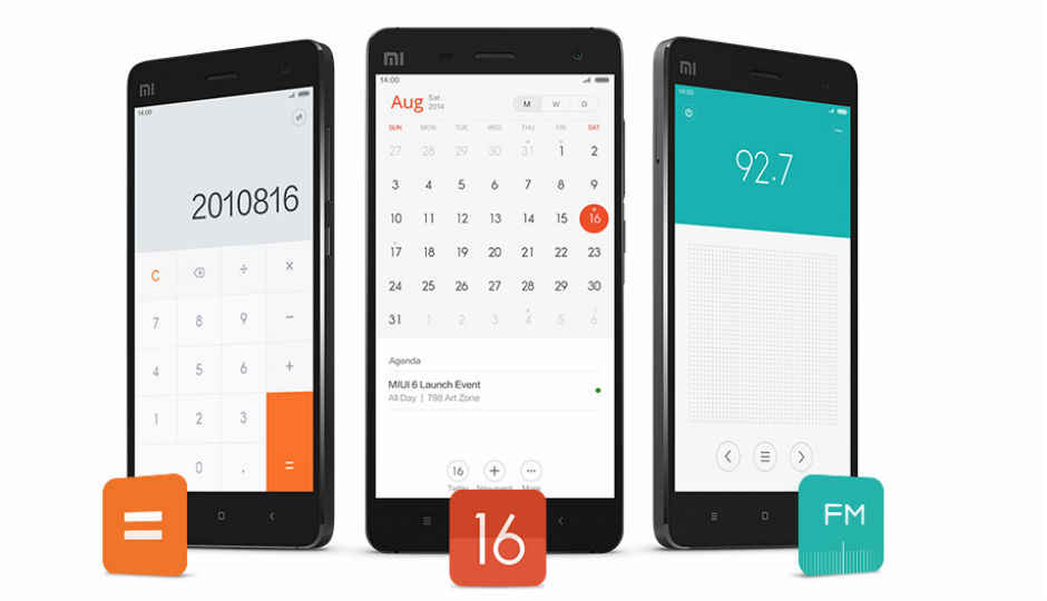
Xiaomi’s new UI sports a flatter and more minimalistic design and is quite different from the current MiUI 5. In fact, the new version of the UI looks a lot Apple’s iOS 7 in many places, while having its own personality as well. The company seems to be drifting a little bit towards a flat design from skeumorphic one. This is seen in the clock and calculator app, which have lost their real-world design elements. Also, the camera app has been made simpler, removing the bars on the top and bottom of the screen.
Perhaps the biggest change though, has been made in the dialler app, which now shows called IDs and allows you to dial your service provider’s customer care number without having to deal with automated messages. There are also 'Do Not Disturb' notifications for calls and messages, which pop up when you’re working with some other app. The lockscreen will now show users the number of pending notifications, with the option to drag up on the number to go directly to the desired app.
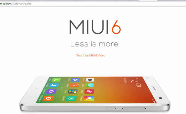
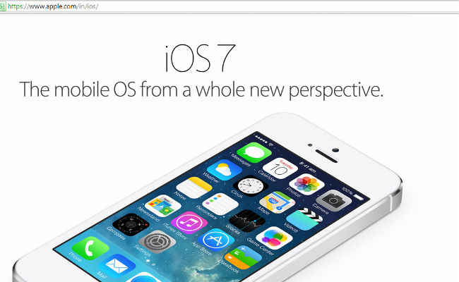
Xiaomi MiUI6 website (above) and Apple iOS 7 website (below).
Coming to the Apple comparison, what is really interesting is how the MiUI 6 website looks almost exactly similar to the iOS 7 website. The new OS does take cues from the iPhone maker’s OS, but still has a personality of its own. It is currently under developer testing and should come to Xiaomi devices like the Xiaomi Mi3 and Mi4, within a few months.
More than the fact that the new interface looks a lot like iOS 7, it is worth pointing out that this could be a sign that Xiaomi is preparing for Android L, which also has a somewhat flatter UI design.


