
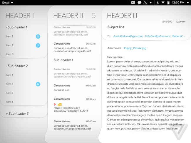
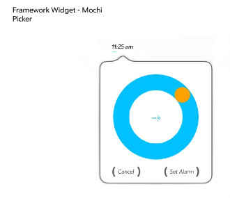
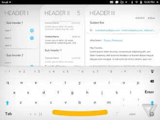
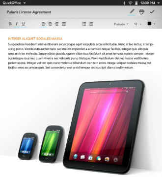
Mochi, the interface being worked on by the WebOS team, uses a lot of design elements that have now become popular in mobile operating systems.
WebOS always had a lot of promise, so much promise in fact that HP described it as one of the prime assets when it acquired Palm in 2010 for $1.2 billion. Unfortunately, the mobile version of WebOS remained an unfulfilled dream and was only used in a handful of unsuccessful devices including HP’s hyped TouchPad. Since then, WebOS was sold off to LG, which is now looking at the OS to power its line-up of smart TVs with nary a word of a future in mobile.
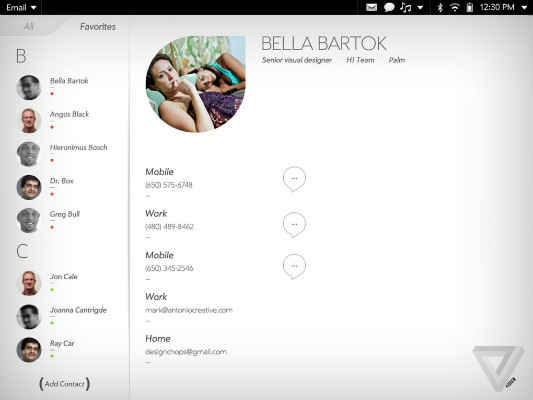
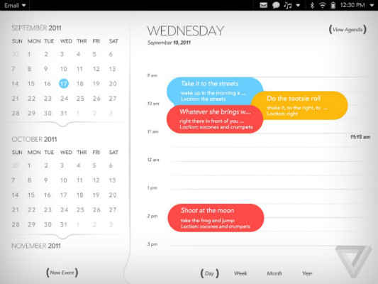
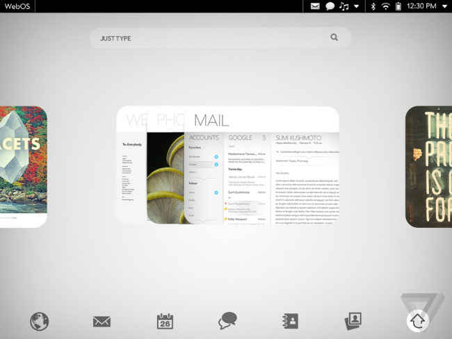
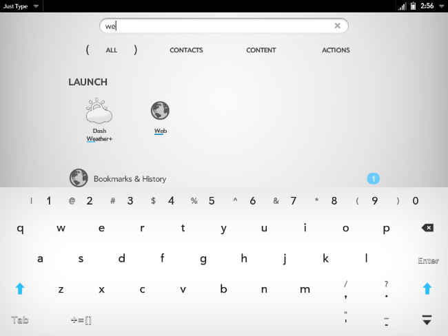
This despondent tale however hasn’t stopped the team that was working on WebOS during the HP era from releasing screens of what could have been. Mochi, the WebOS interface they were working on for a new line-up of smartphones and tablets, is packed to the gills with what has now become standard design philosophy (see: iOS 7 and Android 4.4)- the absence of skeuomorphism and the abundance of flat elements, bright colours and straight, clean lines.The Mochi UI would also overwhelmingly rely on swipes rather than button taps, again something that’s common today.
The WebOS team has launched a wiki and released the code and design elements behind the Mochi UI as open source, using which the community at large is free to develop a final product/s. Hopefully, we will see something come out of this great move by the original developers.
Take a look at how the interface looks in the screens below:
Source: The Verge