Google Android Honeycomb detailed, justifies “built entirely for tablet” tag

Google’s Android Honeycomb browser had its fair share of peeks in the last couple of days at CES, and now there are plenty of official run through videos available online for some of Google’s partners. The “built entirely for tablet” flavour of Android operating system has enough UI changes for the form factor to call it a serious overhaul, and we can see Google’s been a busy little developer.
Take a look at the short official Google and T-Mobile overview videos above that describe most of the changes briefly, before wheelin’ down for some feature-specific videos that which encompass everything from the browser to Gmail to Maps, and homescreen to application menus to multitasking.
[RELATED_ARTICLE]It’s reported that former webOS path-breaker and now a Google user experience director, Matias Duarte (spotted in the video) played a big role in the shaping of Android Honeycomb.
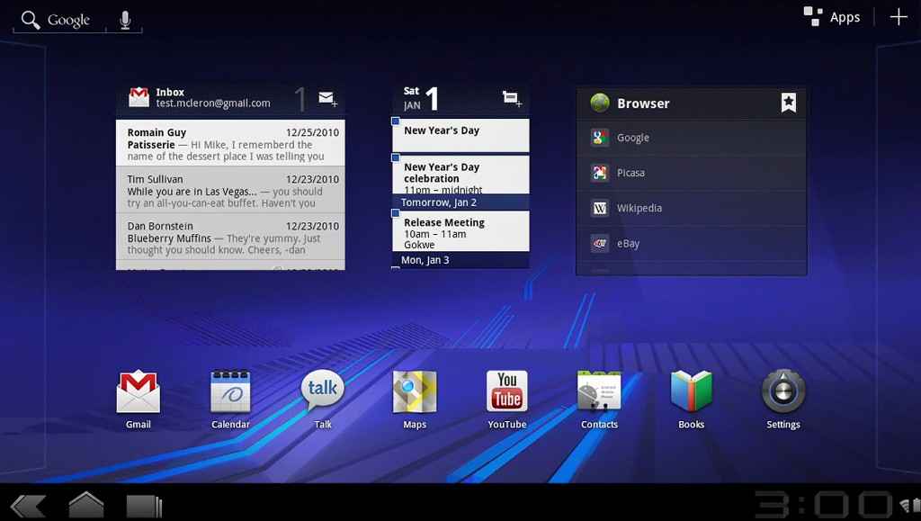
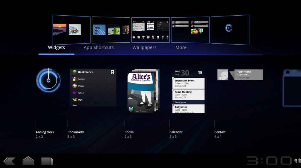
Major UI changes include the presence of static wallpapers (at least, no evidence of live wallpapers was shown), wraparound homescreens, and dedicated shortcut panes – with search (text and voice) on the top left, apps and widget manager shortcuts on the top right, navigation buttons (back, home, and task switcher) on the bottom left, and battery/signal meter on the bottom left alongside the digital clock.
Maps
Gmail
GTalk
Books
Browser


