BlackBerry Z10: A Quick Pictorial Review

We've had the BlackBerry Z10 in the test centre for some time now, prior to the official launch of the device in India. And we put it through a detailed photo shoot! And here is what we came up with.
This is the phone, and this is the platform, that will make or break BlackBerry. Quite literally, this is what their future depends on – whether they live to fight another day, or will the once iconic brand fade into obscurity.The answer to all these questions is rather simple – it all seems to be headed in the right direction.
The amount of hype and excitement for the BB10 platform and the new phones is good enough to rival the excitement preceding and succeeding the launches of the Apple iPhone and the most popular Android devices.
Scroll down for a tour of the new BB10 smartphone, complete with our observations!
Do also check out our comprehensive review of the BlackBerry Z10.
The BlackBerry Z10 has a very industrial design. The minimalism is something that stands out, with the very subtle colour combinations.
Yes, the Z10 feels bigger than the iPhone 5, but mostly because it is wider. The touch enabled panels are the reason why the bezel around the display is not very slim. Nevertheless, comfortable for one hand operation.
Z10 vs iPhone 5 – The backside! The design on the Z10 compared to the plain finish on the iPhone.
Z10 vs iPhone 5 – The earpiece design on the Z10 stands out a bit more, while the iPhone 5 is partly getting more highlight because of the screen protector.JPGZ10 vs iPhone 5 – The earpiece design on the Z10 stands out a bit more, while the iPhone 5 is partly getting more highlight because of the screen protector.
Z10 vs iPhone 5 – While there that one hardware key on the iPhone, there is none on the Z10. The touch enabled panel around the display enables swipe up gestures to minimize, and subsequently, kill apps.JPGZ10 vs iPhone 5 – While there that one hardware key on the iPhone, there is none on the Z10. The touch enabled panel around the display enables swipe up gestures to minimize, and subsequently, kill apps.
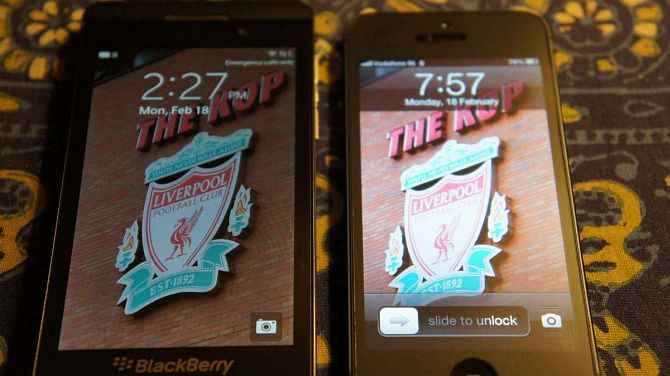
Brightness issues aside, the clarity of the text on the Z10 is tremendous. You can see the icons and the labels and the difference in the clarity.
We were a tad surprised to find that the brightness of the Z10’s display is on the lower side. This is a side-by-side comparison with the iPhone, at 100% brightness.
BlackBerry Hub. We need to inundate this with a whole host of updates to see if it becomes overwhelming or not. But, we like the idea of combining the updates at one place.
BlackBerry promised that the onscreen keyboard will be amazing. And it is. It is much better than the onscreen keyboards of the OS7 era, and the replication of the physical QWERTY design has its unquantified benefits.
When you minimize apps, the non-Hub apps minimize as widgets, and that becomes the default home screen. The latest opened app remains at the top.
Just like the iPhone, the BB10 will take you straight to the app drawer after you unlock the display. Horizointal scrolling in the drawer.
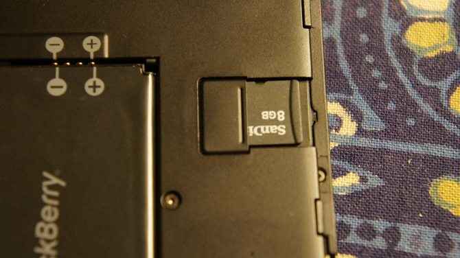
Look ma, I can see the battery! Something rare with modern day phones – the back panel opens up, and the battery is user accessable.
Speaking of the battery cover, we must say that while it is thin, it seems to be of very good quality. The imprint design with the texture lends it a good contrast to the slightly shiny and partly matte front.
Apparently, Blackberry packs in an 8GB memory card with the phone. Good job!
The Z10 uses a micro-SIM card, in line with what most Android and Windows Phone devices require. The Apple iPhone 5, however, uses an even smaller Nano-SIM.

.jpg)
.jpg)
.jpg)
.jpg)
.jpg)

.jpg)
.jpg)
.jpg)
.jpg)
.jpg)
.jpg)

.jpg)