YouTube desktop site revamped with Material Design, support for dark theme

YouTube users can now opt-in to preview revamped desktop site, which also brings tweaks to search
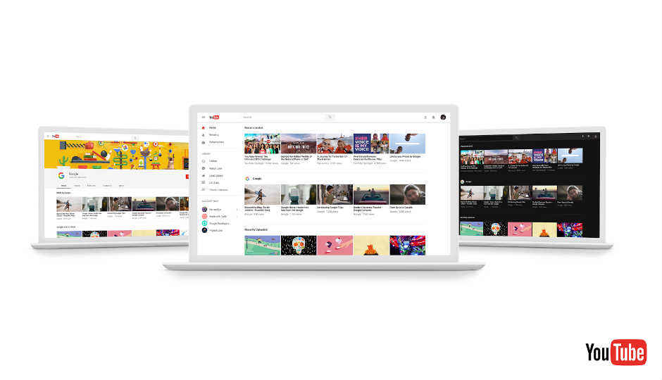
YouTube is revamping its desktop site with material design, with the aim of offering a more consistent experience across the web and Android/iOS apps. The revamped site also brings new features like dark mode, tweaks to search and channel pages, as well as updated theatre mode. YouTube says the new Material Design is meant "to deliver a beautiful, delightful and intuitive user experience."
YouTube, which turned 12 on Monday, is also switching to a faster framework named Polymer. The polymer is an open-source JavaScript library introduced at Google I/O a few years ago and enables developers to build web components that can be reused. The first feature developed on Polymer is Dark Theme, which YouTube says will "cut down on glare and let you take in the true colours of the videos you watch."
Users can opt-in to preview the new design by clicking on youtube.com/new. There is even an option to restore the classic YouTube from the Account menu.
Digit NewsDesk
Digit News Desk writes news stories across a range of topics. Getting you news updates on the latest in the world of tech. View Full Profile


