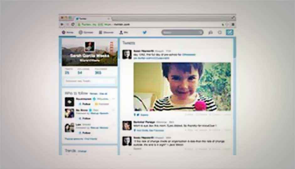
Twitter rolls out refreshed website with new interface

The new interface has more more "whitened" look along with the light blue theme.
Twitter has completed roll out of the new interface for the web version of the social network.
As you must have already noticed, the new interface of web version mirrors the look and feel of Twitter’s iOS and Android. The site now has more “whitened” look. The white boxes appear more joined, giving more breathing space for texts. You will also notice the light blue theme across the new interface. Also read: Twitter updates its website, reflects look and feel of its mobile apps
The update also features a more prominent home bar for logged-in users. The bar allows you to to tap on Home to access the normal feed. Connect shows who has mentioned, while Discover displays Twitter’s trending tags.
Twitter has placed its logo in the top center of the page. The right side of the top bar features search box, Direct Messages button and Settings button. At the right most, you have the Compose button. Clicking on the Compose button, the tweet box appears with the background turning into dark grey.
What do you think of the new interface? Let us know in the comments section below:


