RIP Aero Glass; Windows 8 sticks a fork in familiar UI

Get your reading glasses, just not your Aero Glasses. Microsoft has released an 11,000 word blog post that covers just about every nook, cranny, and design decision behind the Windows user interface since its inception. That’s right – even good ol’ Windows 1 makes an appearance, which has us wondering just how Microsoft managed to take a good screenshot of that legacy OS, let alone install it.
More than just a history lesson, however, Microsoft’s blog posts gives a bit of news about the design decisions that are changing up Windows 8 in new and mildly controversial ways.
Here’s the big reveal: Aero Glass is no more.
Take a moment if you need it — some do. “Start menu and Aero Glass must be reinserted, absolutely, no discussion allowed,” replied one commenter to Microsoft’s post.
“Seriously? Now you removed Aero Glass from the windows? How exactly do you expect to market this to the customer,” said another.
Microsoft’s reasoning for eliminating the visual accoutrements — “flattening surfaces, removing reflections, and scaling back distracting gradients,” writes Jensen Harris, director of program management for Windows’ user experience team — is that it frees Windows 8 of unnecessary clutter and distraction thanks to a more “clean and crisp” user interface.
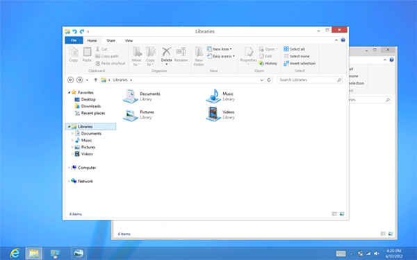
“Gone are the glass and reflections. We squared off the edges of windows and the taskbar. We removed all the glows and gradients found on buttons within the chrome. We made the appearance of windows crisper by removing unnecessary shadows and transparency. The default window chrome is white, creating an airy and premium look. The taskbar continues to blend into the desktop wallpaper, but appears less complicated overall,” Harris writes.
“To complete the story, we updated the appearance of most common controls, such as buttons, check boxes, sliders, and the Ribbon. We squared off the rounded edges, cleaned away gradients, and flattened the control backgrounds to align with our chrome changes. We also tweaked the colors to make them feel more modern and neutral.”
Here are what some of Microsoft’s changes look like thus far (the company plans to incorporate all of the UI tweaks in Windows 8’s final release, not the Release Preview):
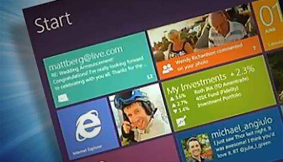
Paul Thurrott, of the Supersite for Windows, has a different take on Microsoft’s changes: It’s all about battery life. Specifically, the Windows Metro UI is designed to function more akin to a tablet. One app, one screen (or two apps on one screen, if you use Windows 8’s “Snap” feature), with Windows managing application lifecycles to ensure that resources and battery life aren’t needlessly spent on background programs.
Aero Glass, he opines, runs contrary to Microsoft’s goals with Metro.
“Rest in peace, Aero. I liked you, a lot. Still do. And I’ll miss you,” Thurrott writes. “I’m curious why Windows 8 can’t simply include Aero themes in addition to something flatter and duller, especially for those desktop PC-using power users who will primarily use the desktop environment and not care about (let alone need) better battery life.”


