The redesigned logo drops the curly blue design and features an angular 'B' and switches to the Segoe font, also used in Microsoft’s logo.

Microsoft has rolled out a revamped Bing logo, bringing it more in line with the company's new redesigned product branding. The redesigned logo drops the curly blue design and features an angular 'B' and switches to the Segoe font, also used in Microsoft’s logo.
Microsoft says it had conducted various studies to review the motion, font, colour, size and form. The company also experimented with mock ads and fake billboards before finalising the logo.
Microsoft retained the lowercase ‘b’ as a tribute to its Bing logo heritage and to provide a slightly less obtrusive stance. The descender on the ‘g’ has been slightly modified to curve upward in a friendlier manner and the cut on the top of the ‘b’ mirrors the angle on the cut of the ‘t’ in our Microsoft logo. The kerning pairs of the ‘i’ and the ‘n’ are exactly the same as the ‘i’ and the ‘n’ in the Windows wordmark.
The company says the symbol, a stylized ‘b’, evokes a sense of movement, direction and energy. The orange-gold colour is inspired by the orange dot in the previous Bing logo and quadrant of the corporate flag logo.
.jpg)
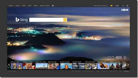
“A logo alone doesn’t make a brand and Bing has been a colorful antidote to boring search pages for years. Bing has provided a new homepage image every single day since it was launched. Our tradition of showcasing inspiring and interesting photography will continue and full-color, full-bleed imagery will remain a mainstay of our visual personality. You’ll continue to see Bing images on the web, on phones and in Xbox and you can download the daily images to your desktop,” says Bing in a blog post.
.jpg)
“The new Bing identity is more than a new logo and color palette – it’s a system of brand architecture that allows us to strategically and visually evolve Bing in line with our mission and our products. We didn’t set out to just provide data via blue links on the web. We set out to provide clarity, decisions and insights.

Bing is no longer just a search engine on a web page. It’s a brand that combines search technology across products you use every day to help empower you with insights. It’s time we all stepped out of the confines of the search box to stop searching and start finding.”
Bing gets new interface
Alongside the new logo, Microsoft has also improved the interface of Bing.com. The new interface is faster, cleaner and visually appealing.
“We believe that search can be beautiful as well as functional and efficient. With that as our goal, we evaluated fonts, spacing, color, visual scan patterns, the search box and even the underlying code. We’re excited about the final result and to give you a glimpse, we have created a destination at www.bing.com/newwhere you can learn more about the new face of search,” says the company in a post.
Microsoft has also integrated Snapshot and Sidebar in the new Bing update.
 |
“This combined region ranks the key information and actions we know about any an entity, while bringing in friends and expert opinions about that same topic. For example, consider a search for “Highway 1”. Bing knows there are many possible things you might be looking for. Our new design displays both the factual data about this beautiful route (length, date, related places), and also the human perspective whether they be status updates, photos, tweets, check-in’s or expert opinions,” added Microsoft.
Read more about the new updates to Bing here.