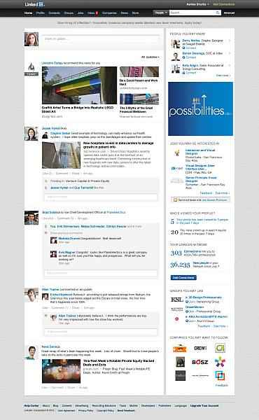
LinkedIn starts rolling out ‘simpler’ home page design

LinkedIn has announced a redesign of its home page in order to make it look cleaner and easier to use. The professional networking site is also working to make the navigation process simpler and add a richer update stream.
LinkedIn in a blog post says the redesigned homepage will make it easier to scan and find the information a user is looking for. Also, the simpler and cleaner design makes it easier to navigate the page.
Moreover, users can now see the important and relevant news updates on the top of the feed. This is supposed to make it easy for users to go through trending topics, news and professional updates, based on your connections and industries you are associated with. LinkedIn says this will reduce time spent on hunting for information on the website.
The redesign brings a new look and feel in the stream, which will have now richer visuals for easier scanning and viewing. With ‘see more’, users can see a continuous stream of updates, including the latest one.
“We’re always looking for new ways to make the Homepage experience better, more efficient and a place where you can come everyday to get what you need to be productive and successful. This is just the beginning of many more exciting, new features we plan to bring to the Homepage to offer more customization and functionality this year,” said LinkedIn in the blog post.
The redesigned Homepage is rolling out to all members over the next few weeks. To find out more about redesigned homepage, click here.
Also read,

