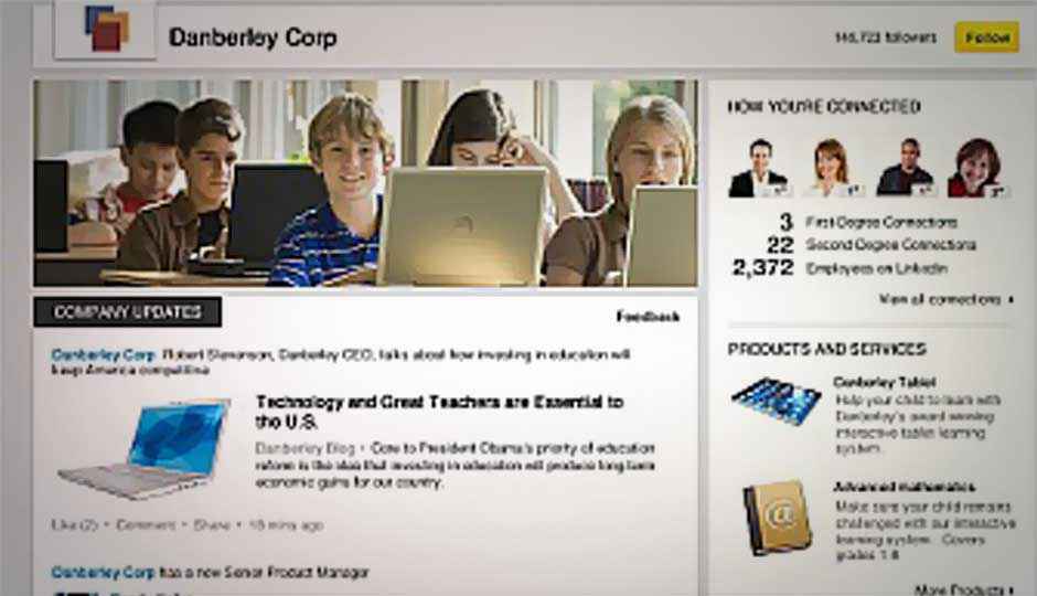
LinkedIn redesigns Company Pages

LinkedIn recently started rolling out a new design for its Company Pages in a bid to simplify its core products, and increase engagement between job seekers and employers on the professional networking website.
LinkedIn in a blog post said that the redesigned Company Pages have better visuals and less stuffed with widgets. There is also a large cover photo on the top, which is quite similar to Facebook’s cover photo format. Moreover, the new layout enables the companies to have more prominent display for their announcements, and job openings.
The company reveals that it has introduced a new and improved algorithm to make sure that the updates posted by companies are customised for the user visiting the professional network, ensuring the user gets to see the maximum number of relevant posts.
“We are just getting warmed up and look forward to sharing more news as we continue to improve Company Pages and roll out the experience to all companies later this year,” says the company in the blog post.
New LinkedIn Company Pages design
The update to Company Pages comes days after LinkedIn added a new notification feature which keeps users notified in real-time, similar to Facebook notifications. The new feature lets users see the notification when someone in their LinkedIn contact likes what they have shared on the network, views their profile, accepts their invitations and more. Find out more about this feature here.
Back in June, LinkedIn started rolling out a redesign for its home page, adding smoother navigation and richer visuals. Learn more about the redesign to LinkedIn home page here.
Source: LinkedIn Blog

