Google tweaks homepage design

On the same day it launched the Google project, Google unveiled a brand new design for its homepage interface, striving to give its users a more consistent online experience with the company’s various products.
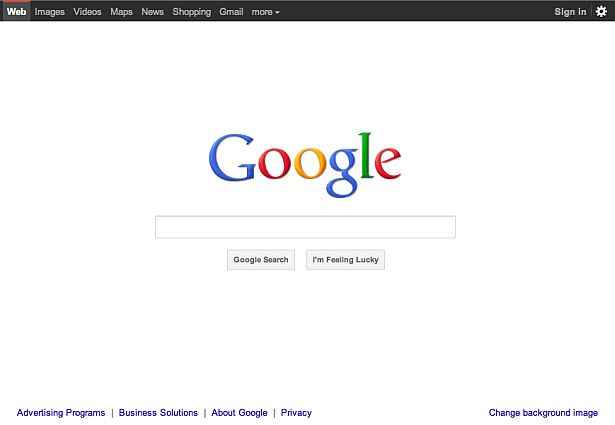
In an official blog update, Google spoke about the changes to its iconic homepage. Tabs like Web, Images, News, etc. which were marked in blue against a white background just a few days ago are now part of a black menu bar at the top, which also has a Sign in and Setting button. The Google logo itself has become smaller than before and links that previously sat immediately below the Google Search button are now pushed to the bottom of the page, giving the homepage a more cleaner, streamlined look.

new Google homepage
[RELATED_ARTICLE]
If you notice the redesigned Google homepage closely, the “I’m Feeling Lucky” button is alive and well, despite rumours to the contrary in the past week or so about Google booting it out in the near future.
Google isn’t just stopping at remaking its homepage design. It promises to apply interface tweaks and design changes to other popular Google products like Google Maps and Gmail.
Needless to say, the latest Google homepage is a far cry from its very first design when Google started its service back in 1997. What do you think of Google’s new homepage design? Love it or hate it?
Also read,
- Google launched, takes on Facebook
- Google plays down Microsoft’s Office 365 challenge
- Google’s new “What Do You Love?” search revealed
- Google takes on Bing and Facebook with ” 1″ social search feature
- Google launches Instant Page, Search By Image
Jayesh Shinde
Executive Editor at Digit. Technology journalist since Jan 2008, with stints at Indiatimes.com and PCWorld.in. Enthusiastic dad, reluctant traveler, weekend gamer, LOTR nerd, pseudo bon vivant. View Full Profile


