Google starts rolling out new homepage design

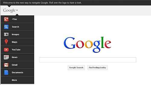
Google has started rolling out its new homepage design, replacing the black strip on the top with a grey logo. When clicked/highlighted, the fly-out menu appears, showing various Google services along with an option to explore more. Google has assigned unique icon for each of its services, making it easy for identification. The new home page design is likely to be rolled out globally very soon.
The new Google home page design features access to various Google services, which were missing from the previous home page design. Google has also put its Google service among its top services, hoping to expand the social networking site further more.
Google’s new home page look looks similar to its web-dependent Chrome operating system. However, Google has kept the design neat, giving it greater resemblance to its other products such as Gmail and YouTube. The new home page design was revealed in November last year. In a blog post, Google said that the drop-down menu nested under the Google logo will feature the list of links presently seen on the strip. Also, users will given access to additional services by hovering over the “more” link at the bottom of the list.
Check out the new Google home page design in the video below:
Also read,

