Google News refreshes its UI, adds new features like Fact Check block

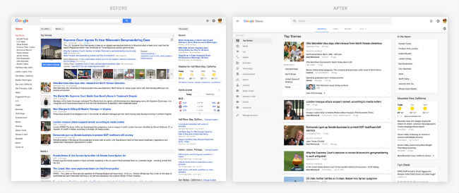
The new UI sports a card-based format similar to that the company uses with Google Now, which the company says is designed to offer a comfortable reading and browsing experience
Google has refreshed the look of its News Page with a card-style layout similar to what it used with Google Now. In its official blog, the company says that the new UI is designed to offer a comfortable reading and browsing experience. The new layout processes on elements such as publisher names and article labels. There is a dedicated navigation column on the left to sections that the user can customise. On top is a new navigation bar with sections for Headlines, Local and For You. The Local and For You sections can be personalised by the user.
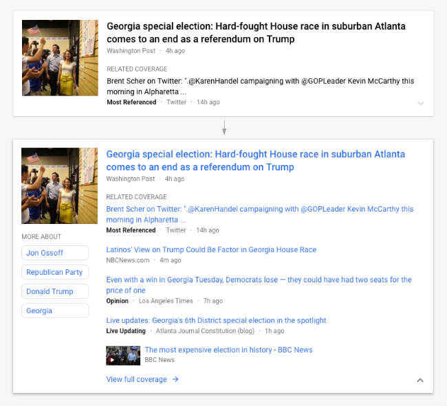
Clicking on each news card will let users read the most relevant stories while, they can also click on the arrow to read other articles on the same topic with different points of view. Beyond this is a Full Coverage section that lets users get deeper coverage of a certain topic.
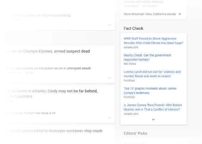
In addition to all this, Google is also rolling out a Fact Check block that makes its easier for users to easily access to fact checking articles. This block is located on the right column and shows the top fact checked articles recently published. However, the feature is currently available only in the US. For videos, the Google says that it has improved the algorithmic selection for top videos, and highlighted the top video in a story card. It also says that it has built a better player, and when watching a video, more related videos will be available to the user.
Digit NewsDesk
Digit News Desk writes news stories across a range of topics. Getting you news updates on the latest in the world of tech. View Full Profile


