Google Home app with Material Design in works: Report

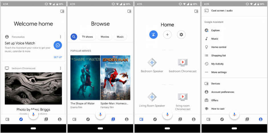
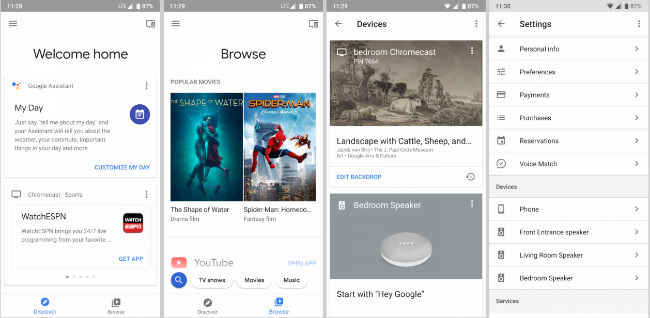
The APK teardown of version number 1.29.20.20 of the Google Home app shows that the sidebar menu has been removed in favour of a bottom toolbar and the ‘Devices’ page will now have a cleaner look with small icons.
After updating several apps like Gmail, Google Drive and Maps with the Material Theme, Google is reported to be testing a design overhaul for the Google Home app which is used for managing smart speakers and Chromecast. In a report by 9to5google, an ‘APK Insight Post’ has decompiled the latest version of the app that the search giant has uploaded on Play Store. The post details various codes that hint at the yet-to-come design and possible features that the new app is expected to have.
The redesign in testing was first spotted by XDA recognised developer Quinny899. The biggest difference reported was the design change in the sidebar menu which has been removed and there is a new bottom toolbar with more navigation options. The home screen and the content browse screen may not see much changes and the ‘Devices’ page will reportedly look cleaner. Google will remove big cards in favour of small icons and texts to save a lot of space. If this design is rolled out, users will not have to scroll much to search for devices. Lastly, the Settings page will also get a facelift and the dividers between the sub menus have been removed to make the overall design look less clustered.
To make it clear, the redesign is under testing and Google may not roll out all the features that are being tested. Also, there is no information when the new design will be launched and rolled out to users. The new design was enabled with the version number 1.29.20.20 of the Google Home app that was updated on May 18.
Google introduced Material Design with the launch of Android Lollipop v5.0 and it has been in existence for almost four years. Since then, the company has provided a uniform appearance and experience of Google’s apps across its platforms. Until now, it has updated many of its apps such as Google Play and Search to the new design language. YouTube was also updated in the lines of the Material Design. The redesign was later extended to Gmail, Drive and Maps for Android.
Sourabh Kulesh
A journalist at heart; has knowledge of a wide gamut of topics related to enterprise and consumer tech. View Full Profile


