Facebook changes its logo, ever so slightly

The social networking giant says it wanted to make the logo more friendly. Do you think it does?
Social networking giant Facebook has quietly changed its logo. Didn’t see it, did you? That’s because the change is really slight and a single glance won't even register the change. According to Facebook, the company wanted to modernise the logo, but after much thought decided it only needed an update. The logo was designed by Facebook’s in-house design team, in collaboration with typographer Eric Olson of Process Type Foundry, a company that makes typefaces for engineers.
In a report by log blog Brand New, Facebook Creative Director Josh Higgins said, "Now that we are established, we set out to modernize the logo to make it feel more friendly and approachable. While we explored many directions, ultimately we decided that we only needed an update, and not a full redesign."
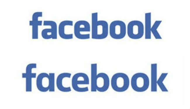
We could try and explain the new logo to you, and say things like the ‘a’ is rounder, as are other alphabets, but seriously, what would that accomplish? The new logo might have an impact in terms of design langauge, but nothing that a common man (or woman) can interpret. Here's the before and after comparison below, be your own judge!
Top: Facebook's Old logo, Bottom: New Logo
Another thing we won’t do is speculate on what this logo means. It’s a logo change, a very simple one at that, for whatever reason. The main reason probably is because it goes better with the flatter material design look on mobile, but hey, no speculations. For now, Facebook’s logo has changed, and the first paragraph of this story is all you actually needed to read. We could use the old and new logos interchangeably and you would most likely not notice, which by the way, is exactly what we did with the main image of this story.
Digit NewsDesk
Digit News Desk writes news stories across a range of topics. Getting you news updates on the latest in the world of tech. View Full Profile


