Facebook announces new look for Messages

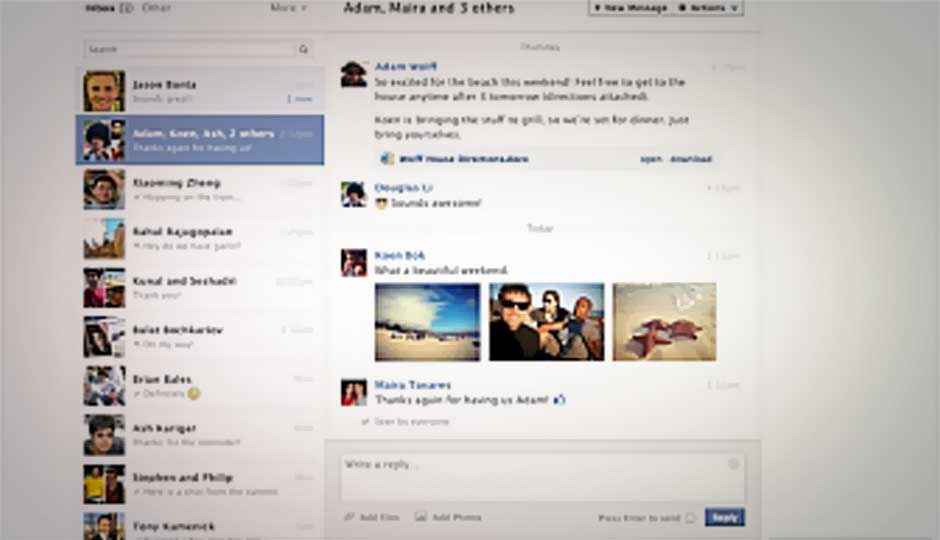
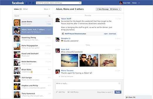
Facebook has announced it will be rolling out a new and cleaner version of Messages, which will now have a dual-pane layout.
The new Messages inbox has a list of the recent messages on the left side, and a reading pane on the right. The two pane format is said to make the Facebook Messages platform look closer to the professional emails, such as Microsoft Outlook. The previous Message design had a single-column view, while users needed to visit another page for viewing any conversation.
The new layout will be rolled out for global users over the next few weeks. Facebook in a blog post says the new format “brings conversations to life”, as it features the option of adding multiple pictures and emoticons to their messages.
Facebook has also added keyboard commands for easier navigation. The shortcut commands enable users to compose, reply and navigate through the messages. To see the full list of available shortcuts, type Alt Q on a PC or Control Q on a Mac. To know more about Facebook messages, you can visit the Facebook Help Center and Facebook Engineering Page.
The update to Messages comes days after Facebook quietly changed users’ default email addresses to @facebook.com. However, Facebook later blamed an API bug for the change. For more, read our previous coverage.

