Blizzard Launches Battle.net 2.0

Blizzard Entertainment has rolled out a surprise makeover update for its Battle.net PC client.
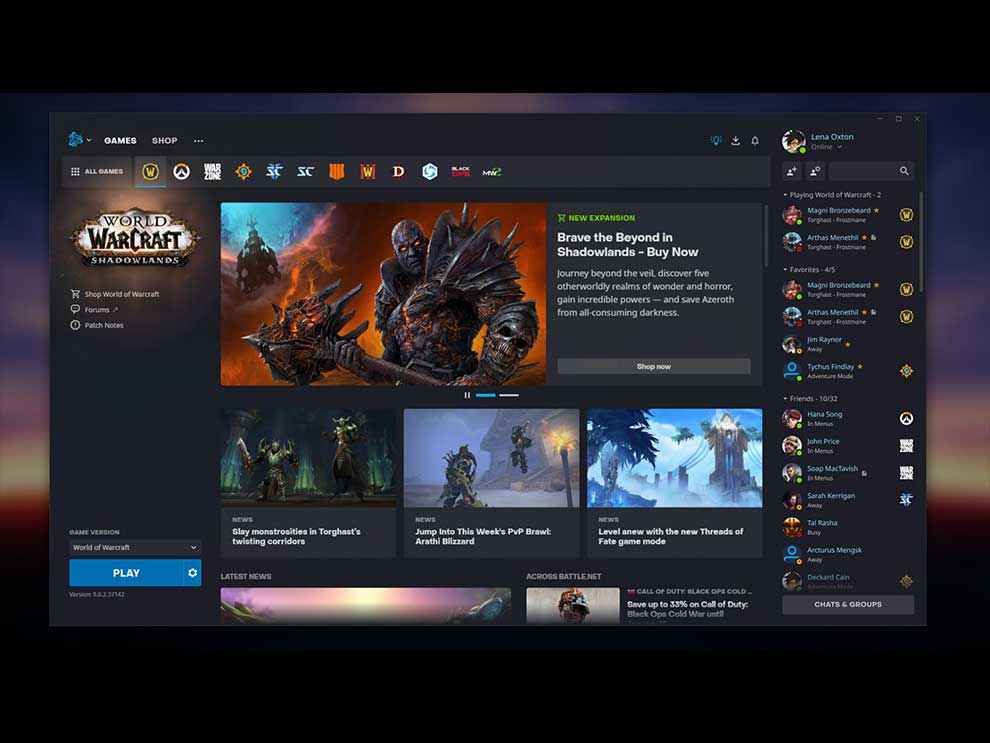
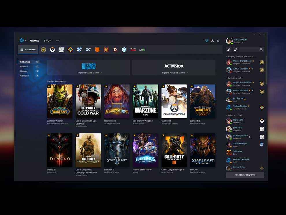
The all-new client draws inspiration from clients like the Epic Games Store, with a tile format to display all its titles.
The update will eventually make its way to other regions in the coming weeks.
Blizzard Entertainment, creators of the Warcraft and Diablo series of games has rolled out the first, surprise makeover update for their Battle.net PC client, in about 8 years. Quote, “Battle.net 2.0”, the new layout was being tested on its beta server for several months, before getting finalized and rolled out to North American users.
The news comes from an official blog post, which basically spells out every new change coming to the age-old, beloved launcher. “Welcome to the new Battle.net!”, it reads. “We’re getting ready to roll out the biggest front-end upgrade to Battle.net in years.” Through this massive design overhaul, Blizzard intends to bring some much-needed quality-of-life improvements to the table, so that every player has a smoother, effortless experience browsing through the app. The new interface is more focussed on aesthetics, arranging game icons to a horizontal top banner, thereby creating a much spatial layout for trailers and news stories in your feed. The page also includes all the necessary hyperlinks such as patch notes and forums at a click’s length, which might come handy every now and then. The biggest improvement of them all, however, is the addition of a fixed social pane on the right-hand side, giving you a better look at what your friends are up to. Compared to that, the older version was quite unreliable and outdated, where you had to click a button to bring up a separate pop-out window of your friends list.
The all-new games library draws inspiration from clients like Epic Games Store, and follows a vibrant, tile format to display all its titles. Both Blizzard and Activision have their respective “Explore” tabs as well, segregating each of their offerings and reducing clutter. This version also adds major accessibility upgrades, such as keyboard navigation, better colour contrast, and an increased screen reader support for the visually impaired. Other minor enhancements include the ability to mark games as favourite, and a new notifications hub for messages and checking download status.
For now, the new Battle.net 2.0 patch is only available in parts of North America as Blizzard continues to work on and test its stability. The app will eventually make its way to other regions in the coming weeks, and will see lots of new features and improvements later on. However, if you’re not from the NA or are simply impatient, you can still use the new layout by opting for the beta version through the launcher’s settings.


