YouTube redesign now visible on the Android app and mobile web

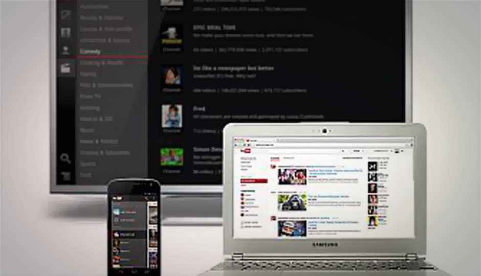
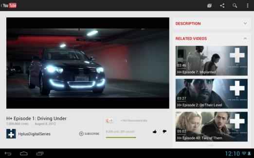
Just last week we had told you about YouTube’s redesign of its homepage stressing more on subscriptions and channels. As expected, the redesign has found its way in the YouTube app as well, so that Android and iOS smartphones and tablets get an experience similar to that on the desktop. YouTube software engineers announced on the site’s Google page that they had updated the YouTube app for Android tablets as well as the mobile site for tablets: m.youtube.com
“In the Android app on a tablet, you’ll see a refreshed YouTube experience including a Guide that provides easy access to your favorite channels and ways to discover new ones… While we’ve recently launched the YouTube app for iPad, we know many of you enjoy using the mobile website (m.youtube.com). Today, that site is refreshed for the tablet experience too, featuring the same Guide with your subscriptions and easier controls for sending videos from your tablet to your TV,” said the engineers.
These recent developments are more geared towards pushing the various channels on YouTube to the end users. YouTube is investing heavily in creating more original content with programs such as YouTube Partner Program. A lot of independent studios such as Maker Studios, Machinima or the Indian studio YoBoHo are producing original content across multiple channels.
YouTube is slowly but surely becoming like television by having multiple channels and with the redesign, a lot of stress is being laid upon managing your subscriptions as it will get increasingly difficult to keep track of various channels as time passes. Whether end-users like it or not, only time will tell.
Source :The Next Web
Also read,
Iran launches YouTube-like video-sharing site, Mehr
YouTube reveals new design focussing on subscriptions and channels
YouTube for iOS updated with iPhone 5 and iPad support

