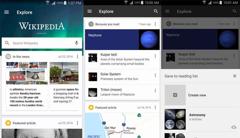

What has helped innumerable research projects as well as vehement online debaters alike when it comes to disseminating crowd-sourced information? Well, I guess I gave it away already – Wikipedia. This massive online information source has brought information to the distance of one Google search away for millions. But most of us will agree that we use it via the desktop website or even the mobile website at times. The Wikimedia Apps Team wants to change that with their brand new redesign of the Wikipedia Android app.
Now, the Wikipedia app not only brings you the information that you need but also content curated based on your usage which you can enjoy during any spare time that you may have. The entire home screen has been redesigned to now show you an Explore feed that consists of recommended images, interesting articles, in the news content, articles based on what you’ve read, and more from Wikipedia. All of this content is in the card format that has been mainly popularized by Google Now. And just like those cards, even here you can swipe away content that doesn’t interest you.
Keeping true to the design ideology of Web 2.0, scrolling down the feed endlessly will keep showing you older content, as in featured images and articles from yesterday and so on. It also allows you to share articles that you like on other platforms and social media. And if you are still really busy to read the article when you find it, you can create your own reading list and save articles to that for reading offline later.
"We're excited to be releasing a completely new experience in the Wikipedia Android app, designed to bring our Android readers new ways to engage with Wikipedia," said Dmitry Brant, Senior Software Engineer at the Wikimedia Foundation. "From trending articles and current events to recommendations on what to read next, we want to make it easier and more fun for our readers to find and enjoy all the knowledge Wikipedia has to offer."
Along with the front end, even the back end of the app has been revamped to increase accessibility. Now, services can use a simple web request to retrieve data from Wikipedia on their feed to use within their own apps. This opens up quite a few interesting possibilities as a number of services already use Wikipedia queries as data sources.
Do let us know your opinion about the new redesign in the comments section below