
WhatsApp's update makes navigation easier, brings 'darker dark mode': Details here
Meta is updating the popular instant messaging platform WhatsApp, making it more easier to use. The latest WhatsApp update makes navigation easier, introduces “darker dark mode”, and more.
Let’s take a look at what the latest WhatsApp update offers.
Also read: WhatsApp makes it easier to plan & schedule events: Here’s how

The latest update brings a “darker dark mode.” This mode features higher contrast and deeper tones to reduce eye strain in low-light environments.
Also read: WhatsApp makes finding messages easier with Chat Filters: A complete guide
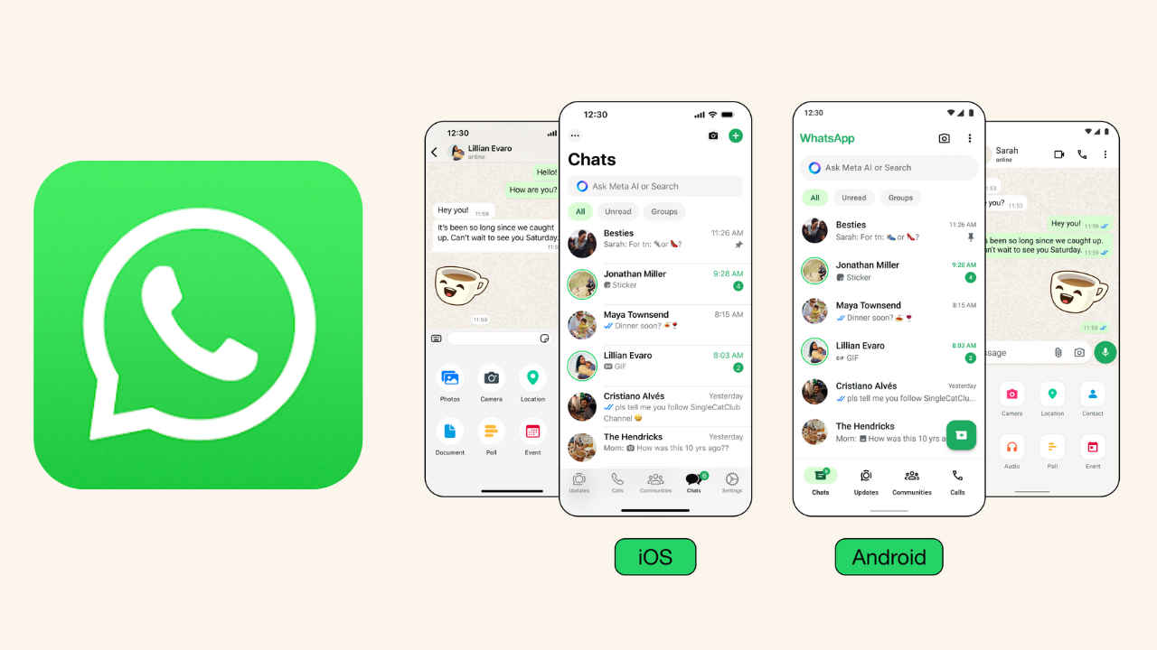
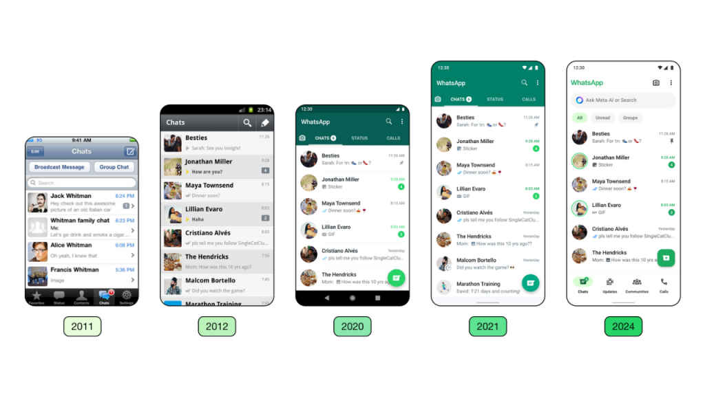
With the new update, Android users will see a more modern, native bottom navigation bar aimed to help them find what they need faster.
According to the company, placing tabs closer to people’s thumbs offers more natural navigation and matches the current experience on Android devices.
On iOS, sending photos and videos will now be easier with a new attachment layout. Instead of a full screen menu, you will now see an expandable tray that allows you to see the features more clearly when sending media, polls, documents and more.
WhatsApp is getting a new, consistent green palette within the app for a unified experience. The company considered over 35 different colour iterations, ultimately aligning with WhatsApp’s iconic green and opting for a palette that allows for harmonious colour pairings throughout the app.
Icons help add visual cues to quickly guide people through the desired action or information, so it’s important that they are intuitive and recognisable. Meta is updating WhatsApp’s icons to a rounded, outlined style.
Meta is also refreshing the original default background in WhatsApp chats. The company reviewed every piece of artwork in the doodle and explored new options that were simple in style and better represented a diverse set of people and objects.