Netflix redesigns Android app’s video player to change UI for the better

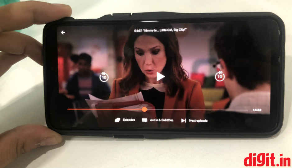
Netflix has added new 10-second forward/rewind buttons, bigger controls with labels and a new 'Next Episode' button.
Netflix users on Android are in for some better news today as the platform is rolling out a redesigned video player with added controls and improved navigation to switch between episodes. The update is rolling out to all Android users of the Netflix app currently, but the redesigned video player has not yet showed up for the iOS version of Netflix’s mobile app.
So how has the player changed? Well, for starters, the revised video player has added three new buttons. The much needed 10-second forward and rewind buttons now show up when you tap the screen while watching a video on the app. This is not something we haven’t already seen on other video streaming platforms, but it’s a welcome update for Netflixers who have been asking for these buttons since a while.
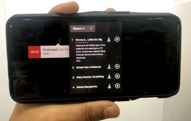
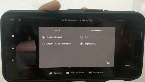
Another new button added is the ‘Next Episode’ button which is labelled by the same name and allows users to, you guessed it, navigate to the next episode faster. Other controls on the video player have also been labelled for ease of use. Users can now switch between episodes by tapping on the ‘Episodes’ button within the player itself. Once the episode list opens up, users can go ahead and select episodes for download as well. Audio language and subtitles can also be better managed with the labelled button now visible clearly at the bottom of the player. All these new buttons have haptic feedback.
Further, the play/pause button has now moved to the centre of the screen, instead of its previous placement to the extreme left of the screen.
There is no news on when the redesigned video player will show up on the iOS version of the Netflix app, but we guess it shouldn't take long.


