Google announces winners of Material Design Awards 2016
The award categories highlight specific aspects of Material Design in apps, which satisfy users and appropriately express the brand
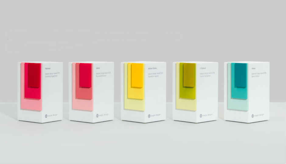
Google has announced the winners of its Material Design Awards for 2016. The awards are aimed at recognising “best-in-class” achievements in using material design for apps. The award categories highlight specific aspects of Material Design that were used in creating apps, which satisfy users and appropriately express the brand. The five winners will be honoured at the SPAN LA conference on October 27.
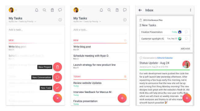
The Brand Infusion award was won by Asana: Team Tasks & Projects. Google says that Asana makes teamwork more productive and collaborative by offering short, and frequently repeated interactions to “make efficiency feel rewarding.”
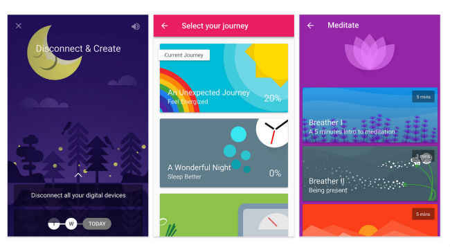
The Charming Engagement award was won by Fabulous – Motivate Me. The app features charming illustration styles to create an impact on users. Google notes that the state transitions, and pleasing goal completion animations help keep up motivation.
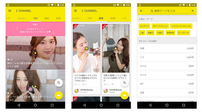
The C Channel got the Creative Navigation award. The app organises content into a series of tabs that can be navigated via swiping. Google states that the app “neatly balances a blend of studio-created and user-submitted videos covering fashion, food, and more.” However, it’s only available in Japanese and Thai.
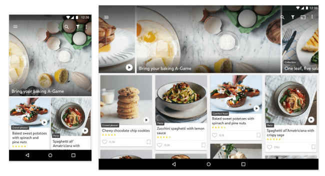
Kitchen Stories app won the Expressive Layouts award. The app was noted for its ability to create effective and easy to scan layouts for recipes across different types of screens and sizes. It also minimises the number of times users will have to touch the screen, which is helpful if the user has messy fingers from cooking.
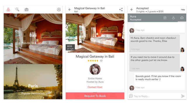
Airbnb won the app for Focused Efficiency. Google states that the app is “able to sidestep the appearance of complexity, making the overall experience feel comfortable.” However, it was noted that efficiency doesn’t come at the cost of the app’s visual appeal.

