Your guide to mastering Opera Neon
Here's how to use Opera's future ready browser Opera Neon like a pro
Everywhere you look, there is a radical reimagining of the way we perceive technology. Cars are driving themselves, homes are maintaining themselves and in general, everybody is busy offering you their vision of the future – be it through concept cars, concept laptops or even concept toothbrushes and hairbrushes. But most of these hail from the hardware realm and when it comes to software, such thoroughgoing changes are fewer in number. When it comes to web browsers however, Opera seems to have taken the mantle with its new concept browser, Neon.
The web is not what it used to be. Formerly a mostly-text platform, it now hosts media and applications that fail to be presented optimally in the dated environment. With the goal of building a browser for the future, Opera has launched Neon, a concept browser similar to the idea of concept cars – it’s not entirely practical yet, but gives a glimpse of where we are headed. Built on top of the Blink physics engine, it offers a host of new and interesting animations and features, and we’re going to show you how to use them.
Opera offers a look into the future of web browsing
Where to get it?
Go to their website on Windows or Mac and download the installer. Once it has downloaded, simply run the installer file and wait for the installation to complete. The browser should open automatically once the installation is done.
A fresh start
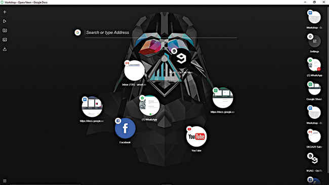
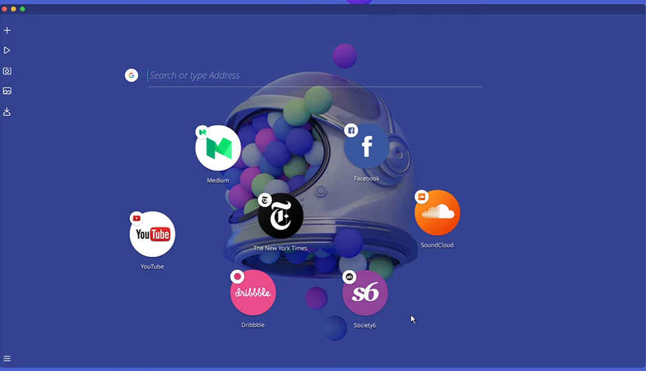
The start page in neon makes an effort to appear less intrusive by using your wallpaper as its background. There isn't much you can do to change this right now, unlike themes in Firefox and Chrome. The bubbles at the centre of the page below the search bar function kind of like bookmarks, by listing your favourite pages (It starts off by showing you pages that you are likely to visit).
You never lose touch with your cool wallpaper
Omnibox
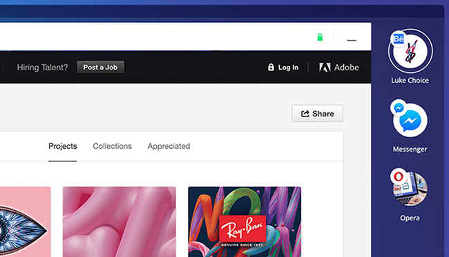
Once you’re done taking in the interface visually, it’s time to start browsing. Opera neon brings the URL to the forefront in the Omnibox – which is equivalent to the browser URL search box but much more prominent. Type in your URL or search term and hit Enter. A new window will open with a bubble shaped tab header appearing in a column on the right. This is where all your tabs are added. This area is feature packed.
If you have entered a search term, the default search engine for that is Google. To change that, the easiest way is to right click on the Omnibox and Click ‘Edit Search Engines’. You will be at the ‘Search Engines’ settings window where you can add additional search engines, and remove default ones. To add a new search engine:
- Type the name in the first box
- Type the keyword to trigger it in the second box. This is the keyword that you will have to type before the search term for the search engine.
- Specify the search URL for the engine in the third box with % in place of the search term.
An alternate way to do this would be to click on the hamburger icon found on the lower right corner of the home screen>Click on settings>Under ‘Search’ click on Manage Search engines.
Tabs are displayed in bubble-shaped headers
Managing tabs
Opera claims that the tabs work like ‘gravity’ with the most frequently used ones floating up the column. While we didn’t exactly observe this happening, there are still some pretty interesting things that can be done with this. For instance, to add a bookmark, you need to click on the tab header and drag it to the central area where it lodges in its own custom place (decided by the browser each time you add a new bookmark). The tab icon and the bookmark icons reflect the website’s logo, or the primary art of the respective page, with the small brand icon, i.e. the ‘favicon’, overlaid on the upper left quarter of the circular icons.
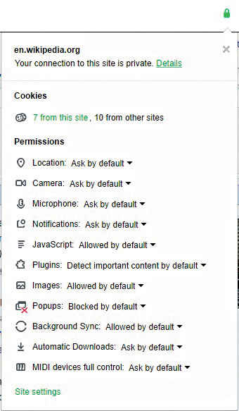
In the tab itself, there are a few interesting and thoughtful features. On top, where you have the title bar for the tab – you can copy the URL with a single click. To do that, Click on the title for the URL to display. On the right of the URL, you will see a cross (that will clear the URL) and a copy icon, that will copy the URL. On the extreme right, to the left of the minimize icon, you have a lock icon. Clicking on that gives you a drop down that will show you all the security information pertaining to the site including cookies and permissions. You can also Allow and Block individual permissions.
Permissions can be individually allowed or blocked
Split screen
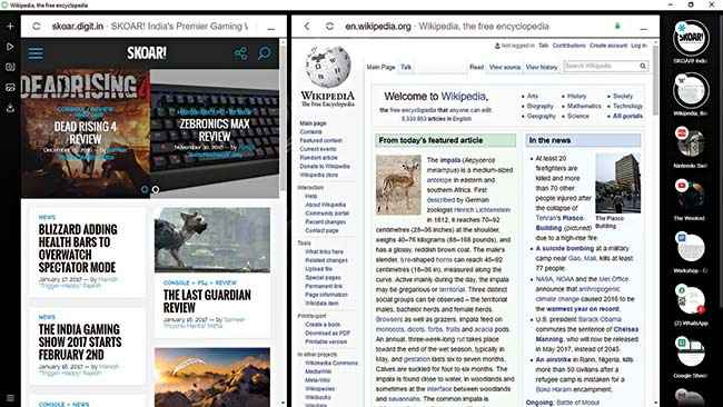
One of the first cool things that you can do with the tab column is, drag the tabs into split screen view. To do that, first, click on a tab bubble to open it. Once that is done, click on another tab bubble and drag it onto the open tab. You should see the title bar drop down and two visible options above the tab – ‘Show in left view’ and ‘Show in right view’. You will have to drag the tab to either option to, well, get either result. Once the tabs are in split screen view, you can click on the space between them to adjust their width in proportion to each other. Also, clicking on either tab bubble will minimize both. If you need to minimize one individually, click on the minimize button on the title bar. Unfortunately, you cannot tile more than two tabs in this manner, and any further tab you to add on top of this will replace the tab on the side you choose.
The Split screen feature only allows two tabs at a time
Sidebar
On the left side of the home screen you have the sidebar with five buttons.
- New tab: Clicking on this will simply minimize all your tabs and put the focus on the omnibox. From here you can open a new tab the usual way.
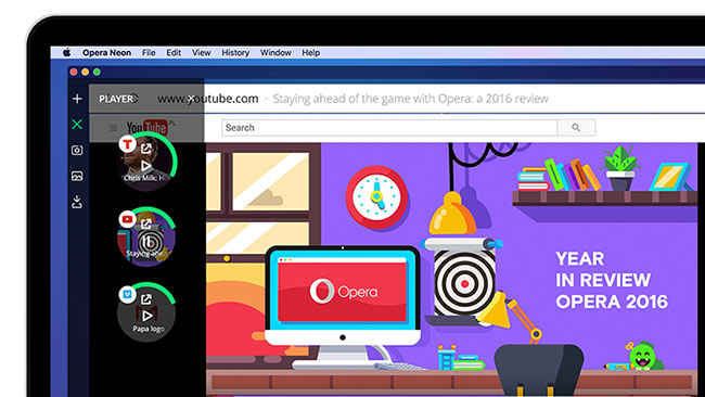
- Videos: This section has some really cool features. If any of your tabs has a video inside it that is controllable, this section shows them all in one place in the form of – you guessed it – bubbles. They can also be popped out as a floating video player. To do that, hover the mouse over the bubble, click on the pop-out button above the pause button. You will now see the video in a floating box that can be dragged around the interface. It also lets you pause, seek and close the video. Closing, however, does not close the tab and that has to be done from the tab column. You can also see the how much of the video has played in the form of a progressing green perimeter around the bubble for that video in the videos section.
- Snap-to-gallery: This is Neon's very own snipping tool. Click on the camera icon to enter snap mode. This lets you select an area within the tabs currently open in front of you. Simply click and drag to save a snap to the gallery, which is where we go next. The Snap tool does not let you capture any area beyond the tabs or between them.
- Gallery: Any snap that you take in the snap-to-gallery mode will show up in the gallery. From here you can simply click-and-drag the snaps to any open tab to place them, say inside a doc or into a chat that supports image pasting, like WhatsApp web. You can even drag the snap outside neon to another browser or document. Sadly, you cannot directly save the image in any way and to save it, you have to drag it to the tab column on the right and drop it, which will open it in a new tab, which will then allow you to right-click on the image and save it.
The Split screen feature only allows two tabs at a time
And more…
Opera will be bringing in more of Opera Browser’s features to Neon but as of now, features like native ad-blocking are not yet in. On the other hand, Opera might be using Neon as a sandbox to see what works and then implement the same in future releases of Opera Browser. Also, there are quite a few additional areas like the inbuilt task manager that lists all the processes running in the browser and the developer console which are beyond the scope of this article.
This article was first published in February 2017 issue of Digit magazine. To read Digit's articles first, subscribe here or download the Digit e-magazine app for Android and iOS. You could also buy Digit's previous issues here.

