Comparison: Moto 360 (2nd Gen) vs Asus Zenwatch 2 vs Pebble Time vs Apple Watch vs Samsung Gear S2
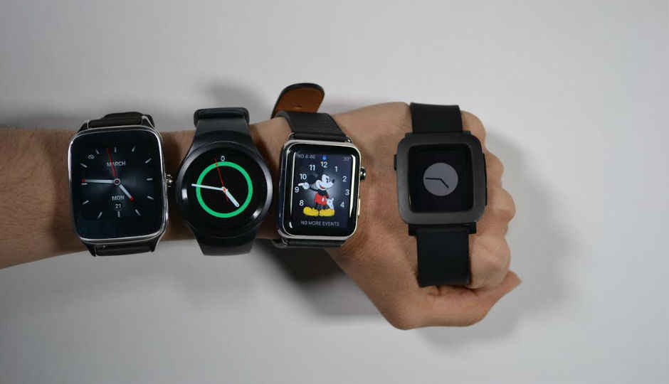
We compare the best smartwatches from Apple, Asus, Motorola, Pebble, and Samsung to tell you which one deserves to be ticking on your wrist
They say smartwatches are the next big thing. In our tests though, we’ve usually found these devices to lack the allround functionality to really be recommended.
That said, smartwatches have come a long way since their debut; enough to make sense for more than just early adopters. There are popular names, from the biggest technology giants, and things are starting to change.
Many took interest in smartwatches after the Apple Watch was announced, while others look to the Moto 360 as the best. Over the past few months, we too have tinkered with many of these devices and there are quite a few options available in the market.
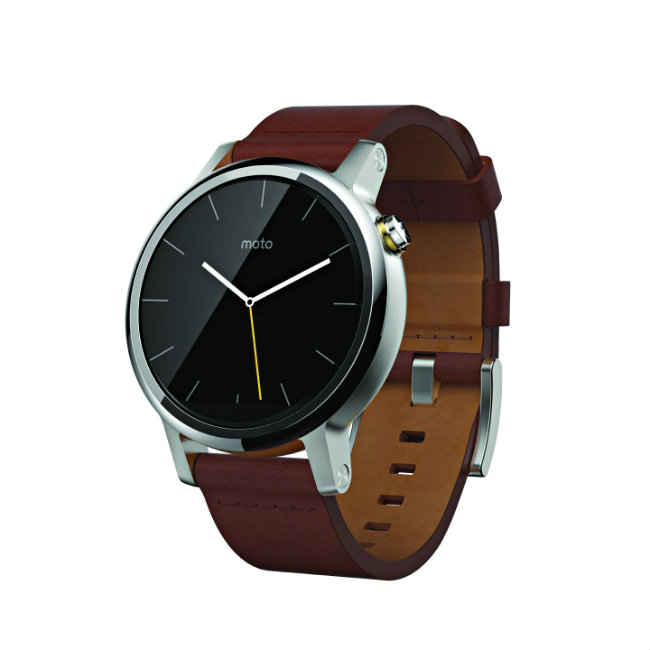
MOTO 360 (2ND GEN)
Perhaps the best known smartwatch in the market today, Motorola was the first company to introduce the round dial on a smartwatch. That said, the first gen Moto 360 still had a way to go, and the company has improved with this second version. The Snapdragon 400 SoC on the device is much faster and the Moto 360 (2nd Gen) is much more responsive than the original. It’s faster and more fluid.
It is available in 46mm and 42mm sizes and is just a hair thinner than its predecessor. While the stainless steel casing on the Moto 360 (2nd Gen) is similar to its predecessor, the new versions looks more mature. The power on/ off button has been moved to the 2’o’clock position and the straps can now be removed by any watch maker. The addition of a metal clasp has also made the watch look better.
While looks are subjective, what’s really worth appreciating is the 233ppi pixel density on the new Moto 360. It makes the display quite crisp and almost eliminates the screendoor effect that was prevalent on the original version. The display is also quite bright and has good touch feedback.
From a performance point of view, the Moto 360 was the fastest to respond to calls and supports a variety of apps, From a performance point of view, the Moto 360 was the fastest to respond to calls and supports a variety of apps, rivaled only by Apple’s Watch OS. It rarely fails to turn the display on when you raise your hand to check a notification or to see the time, and it’s amongst the more accurate smartwatches in the market today. There are also a number of watch faces to choose from.
It costs Rs.19,999 though, which puts it amongst the more affordable smartwatches in the market right now. That said, Android Wear OS isn’t very intuitive. The primary mode of interaction with Android Wear is voice, which is difficult, especially when you’re in noisy outdoor conditions. Even indoors, where the voice recognition works fine, it isn’t the fastest way to interact, when compared with Apple’s crown or Samsung’s rotatable dial.
| A LITTLE MORE TRADITIONAL |
|
The growth of the smartwatch market has been noticed by traditional watchmakers recently. But while tech giants have usually focused on the smart part, these watchmakers focus more on the watch part of these devices. They do still fall under the same category though and may appeal to many people. Titan Juxt The Titan Juxt isn’t the best when it comes to taking calls or responding to, or even reading text messages. It has a high quality leather strap, which can be changed in Titan stores Timex Metropolitan+ Personally, we’re not big fans of this watch’s looks, but as we’ve said time and again, looks are subjective. |
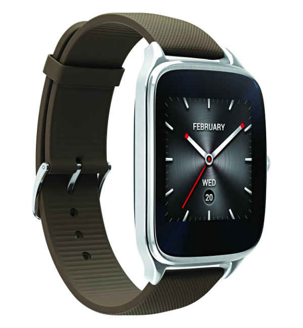
ASUS ZENWATCH 2
Perhaps the cheapest and most value for money smartwatch in the market today, the ASUS Zenwatch 2 is like square dial counterpart to the Moto 360 (2nd Gen). It runs the Android Wear OS, meaning it has some of the same strengths and weaknesses. In addition, the two devices run on the same Snapdragon 400 SoC, and are just as responsive.
The Zenwatch 2 is amongst the few square dial smartwatches running Android Wear and it looks quite good. The stainless steel design is nice, but the thick bezels hamper the overall design. In addition, it has plastic on the back, which is a major downer as well.
The Zenwatch weighs 60 grams, making it the heaviest in this comparison, but the weight really isn’t a big issue. However, while the watch is IP67 certified, we would advise you to keep the leather straps away from water.
The 278 ppi pixel density of the Asus Zenwatch 2 is not as high as the Apple Watch or Samsung Gear S2, but it’s just about enough. It is worth noting that we used the Asus Zenwatch 2 WI501Q, and there is another variants to this device, which has a slightly smaller display. The WI501Q has a 1.63inch display, while the other lies at 1.45 inch.
The performance of the Zenwatch 2 is generally beyond question, except the fact that its display refuses to turn on automatically sometimes.
Where the Asus Zenwatch 2 makes all its money though is its battery life. The watch lasts for a full two days and can go on a tad longer. While it’s not ideal, amongst Android Wear smartwatches, it’s the best. It beats the Moto 360 by a full day. In addition, the number of customisations possible on the Zenwatch 2 also add points in its favour.
The Asus Zenwatch 2 costs Rs. 11,999, making it the cheapest Android Wear smartwatch that you can buy at the moment.
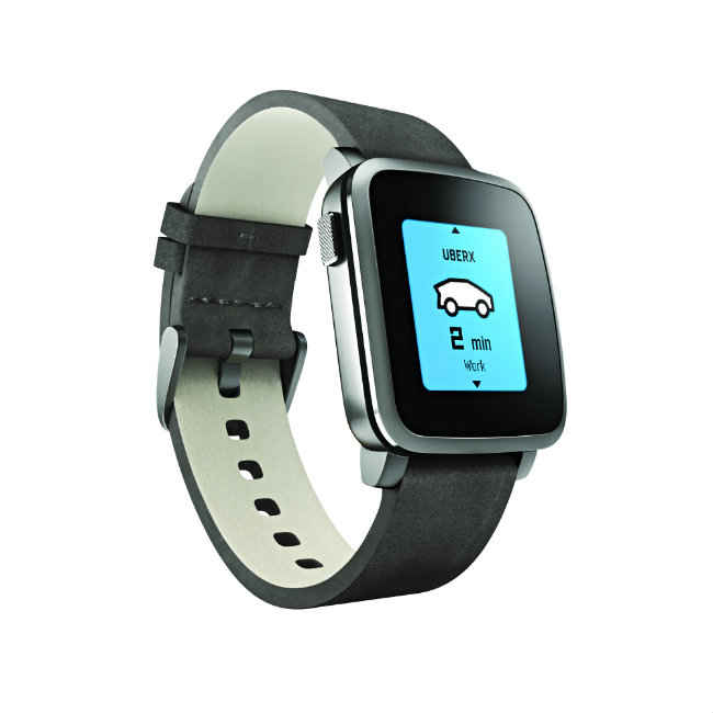
PEBBLE TIME
The Pebble Time is easily the most intriguing smartwatch in the market today. It’s e-paper display solves a very big problem in smartwatches, that of battery life. Of all the smartwatches that get the ‘smart’ part right, the Pebble Time is the only one that can last for a full 7 days. It carries a square-ish design, like the Asus Zenwatch 2 and Apple Watch, but is much lighter than most of them.
In fact, the build and design of the Pebble Time is quite simplistic. It has a stainless steel body, but feels quite plasticky and looks very much like a toy, even more so because of the colour e-paper display. That said, many have appreciated the looks and design of the Pebble Time and simplistic would be the best way to define it. The watch is extremely light, at 42.5 grams, and quite resistant to scratches as well. In fact, many would even say that the Pebble Time has an elegant design, even if very simplistic.
Unlike Android Wear, Apple’s WatchOS or Samsung’s Tizen though, the Pebble OS that runs on the Pebble Time depends on physical buttons for navigation on the watch. This is a major hindrance to using the Pebble Watch effectively. Its buttons are tough to press, especially when you’re wearing it, and four buttons on such a small device give it a pretty steep learning curve. The Pebble Time has three buttons on the right, while there’s also a home button on the left of the device. Since the display isn’t touch sensitive, you will be stuck pressing the buttons whenever you need to read a text or change the settings.
The Pebble Time’s development has also been faster than what many would have expected. Pebble OS supports most of the important apps today, like Evernote, WhatsApp and more, and the watch is really responsive in terms of how fast it responds to calls or texts that you receive.
There’s an interesting note here, while Android Wear and WatchOS devices respond faster to native Android apps, like Google Messenger etc, they’re slower in responding to texts on WhatsApp and other third party apps. The Pebble Time however, takes the same time to respond to all applications that it supports.
The problem with the Pebble Time is that it costs nearly Rs. 20,000, which is a lot considering it’s other problems. The lack of intuitiveness, a heart rate sensor and the inaccuracy in steps-tracking are major inhibitors for it. While the Pebble Time definitely has potential, there’s still more to do for the company.
| HOW WE TESTED |
|
Testing smartwatches can be tricky. It’s one thing to compare looks and design, but that may differ from person to person. What you think looks good, may not be the same as what we think. Nevertheless, the looks for a smartwatch does play a very big role in its success. After all, there is a big fashion play here. There is more to it though. A smartwatch also wants to be your fitness tracker, which means that accuracy is of paramount importance. We tested the tracking capabilities of each of these devices. Then again, smartwatches also have some similarities with phones. Things like processor speed, RAM, pixel density of their displays, were also considered. Waterproofing is an important elements, which means an a watch that is completely waterproof will be more useful than one that is only water resistant. Add to that the weight of each watch. All these features were taken into consideration. For performance, we tested the time each smartwatch took to display notifications. Some took a few seconds too long to detect calls and texts, which is often the difference between pulling your phone out of the pocket and using your smartwatch to respond. Also, while Apple’s Watch OS works well with iOS, Google’s Android Wear is also designed to be in sync with Android. In future, this could be a problem for operating systems like Tizen and Pebble OS, which have to walk the extra mile in order to achieve the same speed and fluidity. Speaking of which, the intuitiveness of the OS was also noted, along with the ecosystem it tries to provide for added functionality. Lastly, having reviewed all of these smartwatches and used them ourselves, we had a good sense of how long their batteries last. However, for a more objective approach, we made equal number of calls and text messages to each of these and noted the battery drop. Few smartwatches can boast battery life of over a day and a half today, which is something that companies really need to solve. With all this done, the price element was brought into play, in order to identify which watch made for the best value for money and bag our Best Buy award. Our selections were the most talked about smartwatches today, which made for a great battle. We had the Apple Watch, Samsung Gear S2, Moto 360 (2nd Gen), Asus Zenwatch 2 and the Pebble Time. |
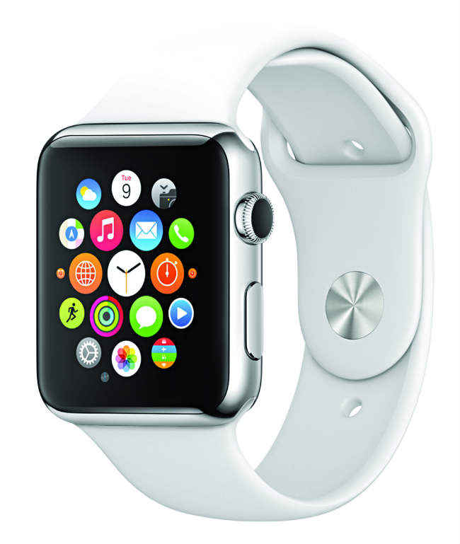
APPLE WATCH
An interesting thing happened while writing down this comparison. On the day we sat down to write this, Apple decided to drop the price of the Apple Watch in the US. It currently costs about $300 there, but unfortunately, at the time of print, the India pricing was still upwards of Rs. 40,000.
Now the Apple Watch played an interesting role here. On the one hand, the device has a really premium metal build, but our judgements on its design are divided. So, we’ll leave the decision of whether the Apple Watch really looks good, to you.
The redeeming qualities of the Apple Watch though, like firstly in its display. It has a 1.65 inch display, with an incredible 303 ppi pixel density. Barring the Samsung Gear S2, the Apple Watch may very well have the highest pixel density amongst smartwatches today. In addition, like most Apple displays, this one also looks very good.
But while the Apple Watch has a really good display, its other features and performance barely justify the price. For one, like most Apple devices in the past, this one also can’t go past a full day’s battery life. In fact, even that depends on how many notifications you usually get. In addition, Apple’s Watch OS isn’t the most intuitive either. It tries to replicate iOS in some ways, while adding the crown has made it easier to navigate than many other smartwatches.
Having said that, the crown still isn’t the best way to navigate and there are places where the Apple Watch just isn’t the best in the market. The good part is that there are quite a few apps to use with it, but like most other smartwatches, they’re not the most useful. In addition, while the Apple Watch isn’t completely accurate in tracking your steps, in our tests it turned out to be the most accurate amongst these competitors.
It also works only with iPhones, meaning it makes no sense unless you own Apple’s premiere device. So, all things considered, while the Apple Watch may be amongst the better smartwatches in the market right now, it’s far from the best.
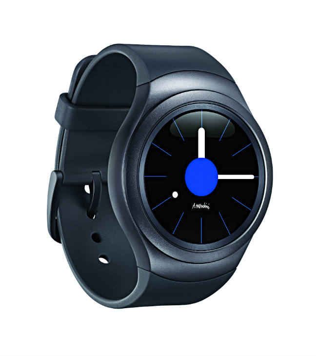
SAMSUNG GEAR S2
The Samsung Gear S2 is easily the most intuitive smartwatch in the market today. In fact, we like this watch more than any other, simply because of that intuitiveness, which is all thanks to the rotatable dial. It makes for a near perfect way to navigate around a smartwatch, and of all the OSs and watches that we compared, this is the only one that actually made us want to read emails and long text messages on the watch. It also costs `24,300, which is a good price, but more than watches like the Moto 360 (2nd Gen).
In fact, while Samsung’s Tizen OS comes out to be this watch’s downfall, the South Korean giant has done a very good job with it. The reason the Gear S2 takes a split second more than the Moto 360 to respond to calls and notifications, is a result of the disconnect between Android/iOS and Tizen. It is the same reason why Pebble OS is slower. That said, the Gear S2 also has the same advantage as the Pebble Time, in that, it responds to all notifications equally. But then again, the app support needs to increase for this to really be the best smartwatch in the market. There aren’t many watch faces to choose from, but the fact that you can put your own pictures on the watch face is good. The Samsung Gear S2 has a lot of redeeming qualities, but it needs a little more work to truly be the best smartwatch in the market.
The Samsung Gear S2 is the lightest after the Pebble Time, but though it has a metal body, it isn’t the best looking smartwatch, in our opinion. The watch has changeable straps, but it’s not as easy to do that as in the Moto 360 and ASUS Zenwatch 2.
It offers longer battery life than the Moto 360 (2nd Gen) and Apple Watch, but not as long as the ASUS Zenwatch 2. Of course, that automatically means it lasts for a much shorter duration than the Pebble Time smartwatch.
All in all, while the Samsung Gear S2 is amongst our favourite smartwatches in the market today, it falls just short of being the best performer right now. It may be the best when it comes to making smartwatches better though. While all others are either first generation products, or slightly improved versions of their originals, the Samsung Gear S2 has added something really meaningful to smartwatches and put Samsung firmly on the map in this market.
| Samsung Gear S2 | Apple Watch | ASUS Zenwatch 2 | Pebble Time | Moto 360 (2nd Gen) | |
| Price | Rs. 24,399 | Rs. 44,000 | Rs. 11,999 | Rs. 19,500 | Rs. 18,499 |
| Performace Final Scores | 14.6 | 12.6 | 12.8 | 8.2 | 17.6 |
| Features Final Scores | 14.8 | 13.7 | 13.8 | 12.3 | 13.7 |
| Platform Final Scores | 16.6 | 15.6 | 13 | 12.2 | 13 |
| Design Final Scores | 21.5 | 22.25 | 23.4 | 19.9 | 22.8 |
| Overall Rating | 67.7 | 64.2 | 63.1 | 52.7 | 67.1 |
| Specifications | |||||
| Processor Cores | 2 | 1 | 4 | 1 | 4 |
| RAM | 512 | 512 | 512 | 512 | 512 |
| Display Size | 1.2 | 1.65 | 1.63 | 1.25 | 1.56 |
| Display Pixel Density | 320 | 303 | 278 | 182 | 233 |
| Shape | Round | Square | Square | Square | Round |
| Battery (in mAh) | 250 | 250 | 400 | 150 | 400 |
| Operating System | Tizen | Watch OS | Android Wear | Pebble OS | Android Wear |
| Performance | |||||
| Time taken to display message (in seconds) | 1.122 | 1.29 | 2.15 | 2.682 | 2.506 |
| Time taken to display calls (in seconds) | 1.51 | 2.18 | 0.86 | 1.67 | 0.2 |
| Intuitiveness of UI | 5 | 3 | 3 | 3 | 3 |
| Number of Gestures available | 1 | 1 | 4 | 1 | 4 |
| Display Auto Turn On | 10 | 9 | 6 | 2 | 9 |
| Step Tracking Accuracy (percent accuracy) | 70.1 | 88.2 | 70 | 75 | 77.5 |
| Heart Rate Tracking Accuracy (percent abberration) | 18 | 22 | 0 | 0 | 14 |
| Battery Life (in hours) | 36 | 24 | 48 | 168 | 27 |
| Design | |||||
| Looks (out of 5) | 3.5 | 4 | 4 | 3 | 4 |
| Sizes Available (number of sizes) | 2 | 2 | 2 | 1 | 2 |
| Platform | |||||
| Operating System (out of 5) | 4 | 5 | 5 | 4 | 5 |
| Mode of Reply for Email/Texts | 1 | 1 | 1 | 1 | 1 |
| Mode of Reply for Calls | 0.5 | 1 | 0.5 | 0.5 | 0.5 |
| Keyboard Quality | 1 | 0 | 0 | 0 | 0 |
| How intuitive is the OS | 4 | 3 | 2 | 2 | 2 |
| Features | |||||
| Weight | 48 gm | 50 gm | 60gm | 42.5 gm | 50 gm |
| On/Off Buttons | 1 | 1 | 1 | 1 | 1 |
| Navigation Buttons/Dial/Crown | 2 | 2 | 0 | 1 | 0 |
| Changeable Straps | 1 | 1 | 1 | 1 | 1 |
| Waterproofing | 2 | 0 | 1 | 1 | 1 |
| Storage | 4 GB | 8 GB | 4 GB | 0.015 GB | 4 GB |
BEST BUY: ASUS Zenwatch 2
As mentioned before, at Rs. 11,999, the ASUS Zenwatch 2 is the most value for money smartwatch today. While there is room for improvement, if you’re looking to get a taste of what smartwatches can offer, this is the one to go for. Android Wear runs smoothly on the device and it is highly customisable, perhaps the most customisable of the lot.
ASUS needs to work on the design by reducing the thickness of the watch’s bezels, and perhaps even make the whole body out of metal. The Zenwatch 2 is still one of the better looking smartwatches in the market.
If you’re planning to buy a smartwatch and can’t decide which one to buy, the ASUS Zenwatch 2 would be the ideal choice. It allows you to understand what a smartwatch can do and being a second generation device, it is greatly improved from the original. The ASUS Zenwatch Manager is also amongst the better bridging apps, with which you can control and customise the smartwatch.
BEST PERFORMER: Moto 360 (2nd Gen)
When the first Moto 360 smartwatch was announced, it was widely proclaimed the best smartwatch in the market. So, it doesn’t come as a big surprise that the second generation version has come to be the best performer this time. The Moto 360 (2nd Gen) was the fastest to respond to calls and texts, while its battery life lies in what can be considered the industry standard today. The Moto 360 (2nd Gen) is also widely benefited from the fact that Android Wear is meant to work well with Android devices.
The Moto 360 (2nd Gen) is also the best looking amongst smartwatches, at least in our opinion. It is well built and looks premium. Even though there aren’t huge design changes, Motorola has refined the design this time, making the Moto 360 (2nd Gen) everything it needs to be, in terms of looks and build. If Google can make progress with Android Wear fast enough, that’ll do the Moto 360 (2nd Gen) a world of good.
It has a big enough display and the pixel density is also quite high.
EDITOR’S PICK: Samsung Gear S2
Numbers play a big role in comparison, which is why the Samsung Gear S2 couldn’t take the best performer titled in this comparison. While the smartwatch is indeed slower to receive notifications than the Moto 360, a split second’s difference barely makes that big of a difference. The Gear S2’s rotatable dial more than makes up for this, and it is very easy to use this smartwatch.
As we mentioned before, the smartwatch is the only one that we really felt like using. Yes, we would be glad if Samsung could add support for more applications, like Pebble OS and Apple’s Watch OS, but it’s a very good start.
It is a tad expensive, but at this nascent stage, it makes much more sense than buying an Apple Watch or an LG Watch Urbane.
This comparison was published in the April 2016 issue of Digit magazine. To get the comparisons first, subscribe to the Digit magazine or download the Digit e-magazine app.

