First impressions of Xiaomi MIUI via the Xiaomi Mi3

The 'so-called' flagship killers are now in India and they have brought the artillery with them. The MIUI is a fresh new look at Android, that has been required for quite some time now. Here's what you need to know about the Xiaomi MiUI
In an earlier story, we wrote about Xiaomi’s best of both worlds approach. Well, that is perhaps best explained through the MIUI, which is the default interface on Xiaomi smartphones. We got a hands on experience with the MIUI today, on all three of Xiaomi’s new smartphones. While the Mi3 runs on the Android 4.4.2 OS, the Redmi 1S and Redmi Note run on Android 4.2.2 and Android 4.3 respectively. But enough about that, let’s get on to what the headline is all about!
![]()
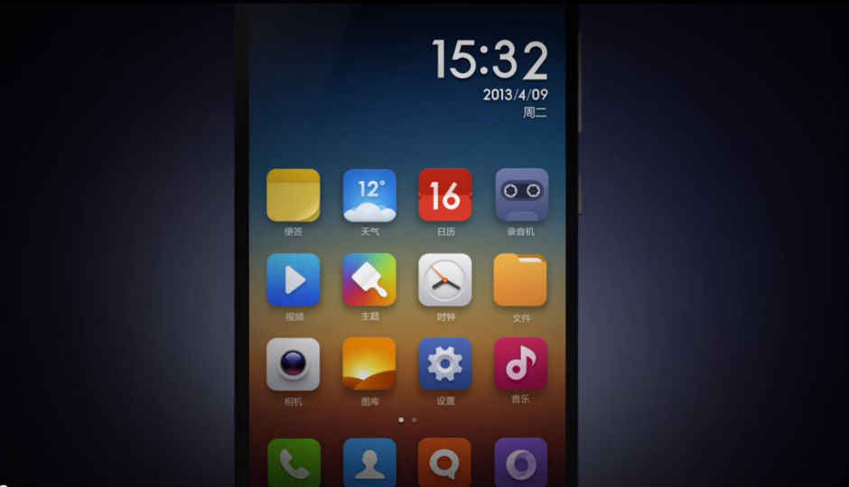
Right at the offset, you’ll see an iOS meets Android approach, which many Indian users may recognise as very similar to Lenovo’s Smart UI. Xiaomi’s MIUI puts all your apps on the home screen, removing the app drawer that is seen on most other Android smartphones. Is this good? We liked it, but we have to say it would clutter your screen and increase the number of home screens if you install many apps. The way around it is to put your apps in folders, but that could still end up cluttering your screen.
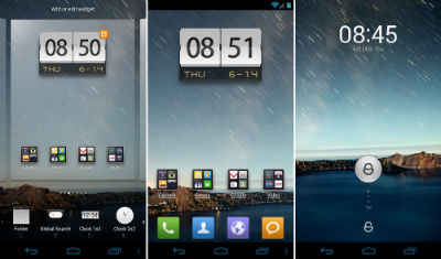
The MIUI though has a persona of its own. This is perhaps the only smartphone that gives the user so much to do on the lock screen itself. There’s a round unlock button, surrounded by four icons in a circle, which unlock the phone or open various apps. This button though has many more functions. Double tapping it changes the circle to give you the music settings, which means that you can play music without unlocking your phone. Moreover, if you have a text message, you will be given a preview of it the minute your finger touches the button. We found both these features to be quite unique and functional.
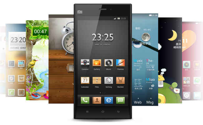
Unlike the iOS, the MIUI incorporates a lot of widgets and themes. Themes really are the cornerstone of this UI. In China, Xiaomi has over 4,000 themes designed by its community members and the company is looking to take the same approach in India. To start with though, Xiaomi has brought a number of these themes to India, all of which are available for free. The UI comes with a Theme Store, which has both paid and free themes.
What we especially liked about the themes is that each brings a completely new look with it. Xiaomi has often stressed on the extreme customisability of its MIUI and it shows through its various themes. Xiaomi has even designed an India centric theme that is available in the theme store already. It’s hard to get ‘bored’ of a smartphone that can change its look every so often!
The MIUI is not only about the looks though. We’ve already talked about the useful lockscreen features and the UI has many such features inside as well. For one, we found the private messaging feature very useful. In this, the user has to drag down after opening his messaging app, to reveal the hidden private messaging screen. You can add specific contacts, whose messages will go directly to this section of your app. In addition, when you get messages from these contacts, the phone won’t show the name or the message, showing only that you have an SMS. Pretty neat isn’t it?
One especially good feature that we saw was in the Notes and some other apps. In this, you can drag down on the Notes app to open up a quick note window. So, you don’t have to open the app itself and don’t have to leave your home screen. The windows open on the screen and allows you to take down a note. The same can also be done on your music app as well.
Another very useful feature of the MIUI was the fact that your camera app has an integrated QR Code scanner. To loosely quote what Hugo Barra himself said, it’s hard to imagine how no camera app has this yet, since QR codes are so prominent nowadays.
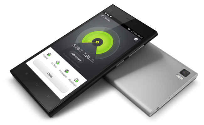
If you are interested in just finding out more about the Xiaomi Mi3 in particular, read our first impressions report of the Xiaomi Mi3 here.
There are other features like this though, which would make you wonder why no one thought of them till now. Xiaomi’s MIUI uses the ‘heads up display’ feature on Android to give you heads up notifications when you get a call while you’re in another app. This puts a small notification on the top of your screen, which can be used to answer or decline a call, without disrupting whatever you were doing. Another example is how you move icons on the MIUI. In other UIs, you have to long press and then drag the icons to the edge of the screen, in order to take it to another one. In the MIUI, you can long press an icon and then use another finger to swipe across various home screens and place the app wherever you want. This is further facilitated by a ‘move’ option, which can be accessed by long pressing a screen. By this, you can choose whichever icon(s) you want to move and then put them all on the screen that you want. These features are really very simple, but make the UI that much easier to use.
Xiaomi has done a lot of other things to the UI, which struck us as useful. We liked the UI, but for any Indian user, the lack of the app drawer and the new features, would be a handful. It would take a while to learn your way across the UI. But then again, Barra was intrigued by this question when it was put to him and promised to try and get the documentation about the UI to users in some way.


