Vivo NEX 3 First Impressions: Curves sharply to stay cutting-edge

The Vivo NEX 3 is the final version of the Vivo APEX prototype it showcased earlier this year, but is it really the future of smartphones?
Last year, Vivo showed it’s ability to innovate and lead the smartphone industry with new features like the in-display fingerprint sensor and the full-screen display with the first Vivo NEX. Then came the Vivo NEX Dual Display, a concept smartphone (which never launched in India) with an additional display at the back. Now, with the Vivo NEX 3, Vivo brought extreme curves to the display, removed all the buttons and added a 64MP camera on the back. Does it count as cutting-edge innovation? Let’s find out —
Curves have never been sharper and less user-friendly
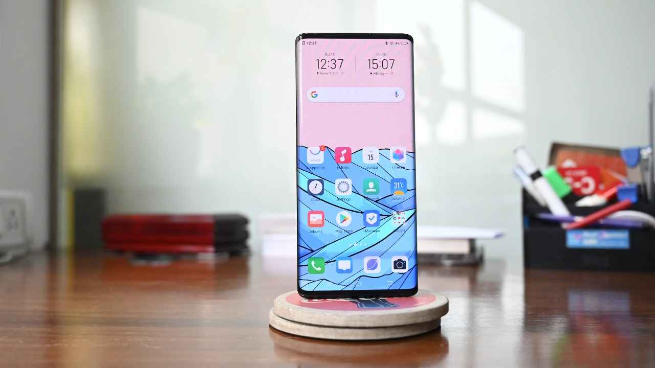
The first thing you’ll notice about the NEX 3 is the display. It’s all-encompassing and takes up the most amount of space on the phone. It doesn’t stop at the edges. Instead, the panel curves sharply down the edges and almost wraps around the body. You’ve seen the curved screens on the Samsung Galaxy flagships and the OnePlus 7 Pro. Now imagine them on steroids! The screen curves a sheer 88-degrees on the sides and stops just short of meeting the rear panel. That allows for an insane 93.6 percent screen-to-body ratio.
Vivo calls it the “Waterfall FullView display”. It’s a P-OLED (last seen on the LG V40 ThinQ), meaning it’s essentially made of plastic which is what allows the screen to curve that sharply. The resolution is FHD+ with HDR10 certification. The colours on the panel do look nice, but they aren’t quite vibrant enough unless you set the brightness levels to max. But what Vivo hopes will convince most people to buy the phone is the new abilities that the curved screen brings to the table. One, the edges light up as you receive a call or a notification in a way not even the Galaxy S10 can. Second, the edges allow the phone to go button-free. Using a combination of haptic feedback and touch, the NEX 3’s volume and power buttons are essentially on-screen buttons. There is a tiny power button on the top which is meant to be used if the display fails to operate as usual. I do quite like the vibration feedback though. The rumble is just as strong as an iPhone. Yet, I couldn’t fail but notice a few glaring inconsistencies. The sharp edges show vast discolouration and while watching a video, it’s even more evident. To prevent this, you will have to restrict the video within the flat part of the panel and not allow it to curve. Furthermore, while gaming, the palm rejection on the edges are minimal and more often than not, I found myself accidentally pressing a button I didn’t want to press.
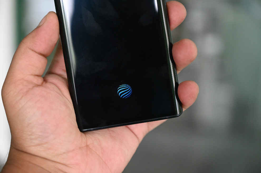
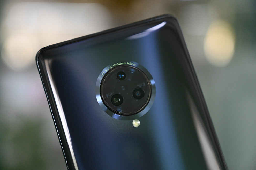
But inconsistencies aside, the NEX 3 does look pretty good. It’s hefty, owing to its metal and glass unibody design. While the front is all display, the rear panel houses a rather large circular camera module housing three cameras arranged in a triangle. There’s the NEX branding and the flash unit. That’s all. The edges are also not sharp at all and the phone does feel pretty good in the hand. Although, getting used to the no-button body takes time. Also the phone is so tall you can forget using it one handed.
Top notch performance with bloated software
Moving on to the performance, that’s one thing Vivo ensured remains top-class. Like every other NEX series phone, the NEX 3 comes with the latest and best hardware inside. The Snapdragon 855+ is at the heart of the thing coupled with 8GB RAM and 128GB UFS 3.0 storage. That makes the phone just as fast as any other flagship launched in the second half of the year. There’s also a Hi-Fi DAC inside for improved audio. A 4500mAh battery keeps the lights on with support for 44W fast charging.
Now, while the hardware is top-notch, it’s Vivo’s FunTouch UI that sets it back from competing against the likes of the OnePlus 7T Pro. FunTouch OS feels aged, cartoonish and immature in front of something as refined as OxygenOS. Increasingly, with hardware becoming saturated at the top level, it’s the software experience that is setting phones apart and it is in this crucial aspect that the Vivo NEX 3 fails to live up to its flagship tag. The phone is filled with uncalled for bloatware, some of which can thankfully be uninstalled. Then there’s the undue overtures to iOS (that too for an older version). Looking for the quick settings tile above the notification bar? It’s not there. Instead, you have to swipe up from the bottom to access an iOS-like Control Center where essential options like Wi-Fi toggle, mobile data and the likes are hidden. Vivo also offers its own Jovi AI assistant on top of Google Assistant.
Cutting-edge cameras that can shoot 64MP RAW
It’s the camera on the back of the phone that perhaps can be a good reason to buy it. It’s one of the newer 64MP camera phones with a f/1.8 lens, which is accompanied by a 13MP telephoto camera with 2X optical zoom (with an odd f/2.5 aperture however that is sure to underexpose photos in low-light) and another 13MP ultrawide camera with f/2.2 aperture. On the front, you get a 16MP selfie shooter housed in a large pop-up module coupled with a soft flash.
The camera hardware is certainly impressive with Vivo going for the absolute latest tech available. What left me surprised was the ability to take RAW photos in the default 64MP sensor readout in the Pro Mode. Getting access to such data gave us an excellent peek into how the high-res sensor works. We will be revisiting the same in another article in the future. There’s also a dedicated Night Mode and a Portrait Mode which comes with its own AI assistant that shows how the model should pose and how to frame the shot. That was pretty neat and I have a feeling it will be appreciated by people who are keen about photography but don’t know much about the hobby.
Shot on primary 64MP camera (in binned mode)
Shot on the wide-angle camera
Shot on primary 64MP camera (in binned mode)
Shot in 64MP mode
What’s missing in the camera is stabilisation of any sort. EIS or OIS. That results in videos that are shaky from the get go, even though you can shoot at 4K at 60 FPS. Zoomed frames also have to held with steady hands to counter the shake. For a phone as expensive and premium as this, the lack of stabilisation could hurt its prospects in the market.
Overall, having spent some time with the Vivo NEX 3, I couldn’t help but appreciate how futuristic and premium the phone looks, but it’s only when I actually started using it did I notice all the shortcomings. The design surely marks the future with more and more OEMs opting for the curved route, but unless things like edge discolouration and palm rejection are improved, the road might curve to a deadend. Otherwise, the NEX 3 feels premium, fast and can take some pretty good photos. We will be going more in-depth into the phone once it launches in the market.


